Product
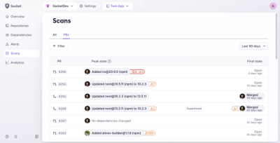
Introducing Pull Request Stories to Help Security Teams Track Supply Chain Risks
Socket’s new Pull Request Stories give security teams clear visibility into dependency risks and outcomes across scanned pull requests.
placeholder-loading
Advanced tools
Simple and flexible, css only, content placeholder loading animation.
Simple and flexible, css only, content placeholder loading animation.
https://zalog.github.io/placeholder-loading/
Take a look at this examples, but keep in mind that it's flexible enough to play with elements as you need.
You can change the order, add avatar or image, change text bar sizes, etc.


npm install placeholder-loading --save@import "~/node_modules/placeholder-loading/src/scss/placeholder-loading"; - please modify the path accordingly$ph-direction: ltr !default;
$ph-bg: #fff !default;
$ph-color: #ced4da !default;
$ph-border: 1px solid darken($ph-bg, 10%) !default;
$ph-border-radius: 2px !default;
$ph-cols: 12 !default;
$ph-cols-remove-odd: true !default;
$ph-gutter: 30px !default;
$ph-spacer: 15px !default;
$ph-avatar-border-radius: 50% !default;
$ph-animation-duration: 0.8s !default;
Just replace npm with bower: bower install placeholder-loading --save
<head>
    <link rel="stylesheet" href="https://unpkg.com/placeholder-loading/dist/css/placeholder-loading.min.css">
</head>
A simple html markup would be something like this:
<div class="ph-item">
    <div class="ph-col-12">
        <div class="ph-picture"></div>
        <div class="ph-row">
            <div class="ph-col-6 big"></div>
            <div class="ph-col-4 empty big"></div>
            <div class="ph-col-2 big"></div>
            <div class="ph-col-4"></div>
            <div class="ph-col-8 empty"></div>
            <div class="ph-col-6"></div>
            <div class="ph-col-6 empty"></div>
            <div class="ph-col-12"></div>
        </div>
    </div>
</div>
grid classes: .ph-col-2, .ph-col-4, .ph-col-6, .ph-col-8, .ph-col-10, .ph-col-12
elements inside: .ph-avatar and .ph-picture
use .big for bigger text line
Please read Angular's CONTRIBUTING.md for details on our code of conduct, and the process for submitting pull requests to us.
We use SemVer for versioning. For the versions available, see the tags on this repository.
See also the list of contributors who participated in this project.
This project is licensed under the MIT License - see the LICENSE file for details
FAQs
Simple and flexible, css only, content placeholder loading animation.
The npm package placeholder-loading receives a total of 7,996 weekly downloads. As such, placeholder-loading popularity was classified as popular.
We found that placeholder-loading demonstrated a healthy version release cadence and project activity because the last version was released less than a year ago. It has 1 open source maintainer collaborating on the project.
Did you know?

Socket for GitHub automatically highlights issues in each pull request and monitors the health of all your open source dependencies. Discover the contents of your packages and block harmful activity before you install or update your dependencies.

Product
Socket’s new Pull Request Stories give security teams clear visibility into dependency risks and outcomes across scanned pull requests.

Research
/Security News
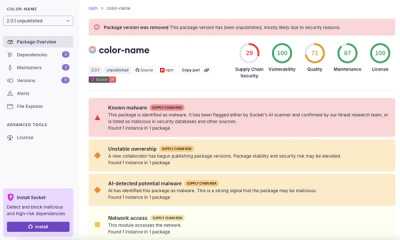
npm author Qix’s account was compromised, with malicious versions of popular packages like chalk-template, color-convert, and strip-ansi published.

Research
Four npm packages disguised as cryptographic tools steal developer credentials and send them to attacker-controlled Telegram infrastructure.