Security News
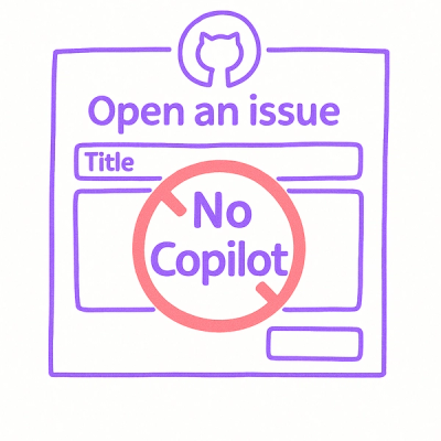
Open Source Maintainers Demand Ability to Block Copilot-Generated Issues and PRs
Open source maintainers are urging GitHub to let them block Copilot from submitting AI-generated issues and pull requests to their repositories.
places-autocomplete-svelte
Advanced tools
A flexible and customizable Svelte component leveraging the Google Maps Places (New) Autocomplete API to provide a user-friendly way to search for and retrieve detailed address information within your SvelteKit applications.
A flexible and customizable Svelte component leveraging the Google Maps Places (New) Autocomplete API to provide a user-friendly way to search for and retrieve detailed address information within your SvelteKit applications.
This component handles API loading, session tokens, fetching suggestions, and requesting place details, allowing you to focus on integrating the results into your application. Includes features like debounced input, highlighting of matched suggestions, extensive customization via CSS classes, and full TypeScript support.
Simply include a single script tag and handle the response in your JavaScript code. View Details
options.classes prop. Built with Tailwind CSS utility classes by default.onResponse and onError callbacks.requestParams), requested data fields (fetchFields), and component behavior/appearance (options).See a live demo of the component in action: Basic Example
Reactive parameters - change the search criteria based on user input, like filtering by country or change results language.
Customise request parameters - construct a requestParams object and control various aspects of the search, including language, region, and more.
npm install places-autocomplete-svelte
# or
yarn add places-autocomplete-svelte
'___YOUR_API_KEY___' with your actual Google Maps API Key.onResponse callback to handle the response.<script>
import { PlaceAutocomplete } from 'places-autocomplete-svelte';
import type { PlaceResult, ComponentOptions, RequestParams } from 'places-autocomplete-svelte/interfaces'; // Adjust path if needed
// Get API Key securely (e.g., from environment variables)
const PUBLIC_GOOGLE_MAPS_API_KEY = import.meta.env.VITE_PUBLIC_GOOGLE_MAPS_API_KEY;
let fullResponse: PlaceResult | null = $state(null);
let placesError = $state('');
// --- Event Handlers ---
const handleResponse = (response: PlaceResult) => {
console.log('Place Selected:', response);
fullResponse = response;
placesError = ''; // Clear previous errors
};
const handleError = (error: string) => {
console.error('Places Autocomplete Error:', error);
placesError = error;
fullResponse = null; // Clear previous results
};
// --- Configuration (Optional) ---
// Control API request parameters
const requestParams: Partial<RequestParams> = $state({
region: 'GB', // Example: Bias results to Great Britain
language: 'en-GB',
// includedRegionCodes: ['GB'], // Example: Only show results in the specified regions,
// includedPrimaryTypes: ['address'], // Example: Only show addresses
});
// Control which data fields are fetched for Place Details (affects cost!)
const fetchFields: string[] = $state(['formattedAddress', 'addressComponents', 'displayName']);
// Control component appearance and behavior
const options: Partial<ComponentOptions> = $state({
placeholder: 'Start typing your address...',
debounce: 200, // Debounce input by 200ms (default is 100ms)
distance: true, // Show distance if origin is provided in requestParams
classes: {
// Example: Override input styling and highlight class
input: 'my-custom-input-class border-blue-500',
highlight: 'bg-yellow-200 text-black', // Customize suggestion highlighting
}
});
</script>
{#if placesError}
<div class="error-message" role="alert">
Error: {placesError}
</div>
{/if}
<PlaceAutocomplete
{PUBLIC_GOOGLE_MAPS_API_KEY}
{requestParams}
{fetchFields}
{options}
onResponse={handleResponse}
onError={handleError}
/>
{#if fullResponse}
<h2>Selected Place Details:</h2>
<pre>{JSON.stringify(fullResponse, null, 2)}</pre>
{/if}
<style>
/* Example of styling an overridden class */
:global(.my-custom-input-class) {
padding: 0.75rem;
border-radius: 0.25rem;
width: 100%;
/* Add other styles */
}
.error-message {
color: red;
margin-bottom: 1rem;
}
</style>
| Prop | Type | Required | Default | Description |
|---|---|---|---|---|
| PUBLIC_GOOGLE_MAPS_API_KEY | string | Yes | - | Your Google Maps API Key with Places API enabled. |
| fetchFields | string[] | No | ['formattedAddress', 'addressComponents'] | Array of Place Data Fields to request when a place is selected. Affects API cost. |
| requestParams | Partial | No | { inputOffset: 3, ... } | Parameters for the Autocomplete request. See AutocompletionRequest options. |
| options | Partial | No | { debounce: 100, ... } | Options to control component behavior and appearance. See details below. |
| onResponse | (response: PlaceResult) => void | Yes | - | Callback function triggered with the selected place details (PlaceResult object) after fetchFields is complete. |
| onError | (error: string) => void | Yes | - | Callback function triggered when an error occurs (API loading, fetching suggestions, fetching details). |
| Option | Type | Default | Description |
|---|---|---|---|
| placeholder | string | '' | Placeholder text for the input field. |
| debounce | number | 100 | (New) Delay in milliseconds before triggering autocomplete API request after user stops typing. Set to 0 to disable debouncing. |
| distance | boolean | true | Show distance from requestParams.origin in suggestions (if origin is provided). |
| distance_units | 'km' | 'miles' | 'km' | Units to display distance in. |
| label | string | '' | Optional label text displayed above the input field. |
| autofocus | boolean | false | Automatically focus the input field on mount. |
| autocomplete | string | 'off' | Standard HTML autocomplete attribute for the input field. |
| classes | Partial | {} | Object to override default CSS classes. See Styling section. |
options.classes)You can customize the appearance of the component by providing your own CSS classes via the options.classes prop. The component uses Tailwind CSS utility classes by default. Provide an object where keys are the component parts and values are the class strings you want to apply. See styling for details.
Available Class Keys:
section: The main container section.container: The div containing the input and suggestions list.label: The label element (if options.label is provided).input: The main text input element.icon_container: Container for the optional icon.icon: SVG string for the icon.ul: The <ul> element for the suggestions list.li: Each <li> suggestion item.li_current: Class added to the currently highlighted/selected <li> (keyboard/mouse).li_a: The inner <a> or <button> element within each <li>.li_a_current: Class added to the inner element when its <li> is current.li_div_container: Container div within the <a>/<button>.li_div_one: First inner div (usually contains the main text).li_div_one_p: The <p> tag containing the main suggestion text (@html is used).li_div_two: Second inner div (usually contains the distance).li_div_two_p: The <p> tag containing the distance text.kbd_container: Container for the keyboard hint keys (Esc, Up, Down).kbd_escape: The <kbd> tag for the 'Esc' hint.kbd_up: The <kbd> tag for the 'Up Arrow' hint.kbd_down: The <kbd> tag for the 'Down Arrow' hint.highlight: (New) The class applied to the <span> wrapping the matched text within suggestions. Defaults to 'font-bold'.const options = {
classes: {
input: 'form-input w-full rounded-md shadow-sm', // Replace default input style
ul: 'absolute bg-white shadow-lg rounded-md mt-1 w-full z-10', // Custom dropdown style
li_current: 'bg-blue-500 text-white', // Custom highlight style for selected item
highlight: 'text-blue-700 font-semibold' // Custom style for matched text
}
};
onResponse: (response: PlaceResult) => void
fetchFields have been successfully retrieved.response argument is an object containing the place details based on the fetchFields requested. Its structure mirrors the PlaceResult but includes only the requested fields.onError: (error: string) => void
error argument is a string describing the error.This component is written in TypeScript and includes type definitions for props (Props, ComponentOptions, RequestParams, ComponentClasses) and the response (PlaceResult, AddressComponent). You can import these types from places-autocomplete-svelte/interfaces (adjust path if needed based on your setup).
fetchFields when a suggestion is selected) are billed separately. Carefully select only the fetchFields you need to manage costs. See Place Data Fields Pricing.Contributions are welcome! Please feel free to open an issue or submit a pull request.
FAQs
A flexible and customizable Svelte component leveraging the Google Maps Places (New) Autocomplete API to provide a user-friendly way to search for and retrieve detailed address information within your SvelteKit applications.
The npm package places-autocomplete-svelte receives a total of 72 weekly downloads. As such, places-autocomplete-svelte popularity was classified as not popular.
We found that places-autocomplete-svelte demonstrated a healthy version release cadence and project activity because the last version was released less than a year ago. It has 1 open source maintainer collaborating on the project.
Did you know?

Socket for GitHub automatically highlights issues in each pull request and monitors the health of all your open source dependencies. Discover the contents of your packages and block harmful activity before you install or update your dependencies.

Security News
Open source maintainers are urging GitHub to let them block Copilot from submitting AI-generated issues and pull requests to their repositories.

Research
Security News
Malicious Koishi plugin silently exfiltrates messages with hex strings to a hardcoded QQ account, exposing secrets in chatbots across platforms.

Research
Security News
Malicious PyPI checkers validate stolen emails against TikTok and Instagram APIs, enabling targeted account attacks and dark web credential sales.