Security News
Crates.io Users Targeted by Phishing Emails
The Rust Security Response WG is warning of phishing emails from rustfoundation.dev targeting crates.io users.
postcss-combine-media-query
Advanced tools
If you are used to write the media queries of your components within those components (what you should do instead of maintaining a large global media query file) you might end up with CSS that contains the same media query rule multiple times.
.foo { color: red; }
@media (min-width: 1024px) {
.foo { color: green; }
}
.bar { font-size: 1rem; }
@media (min-width: 1024px) {
.bar { font-size: 2rem; }
}
While this is totally fine in development (and supports a modular structure in particular when using Sass) it's not that good for production where you wanna keep your CSS as small as possible.
That's the use case this plugin is built for! It looks for equal media query rules and appends them combined.
.foo { color: red; }
.bar { font-size: 1rem; }
@media (min-width: 1024px) {
    .foo { color: green; }
    .bar { font-size: 2rem; }
}
npm install postcss-combine-media-query --save-dev
yarn add postcss-combine-media-query --dev
Simply add the plugin to your PostCSS config. That's all – easy as pie :wink: (there are no options)
If you're not familiar with using PostCSS you should read the official PostCSS documentation first.
Since this plugin moves all media queries to end of the file it may introduce bugs if your CSS is not well structured. So keep that in mind!
Let's say you've got the following code which results in .foo being yellow on desktop.
.foo { color: red; }
@media (min-width: 1024px) {
    .foo { color: green; }
}
.foo { color: yellow; }
Once you use this plugin it will change into green because the media query has been moved.
.foo { color: red; }
.foo { color: yellow; }
@media (min-width: 1024px) {
    .foo { color: green; }
}
Therefore it's recommended to use this plugin in development as well to detect such side effects sooner.
If this plugin is helpful to you it'll be great when you give me a star on github and share it. Keeps me motivated to continue the development.
FAQs
PostCSS plugin to combine equal media query rules.
The npm package postcss-combine-media-query receives a total of 8,281 weekly downloads. As such, postcss-combine-media-query popularity was classified as popular.
We found that postcss-combine-media-query demonstrated a healthy version release cadence and project activity because the last version was released less than a year ago. It has 1 open source maintainer collaborating on the project.
Did you know?

Socket for GitHub automatically highlights issues in each pull request and monitors the health of all your open source dependencies. Discover the contents of your packages and block harmful activity before you install or update your dependencies.

Security News
The Rust Security Response WG is warning of phishing emails from rustfoundation.dev targeting crates.io users.

Product
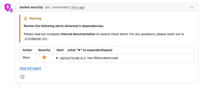
Socket now lets you customize pull request alert headers, helping security teams share clear guidance right in PRs to speed reviews and reduce back-and-forth.

Product
Socket's Rust support is moving to Beta: all users can scan Cargo projects and generate SBOMs, including Cargo.toml-only crates, with Rust-aware supply chain checks.