Security News
Deno 2.4 Brings Back deno bundle, Improves Dependency Management and Observability
Deno 2.4 brings back bundling, improves dependency updates and telemetry, and makes the runtime more practical for real-world JavaScript projects.
postcss-flexbox
Advanced tools
PostCSS Flexbox provides an easy to use option for using CSS3 Flexbox layouts. This is supported by IE 10+ and all evergreen browsers.
npm install postcss-flexbox
Please add autoprefixer after postcss-flexbox. This will ensure all the appropriate vendor prefixes are added. Flexbox is not supported without these prefixes in some browsers yet. Please refer here for detailed information.
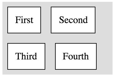
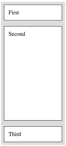
CSS3 Flexbox lets you set the layout for container divs: horizontal alignment of children or vertical. The children can in turn choose the space they occupy in the container and the alignment as well. Below are examples to show how this works. Here is a detailed blogpost I wrote on building using Flexbox in Coursera's tech blog
postcss-flexbox offers 2 props to set on a selector:
box : This is to make a HTML element a flexbox Below are the values it can take. Please provide these values separated by a empty space. Provide a combination of these values and see the wonders of Flexbox working effortlessly.
One of the following options is necessary to specify the direction of laying things out:
Here are the rest of the options which will apply based on the direction:
box-item : This is to align or adjust size of elements within a flexbox. Here are the list of options. Please specify them with a space between. You can provide the alignment option like top or right along with the size option like flex-1. Use a combination of these.
.horizontal-box {
box: horizontal;
}

.horizontal-box.align-items-center {
   box: horizontal center;
}

.horizontal-box.align-items-bottom-center {
   box: horizontal bottom center;
}

.horizontal-box.align-items-space-between {
  box: horizontal space-between;
}

.horizontal-box.align-items-space-around {
  box: horizontal space-around;
}

.horizontal-box.align-items-bottom-right {
  box: horizontal bottom right;
}

.horizontal-box {
  box: horizontal;
}

.first {
  box-item: flex-1;
}

.second {
  box-item: flex-2;
}

.horizontal-box{
  box: horizontal;
}
.first, .second, .third, .fourth {
  box-item: flex-1;
}
.first {
  box-item: top;
}
.second {
  box-item: center;
}
.third {
  box-item: stretch;
}
.fourth {
  box-item: bottom;
}

.horizontal-box {
  box: horizontal wrap;
}

.vertical-box {
  box: vertical;
}
.second {
  box-item: flex-1;
}

.vertical-box {
  box: vertical;
}

.fullbleed {
  box-item: flex-1;
}

FAQs
Flexbox layouts made easy with PostCSS
The npm package postcss-flexbox receives a total of 230 weekly downloads. As such, postcss-flexbox popularity was classified as not popular.
We found that postcss-flexbox demonstrated a not healthy version release cadence and project activity because the last version was released a year ago. It has 1 open source maintainer collaborating on the project.
Did you know?

Socket for GitHub automatically highlights issues in each pull request and monitors the health of all your open source dependencies. Discover the contents of your packages and block harmful activity before you install or update your dependencies.

Security News
Deno 2.4 brings back bundling, improves dependency updates and telemetry, and makes the runtime more practical for real-world JavaScript projects.

Security News
CVEForecast.org uses machine learning to project a record-breaking surge in vulnerability disclosures in 2025.

Security News
Browserslist-rs now uses static data to reduce binary size by over 1MB, improving memory use and performance for Rust-based frontend tools.