Security News
Crates.io Users Targeted by Phishing Emails
The Rust Security Response WG is warning of phishing emails from rustfoundation.dev targeting crates.io users.
postcss-if-media
Advanced tools
A PostCSS plugin to inline or nest media queries with CSS properties.

A PostCSS plugin for adding ?if media queries inside rules and inline with property values.
A great way to keep style values for different media queries neatly organized and grouped together under their natural rules.
Use with PostCSS Media Minmax and PostCSS Custom Media for best effect (be sure to place postcss-if-media before postcss-media-minmax, and postcss-custom-media, or any other media query plugins).
The plugin provides ?if media QUERY as an inline declaration and a nested block, where QUERY is any valid media query.
Any properties with the ?if media QUERY declaration following their value, or any properties inside an ?if media QUERY { } block will be extracted from their rule and placed in their own rule under an @media QUERY query.
The generated @media queries are placed directly after the original rule to maintain specificity.
npm install postcss-if-media --save
An inline declaration example.
/* Input. */
.test {
  position: relative;
  margin: 0 1em ?if media (min-width: 1025px);
  margin: 0 0.5em ?if media (min-width: 641px) and (max-width: 1024px);
  margin: 0 0.3em ?if media (max-width: 640px);
}

/* Output. */
.test {
  position: relative;
}

@media (min-width: 1025px) {
  .test {
     margin: 0 1em;
  }
}
@media (min-width: 641px) and (max-width: 1024px) {
  .test {
     margin: 0 0.5em;
  }
}
@media (max-width: 640px) {
  .test {
     margin: 0 0.3em;
  }
}
A nested block example.
/* Input. */
.test {
  position: relative;
  ?if media (min-width: 1025px) {
    color: red;
    margin: 0 1em;
  }
  ?if media (min-width: 641px) and (max-width: 1024px) {
    color: green;
    margin: 0 0.5em;
  }
  ?if media (max-width: 640px) {
    color: blue;
    margin: 0 0.3em;
  }
}

/* Output. */
.test {
  position: relative;
}

@media (min-width: 1025px) {
  .test {
    color: red;
    margin: 0 1em;
  }
}
@media (min-width: 641px) and (max-width: 1024px) {
  .test {
    color: green;
    margin: 0 0.5em;
  }
}
@media (max-width: 640px) {
  .test {
    color: blue;
    margin: 0 0.3em;
  }
}
FAQs
A PostCSS plugin to inline or nest media queries with CSS properties.
The npm package postcss-if-media receives a total of 22 weekly downloads. As such, postcss-if-media popularity was classified as not popular.
We found that postcss-if-media demonstrated a not healthy version release cadence and project activity because the last version was released a year ago. It has 1 open source maintainer collaborating on the project.
Did you know?

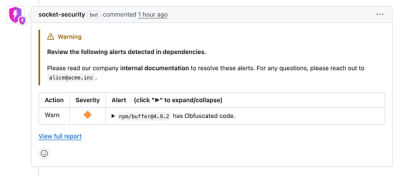
Socket for GitHub automatically highlights issues in each pull request and monitors the health of all your open source dependencies. Discover the contents of your packages and block harmful activity before you install or update your dependencies.

Security News
The Rust Security Response WG is warning of phishing emails from rustfoundation.dev targeting crates.io users.

Product
Socket now lets you customize pull request alert headers, helping security teams share clear guidance right in PRs to speed reviews and reduce back-and-forth.

Product
Socket's Rust support is moving to Beta: all users can scan Cargo projects and generate SBOMs, including Cargo.toml-only crates, with Rust-aware supply chain checks.