Security News
npm Adopts OIDC for Trusted Publishing in CI/CD Workflows
npm now supports Trusted Publishing with OIDC, enabling secure package publishing directly from CI/CD workflows without relying on long-lived tokens.
preact-markup
Advanced tools
Render HTML/XML using VDOM, with Custom Elements mapped to Components.

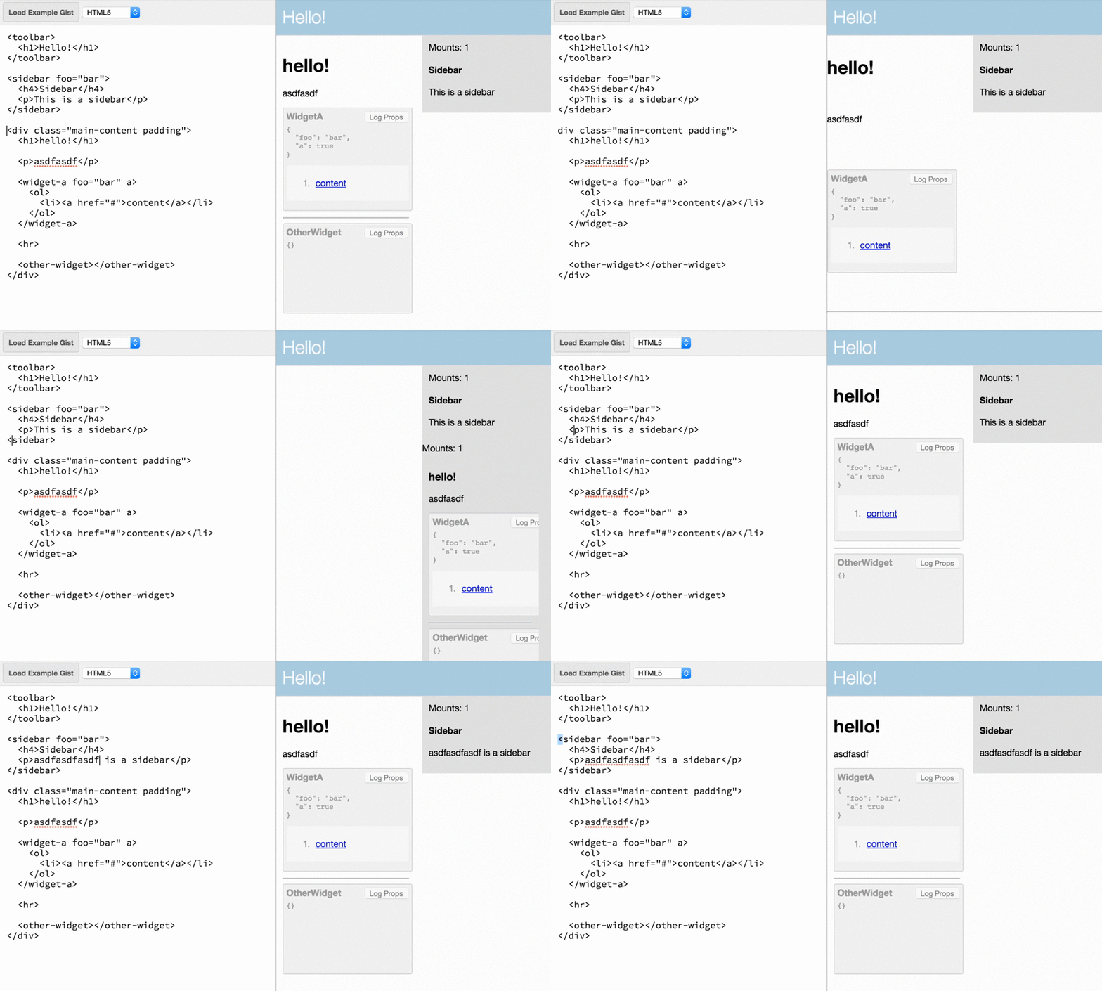
A <Markup> component that renders HTML (or XML) using Virtual DOM, mapping a set of element names to Components. Works beautifully with Preact.
Think of this like an HTML5 renderer where Web Components are implemented as Preact Components.

The <Markup /> component takes some markup, an optional mapping of custom element names to components, and an optional type of either xml or html.
In it's simplest form, <Markup /> is just a diffing XML/HTML renderer. It only re-renders when you change the markup prop.
import Markup from 'preact-markup';

let html = `<h1>hello</h1> <p>Testing 1 2 3...</p>`;
render(<Markup markup={html} />, document.body);
Note: by default, content is parsed as XML, which may be too strict for your content but is the fastest option. Pass
type="html"to parse as HTML.
The real value of <Markup /> is seen when passing a components prop. This prop is an Object that lets us map any HTML/XML element name to a preact Component. The mapped component is injected and rendered as if it had been referenced from within JSX. HTML attributes defined on the custom element in markup get passed to the mapped Component as props.
import Markup from 'preact-markup';

const Sidebar = ({ title, children }) => (
	<aside class="sidebar">
		<h2>{ title }</h2>
		{ children }
	</aside>
);

let html = `
<h1>Hello, World</h1>
<sidebar title="My Sidebar!">
	<p>Sidebar contents.</p>
</sidebar>
`;
render(<Markup markup={html} components={{ Sidebar }} />, document.body);
When render() is invoked, Our <Sidebar /> component is substituted for the <sidebar> element, which means it gets mounted and rendered like a normal Preact Component. The result is this HTML DOM:
<div class="markup">
	<h1>Hello, World</h1>
	<aside class="sidebar">
		<h2>My Sidebar!</h2>
		<p>Sidebar contents.</p>
	</aside>
</div>
Subsequent render()s diff against that DOM just like a normal JSX rendering flow would.
type - By default, content is parsed as XML. Pass type="html" to use an HTML parser.
trim - Trimming tries to emulate HTML semantics by default, but these differ from JSX semantics. Pass false to retain all whitespace, or all to omit all whitespace.
onError - Suppress XML/HTML parse errors and instead pass them to this function.
allow-scripts - By default, preact-markup sanitizes the rendered HTML by removing script tags. The allow-scripts property re-enables script tags, executing any JavaScript code within them.
Example
let markup = `<em>hello!</em><h1>asdflkj</h1><script>alert("Hello world");</script>`;
render(<Markup markup={markup} allow-scripts />, document.body);
FAQs
Render HTML/XML using VDOM, with Custom Elements mapped to Components.
The npm package preact-markup receives a total of 11,080 weekly downloads. As such, preact-markup popularity was classified as popular.
We found that preact-markup demonstrated a not healthy version release cadence and project activity because the last version was released a year ago. It has 1 open source maintainer collaborating on the project.
Did you know?

Socket for GitHub automatically highlights issues in each pull request and monitors the health of all your open source dependencies. Discover the contents of your packages and block harmful activity before you install or update your dependencies.

Security News
npm now supports Trusted Publishing with OIDC, enabling secure package publishing directly from CI/CD workflows without relying on long-lived tokens.

Research
/Security News
A RubyGems malware campaign used 60 malicious packages posing as automation tools to steal credentials from social media and marketing tool users.

Security News
The CNA Scorecard ranks CVE issuers by data completeness, revealing major gaps in patch info and software identifiers across thousands of vulnerabilities.