

Product
Introducing Reports: An Extensible Reporting Framework for Socket Data
Explore exportable charts for vulnerabilities, dependencies, and usage with Reports, Socket’s new extensible reporting framework.
By André Staltz - Apr 21, 2026
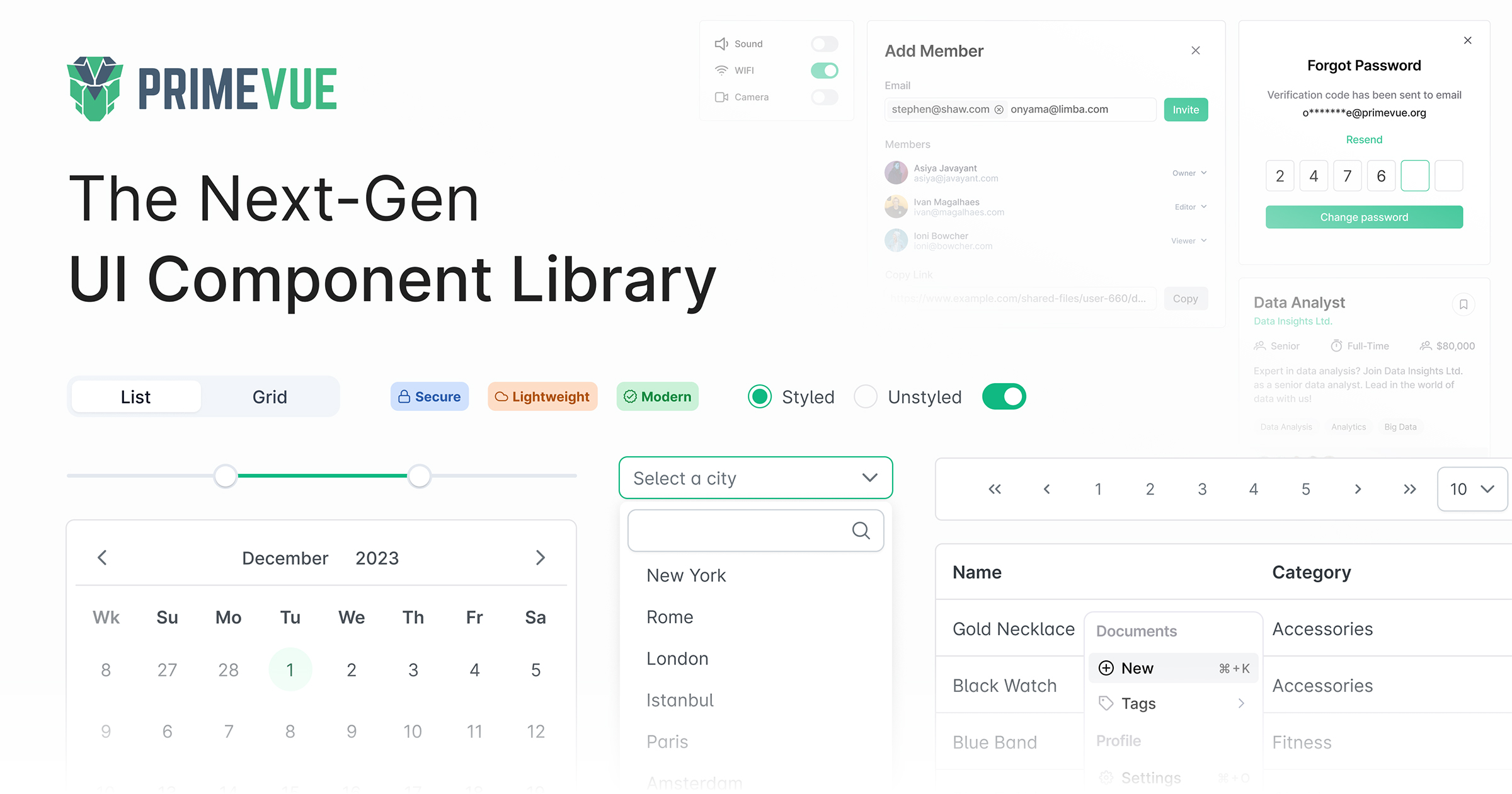
PrimeVue is an open source UI library for Vue featuring a rich set of 80+ components, a theme designer, various theme alternatives such as Material, Bootstrap, Tailwind, premium templates and professional support. In addition, it integrates with PrimeBloc

PrimeVue is a rich set of open source UI Components for Vue. Visit the PrimeVue website for interactive demos, comprehensive documentation and additional resources.
Vuetify is a popular Vue.js component library that follows the Material Design guidelines. It offers a wide range of components and features similar to PrimeVue, but with a focus on Material Design aesthetics.
Element Plus is a Vue 3 UI library that provides a comprehensive set of components for building web applications. It is known for its ease of use and extensive documentation, making it a strong alternative to PrimeVue.
BootstrapVue provides Vue.js components and directives based on Bootstrap 4. It combines the power of Bootstrap with the flexibility of Vue, offering a wide range of components similar to PrimeVue.
Ant Design Vue is a Vue.js implementation of the Ant Design system. It offers a rich set of high-quality components and follows the Ant Design guidelines, making it a strong competitor to PrimeVue.
FAQs
PrimeVue is an open source UI library for Vue featuring a rich set of 80+ components, a theme designer, various theme alternatives such as Material, Bootstrap, Tailwind, premium templates and professional support. In addition, it integrates with PrimeBloc
The npm package primevue receives a total of 485,845 weekly downloads. As such, primevue popularity was classified as popular.
We found that primevue demonstrated a healthy version release cadence and project activity because the last version was released less than a year ago. It has 3 open source maintainers collaborating on the project.
Did you know?

Socket for GitHub automatically highlights issues in each pull request and monitors the health of all your open source dependencies. Discover the contents of your packages and block harmful activity before you install or update your dependencies.
Product
Explore exportable charts for vulnerabilities, dependencies, and usage with Reports, Socket’s new extensible reporting framework.

Product
Socket for Jira lets teams turn alerts into Jira tickets with manual creation, automated ticketing rules, and two-way sync.

Company News
Socket won two 2026 Reppy Awards from RepVue, ranking in the top 5% of all sales orgs. AE Alexandra Lister shares what it's like to grow a sales career here.