Research
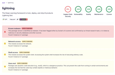
lightning PyPI Package Compromised in Supply Chain Attack
Socket detected a malicious supply chain attack on PyPI package lightning versions 2.6.2 and 2.6.3, which execute credential-stealing malware on import.
Build high-performance VueJS user interfaces (SPA, PWA, SSR, Mobile and Desktop) in record time
Build high-performance VueJS user interfaces in record time: responsive Single Page Apps, SSR Apps, PWAs, Browser extensions, Hybrid Mobile Apps and Electron Apps. If you want, all using the same codebase!

Please submit a PR to https://github.com/quasarframework/quasar-awesome with your website/app/Quasar tutorial/video etc. Thank you!
Quasar Framework is an MIT-licensed open source project. Its ongoing development is made possible thanks to the support by these awesome backers.
Please read our manifest on Why donations are important. If you'd like to become a donator, check out Quasar Framework's Donator campaign.
Head on to the Quasar Framework official website: https://quasar.dev
For latest releases and announcements, follow on Twitter: @quasarframework
Ask questions at the official community Discord server: https://chat.quasar.dev
Ask questions at the official community forum: https://forum.quasar.dev
I'm excited if you want to contribute to Quasar under any form (report bugs, write a plugin, fix an issue, write a new feature). Please read the Contributing Guide.
Quasar is following Semantic Versioning 2.0.
Copyright (c) 2015-present Razvan Stoenescu
FAQs
Build high-performance VueJS user interfaces (SPA, PWA, SSR, Mobile and Desktop) in record time
The npm package quasar receives a total of 173,004 weekly downloads. As such, quasar popularity was classified as popular.
We found that quasar demonstrated a healthy version release cadence and project activity because the last version was released less than a year ago. It has 3 open source maintainers collaborating on the project.
Did you know?

Socket for GitHub automatically highlights issues in each pull request and monitors the health of all your open source dependencies. Discover the contents of your packages and block harmful activity before you install or update your dependencies.

Research
Socket detected a malicious supply chain attack on PyPI package lightning versions 2.6.2 and 2.6.3, which execute credential-stealing malware on import.
Research
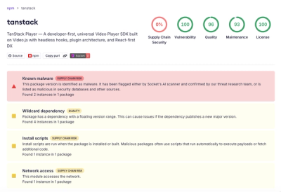
A brand-squatted TanStack npm package used postinstall scripts to steal .env files and exfiltrate developer secrets to an attacker-controlled endpoint.
Research
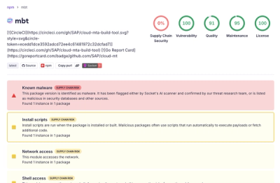
Compromised SAP CAP npm packages download and execute unverified binaries, creating urgent supply chain risk for affected developers and CI/CD environments.