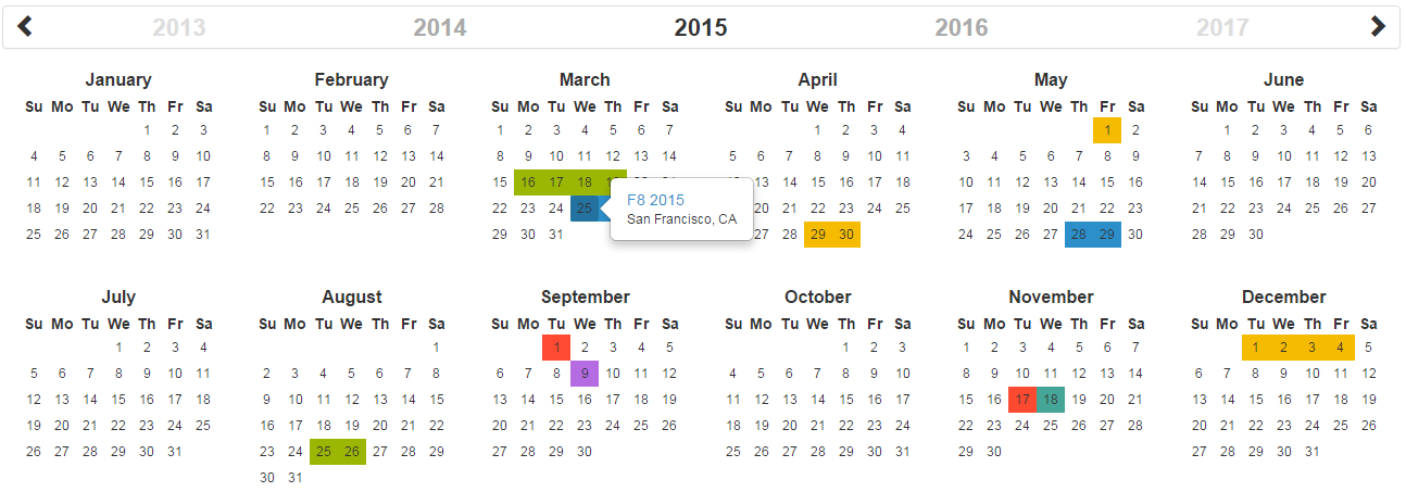
rc-year-calendar
Official React.js wrapper for the year-calendar widget. https://year-calendar.github.io/


This library is also available for:


Installation
You can get the widget using the following methods:
- From the GitHub repository
- From the Node package manager, using the following command:
npm install rc-year-calendar
- From Yarn, using the following command:
yarn add rc-year-calendar
- From the CDN, using the following script:
<script src="https://unpkg.com/rc-year-calendar@latest/dist/rc-year-calendar.umd.min.js"></script>
Usage
You can create a calendar using the following javascript code :
// Import (only if not using the CDN installation option)
import Calendar from 'rc-year-calendar';

// Render
render() {
    return (<Calendar />);
}
Using options
You can specify props to customize the calendar:
render() {
    return (
        <Calendar style="background" minDate={new Date()} />
    );
}
The props are the following
| allowOverlap | Specifies whether the user can select a range which overlapping an other element present in the datasource. | boolean | true |
| alwaysHalfDay | Specifies whether the beginning and the end of each range should be displayed as half selected day. | boolean | false |
| contextMenuItems | Specifies the items of the default context menu. | array | [] |
| customDayRenderer | Specify a custom renderer for data source. Works only with the style set to "custom". This function is called duringender for each day containing at least one event. | Render function | null |
| customDataSourceRenderer | Specify a custom renderer for days. This function is called during render for each day. | Render function | null |
| dataSource | The elements that must be displayed on the calendar. | array or function | [] |
| disabledDays | The days that must be displayed as disabled. | array | [] |
| disabledWeekDays | The days of the week that must be displayed as disabled (0 for Sunday, 1 for Monday, etc.). | array | [] |
| displayDisabledDataSource | Specifies whether the data source must be rendered on disabled days. | boolean | false |
| displayHeader | Specifies whether the calendar header is displayed. | boolean | true |
| displayWeekNumber | Specifies whether the weeks number are displayed. | boolean | false |
| enableContextMenu | Specifies whether the default context menu must be displayed when right clicking on a day. | boolean | false |
| enableRangeSelection | Specifies whether the range selection is enabled. | boolean | false |
| hiddenWeekDays | The days of the week that must not be displayed (0 for Sunday, 1 for Monday, etc.). | array | [] |
| language | The language/culture used for calendar rendering. | String | en |
| loadingTemplate | A custom loading template | String | null |
| maxDate | The date until which days are enabled. | Date | null |
| minDate | The date from which days are enabled. | Date | null |
| roundRangeLimits | Specifies whether the beginning and the end of each range should be displayed as rounded cells. | boolean | false |
| style | Specifies the style used for displaying datasource ("background", "border" or "custom"). | string | border |
| weekStart | The starting day of the week. This option overrides the parameter define in the language file. | number | 0 |
| year | The year displayed by the calendar. | number | Current year |
| defaultYear | The year on which the calendar should be opened. | number | Current year |
| onDayClick | Function fired when a day is clicked. | { date, events } |
| onDayContextMenu | Function fired when a day is right clicked. | { date, events } |
| onDayEnter | Function fired when the mouse enter on a day. | { date, events } |
| onDayLeave | Function fired when the mouse leaves a day. | { date, events } |
| onRangeSelected | Function fired when a date range is selected. | { startDate, endDate } |
| onRenderEnd | Function fired when the calendar rendering is ended. | { currentYear } |
| onYearChanged | Function fired when the visible year of the calendar is changed. | { currentYear } |
Language
If you want to use the calendar in a different language, you should import the locale file corresponding to the language you want to use, and then set the language prop of the calendar:
import Calendar from 'rc-year-calendar';
import 'rc-year-calendar/locales/rc-year-calendar.fr';
OR
<script src="https://unpkg.com/rc-year-calendar@latest/dist/rc-year-calendar.umd.min.js"></script>
<script src="https://unpkg.com/rc-year-calendar@latest/locales/rc-year-calendar.fr.js"></script>
Then
render() {
    return (
        <Calendar language="fr" />
    );
}
The list of available languages is available here
What next
Check the examples page to discover all the functionalities.


