
Security News
The Hidden Blast Radius of the Axios Compromise
The Axios compromise shows how time-dependent dependency resolution makes exposure harder to detect and contain.
By Ahmad Nassri - Apr 01, 2026
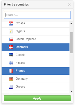
A github flavoured dropdown menu for ReactJS.
Demo: https://jamhall.github.io/rdropdown/
npm install rdropdown --save
Import RDropdown and its styles in your application as follows:
import RDropdown from 'rdropdown';
import 'rdropdown/dist/rdropdown.css';
A simple example:
import React, { Component } from 'react';
import RDropdown from 'rdropdown';
import 'rdropdown/dist/rdropdown.css';

class App extends Component {
  constructor(props) {
    super(props);
    this.handleClose = this.handleClose.bind(this);
    this.handleOpen = this.handleOpen.bind(this);
    this.handleSelectedOptions = this.handleSelectedOptions.bind(this);
    this.state = {
      isOpen: false,
      selectedOptions: null
    };
  }

  handleClose() {
    this.setState({
      isOpen: false
    });
  }

  handleOpen() {
    this.setState({
      isOpen: true
    });
  }


  handleSelectedOptions(options) {
    this.setState({
        isOpen: !this.state.isOpen,
        selectedOptions: options
    });
  }

  renderOption(option) {
    return (<div>{option.name}</div>);
  }

  renderDropdown() {
    const countries = [
              { name: "France", code: "FR" },
              { name: "Italy", code: "IT"  },
              { name: "United Kingdom", code: "GB" }
    ];
    if(this.state.isOpen) {
      return (
          <RDropdown
                    options={countries}
                    onClose={ this.handleClose }
                    onSelectedOptions={ this.handleSelectedOptions }
                    selectedOptions={ this.state.selectedOptions }
                    renderOption={ this.renderOption }/>

      );
    }
  }

  renderSelected() {
    const {selectedOptions} = this.state;
    if(selectedOptions) {
      return (<span>{ selectedOptions.name }</span>);
    }
    return (<span>No option selected</span>)
  }

  render() {
    return (
      <div>
        <button onClick={this.handleOpen}>Open</button>
        { this.renderDropdown () }
        <p>Selected options: {this.renderSelected() }</p>
      </div>
    );
  }
}
Please look at the example source code in the demo folder for a good example of how to use the component: https://github.com/jamhall/rdropdown/tree/master/demo
| Name | Type | Required | Description |
|---|---|---|---|
options | Array or promise | Yes | Options to be used for the list |
renderOption | Function | Yes | Callback used to render an option item in the dropdown list |
onSelectedOptions | Function | Yes | Callback when an option item(s) is selected. If set to multiple, it will return an array otherwise it will return an object |
selectedOptions | Any | Yes | An an array of options or an option object. This is used to pre-select the options in the list |
title | String | No | The title of the dropdown (default: 'Filter') |
searchable | Bool | No | Activate or disactivate searching. (default:false) |
searchPlaceholder | No | String | The search input box placeholder (default: Search) |
searchTimeout | No | Number | When to start searching after the user stops typing (default: 200ms) |
noResultsText | String | No | Text to be displayed when no options are found (default: 'No results') |
onSearch | Function | Yes if searchable enabled | Callback or a promise for when a user starts typing to search the list |
onClose | Function | Yes | Close the menu |
enableEsc | Bool | No | Allow the user to press ESC to close the menu (default: true) |
errorText | String | No | String to be displayed to the user when an error occurs (default: 'An error occurred') |
height | Number | No | The maximum height of the dropdown list (default: 300) |
multiple | Bool | No | Allow multiple selected options (default: false) |
applyOptions | Bool | No | Make the use manually apply the options selected (default: false) |
applyOptionsText | String | No | The text to be displayed for the apply button (default: 'Apply' ) |
Clone the repository:
git clone git@github.com:jamhall/rdropdown.git && cd rdropdown
Install the dependencies:
npm install
Run the demo:
npm start
Navigate to:
http://localhost:3001/
MIT Licensed. Copyright (c) Jamie Hall 2016.
FAQs
A ReactJS component to render a Github-style dropdown
We found that rdropdown demonstrated a not healthy version release cadence and project activity because the last version was released a year ago. It has 1 open source maintainer collaborating on the project.
Did you know?

Socket for GitHub automatically highlights issues in each pull request and monitors the health of all your open source dependencies. Discover the contents of your packages and block harmful activity before you install or update your dependencies.
Security News
The Axios compromise shows how time-dependent dependency resolution makes exposure harder to detect and contain.

Research
A supply chain attack on Axios introduced a malicious dependency, plain-crypto-js@4.2.1, published minutes earlier and absent from the project’s GitHub releases.

Research
Malicious versions of the Telnyx Python SDK on PyPI delivered credential-stealing malware via a multi-stage supply chain attack.