
React Autocomplete Tagbox
Modern, flexible, and fully customizable React tag input with autocomplete.


---
React Autocomplete Tagbox is a modern, flexible, and fully customizable React component for tag input with optional autocomplete. Effortlessly add, remove, and select tags with keyboard or mouse. Supports both free-form and restricted tag entry, smart suggestions, and a clean, accessible UI. Perfect for forms, search bars, and dynamic filters. Easy to integrate and fully styleable to match your project.
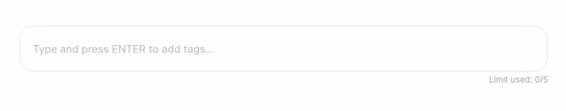
🎬 Without Autocomplete
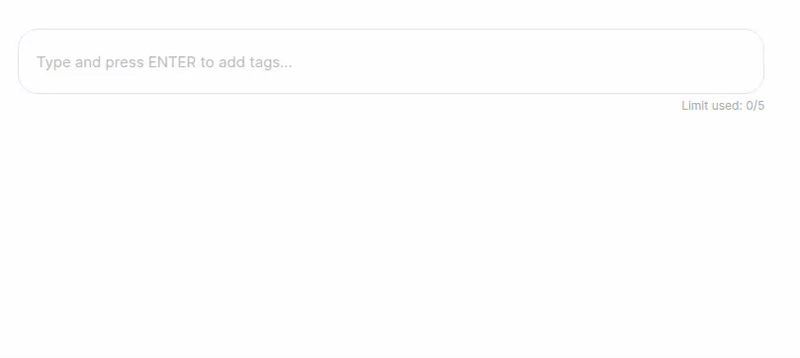
🎬 With Autocomplete
✨ Features
- Autocomplete Suggestions: Show relevant tag options as users type.
- Free-form or Restricted Tags: Allow any input or restrict to a predefined list.
- Custom Tag Validation (
filterData): Accept only tags that match your custom logic (e.g., only URLs, emails, etc.).
- Keyboard & Mouse Friendly: Full keyboard navigation and intuitive mouse interactions.
- Customizable UI: Easily style to match your design system.
- Tag Removal: Remove tags with a click or keyboard.
- Tag Limit: Optionally limit the number of tags.
- Paste Multiple Tags: Paste a list of tags separated by space/comma/newline.
- Accessible: Built with accessibility in mind (ARIA roles, keyboard support).
- TypeScript Support: Fully typed for a great developer experience.
- Lightweight: Small bundle size, no heavy dependencies.
- Easy Integration: Plug-and-play with minimal setup.
🚀 Installation
npm install react-autocomplete-tagbox
yarn add react-autocomplete-tagbox
🛠️ Usage
import React, { useState } from "react";
import ReactAutocompleteTagbox from "react-autocomplete-tagbox";
const options = [
"React",
"JavaScript",
"TypeScript",
"GraphQL",
"Redux",
"Bootstrap",
];
const filterData = (str: string) => str.length >= 5;
const filteredOptions = options.filter(filterData);
export default function App() {
const [tags, setTags] = useState<string[]>([]);
return (
<ReactAutocompleteTagbox
tags={tags}
onChange={setTags}
options={filteredOptions} // Filtered options
filterData={filterData}
limit={5}
placeholder="Add technologies..."
/>
);
}
Note:
If you use both options and filterData, only options that pass filterData will be selectable or added as tags.
It's recommended to filter your options with filterData before passing them to the component.
⚙️ Props
tags | string[] | [] | The current list of tags. |
onChange | (tags: string[]) => void | | Callback when tags change. |
options | string[] | undefined | Optional. Restricts tags to these options and enables autocomplete. |
limit | number | undefined | Optional. Maximum number of tags allowed. |
placeholder | string | "Type and press ENTER to add tags..." | Placeholder text for the input. |
containerStyle | React.CSSProperties | undefined | Optional. Inline styles for the container. |
className | string | undefined | Optional. Additional class for the container. |
filterData | (data: string) => boolean | undefined | Optional. Custom validation/filter function for tags. |
🧠 Filtering Options
If you use both options and filterData, make sure your options match your filter. For example, to only allow URLs:
const filterData = (str: string) => {
  try {
    const url = new URL(str.trim());
    return url.protocol === "http:" || url.protocol === "https:";
  } catch {
    return false;
  }
};
const filteredOptions = options.filter(filterData);

<ReactAutocompleteTagbox
  tags={tags}
  onChange={setTags}
  options={filteredOptions}
  filterData={filterData}
/>;
🎨 Customization
- Styling: The component uses CSS Modules. You can override styles by importing your own CSS or using the
className prop.
- Accessibility: Keyboard navigation and ARIA attributes are included for a11y. You can further enhance accessibility by providing descriptive labels and ensuring color contrast in your custom styles.
🧑💻 Development
Clone the repo and run:
npm install
npm run dev
📝 License
MIT © Amrit Utsav
💡 Contributing
Contributions, issues, and feature requests are welcome!
Feel free to check issues page.
React Autocomplete Tagbox — The smart, beautiful way to manage tags in your React apps!


