React <AwesomeButton /> UI Component


react-awesome-button is a performant, extendable, highly customisable, production ready React Component that renders an animated set of 3D UI buttons. Bundled together with a social share and progress enabled components.
Key Features
- 60fps 3D animated button
- Animated progress button
- Social icons and network specific share methods
- OnPress ripple effect
- Look and feel customisable and extendable in two ways: via CSS custom properties or SASS variables and lists (scss config file).
- Use it with CSSModules or **Plain CSS
Live demo
Checkout the live demo with the CSS customizer at awesome-button.caferati.me.
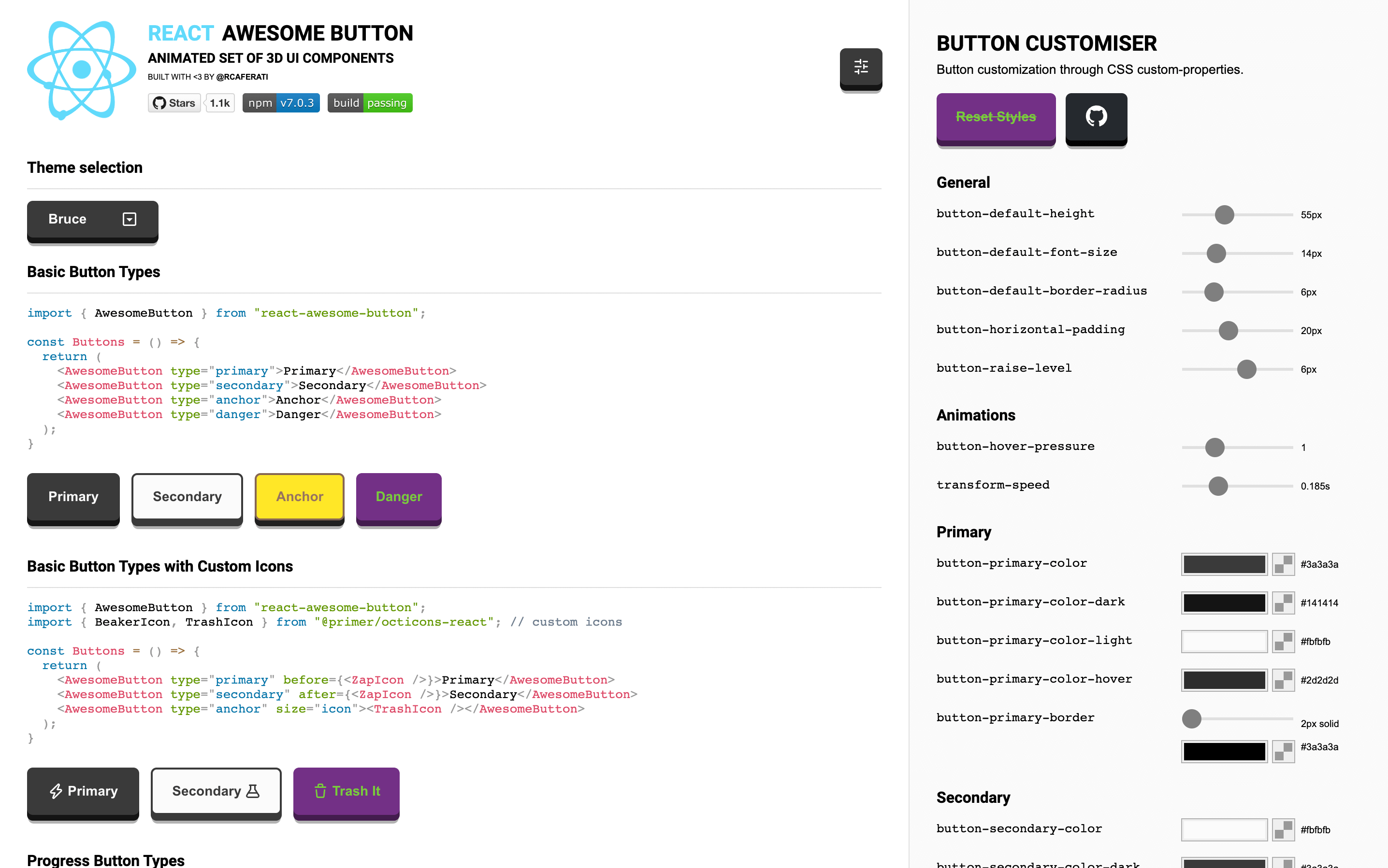
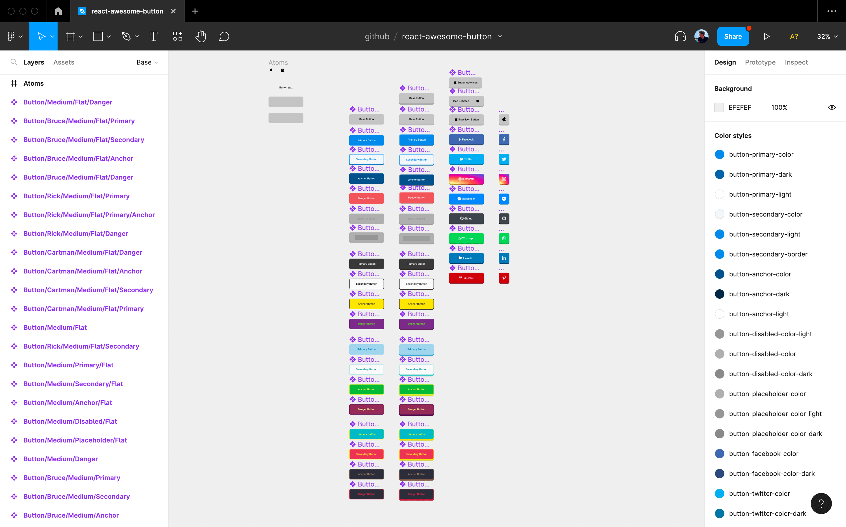
Figma File
Import it directly into your Figma project.
You can run the storybook locally on 6006 by cloning this repository and running npm run storybook
Installation
npm install --save react-awesome-button
Styling with plain CSS and CSS Modules
Plain CSS
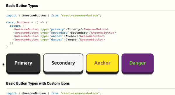
import { AwesomeButton } from 'react-awesome-button';
import 'react-awesome-button/dist/styles.css';

function Button() {
  return <AwesomeButton type="primary">Button</AwesomeButton>;
}
CSS Modules
import { AwesomeButton } from 'react-awesome-button';
import AwesomeButtonStyles from 'react-awesome-button/src/styles/styles.scss';

function Button() {
  return (
    <AwesomeButton cssModule={AwesomeButtonStyles} type="primary">
      Button
    </AwesomeButton>
  );
}
AwesomeButton rendered with a button tag
Renders the component with a button HTML tag and an onPress prop called on animation release.
import { AwesomeButton } from 'react-awesome-button';
import AwesomeButtonStyles from 'react-awesome-button/src/styles/styles.scss';

function Button() {
  return (
    <AwesomeButton
      cssModule={AwesomeButtonStyles}
      type="primary"
      onPress={() => {
        // do something
      }}>
      Button
    </AwesomeButton>
  );
}
AwesomeButton rendered with an anchor tag
Render the component with an anchor HTML tag setting the href attribute.
import { AwesomeButton } from 'react-awesome-button';
import AwesomeButtonStyles from 'react-awesome-button/src/styles/styles.scss';

function Button() {
  return (
    <AwesomeButton
      cssModule={AwesomeButtonStyles}
      type="primary"
      href="https://google.com">
      Button
    </AwesomeButton>
  );
}
AwesomeButton props
| type | string | primary | Render a specific button type, styled by the .scss type list |
| size | string | auto | Render a specific button size, styled by the .scss size list |
| element | node | null | Overwrites the default container element renderer, useful for using it with react-router Link component. |
| disabled | bool | false | Render the disabled button |
| visible | bool | true | Toggle button visibility |
| ripple | bool | false | Sets up the button with the onPress ripple effect |
| placeholder | bool | true | Should render the animated placeholder on empty children |
| onPress | function | null | Default pressRelease event function |
| onPressed | function | null | Event function triggered only on full button press |
| onReleased | function | null | Event function triggered on button full animation release |
| onMouseDown | function | null | Event function coupled with the element's onMouseDown |
| onMouseUp | function | null | Event function coupled with the element's onMouseUp |
| href | string | null | Forces the button to be rendered on an anchor container and sets the href to the specified value |
| className | string | null | Adds a className to the button container element |
| style | object | null | Passes a style object to the container element |
| containerProps | object | null | Exposes an option for freely adding props to the button container element |
| cssModule | object | null | Accepts a css module configuration from the themed module.scss files |
| target | string | null | When used together with href renders an anchor with a specific target attribute |
| before | React.Node | null | Render a node before the main content span container; useful for setting icons |
| after | React.Node | null | Render a node after the main content span container; useful for setting icons |
| between | string | null | Sets the content elements relation to space-between; useful for setting icons |
| active | bool | false | When set to true activates the pressIn animation |
AwesomeButtonProgress basic example
Checkout this example live on the storyboard.
import { AwesomeButtonProgress } from 'react-awesome-button';
import AwesomeButtonStyles from 'react-awesome-button/src/styles/styles.scss';

function Button() {
  return (
    <AwesomeButtonProgress
      cssModule={AwesomeButtonStyles}
      type="primary"
      onPress={(event, release) => {
        // do a sync/async task then call `release()`
      }}>
      Button
    </AwesomeButtonProgress>
  );
}
AwesomeButtonProgress specific props
Being a wrapper on the AwesomeButton component, it accepts its props plus the following ones.
| onPress | function | null | Default onPress function returning the event and a button release strategy |
| loadingLabel | string | Wait .. | Progress button loading label text |
| resultLabel | string | Success! | Progress button success label text |
| releaseDelay | number | 500 | Delay for releasing the button after the progress animation |
AwesomeButtonSocial basic example
If nothing is passed on the sharer prop, the component automatically gets the page's own title and og:image properties; otherwise, it's setup by the sharer.
  import { AwesomeButtonSocial } from 'react-awesome-button';
  import AwesomeButtonStyles from 'react-awesome-button/src/styles/styles.scss'

  function Button() {
    return (
      <AwesomeButtonSocial
        cssModule={AwesomeButtonStyles}
        type="facebook"
        sharer={{
          url="https://caferati.me"
        }}
      >
        Button
      </AwesomeButton>
    );
  }
AwesomeButtonSocial whatsapp example
  import { AwesomeButtonSocial } from 'react-awesome-button';
  import AwesomeButtonStyles from 'react-awesome-button/src/styles/styles.scss'

  function Button() {
    return (
      <AwesomeButtonSocial
        cssModule={AwesomeButtonStyles}
        type="whatsapp"
        sharer={{
          phone: '############',
          message: 'Whatsapp init message'
        }}
      >
        Button
      </AwesomeButton>
    );
  }
AwesomeButtonSocial specific props
Being a wrapper on the AwesomeButton component, it accepts its props plus the following ones.
| type | string | null | Render a button type (Facebook, Instagram, Twitter, Github, Youtube, Linkedin, Pinterest, Reddit, Messenger, Whatsapp) |
| icon | bool or Dimensions | true | Setting to false avoids icon rendering; if the dimensions type is passed in {width: number, height: number}, configures the button size |
| sharer.url | string | null | Url string to be used on the sharer |
| sharer.image | string | null | Image url to be rendered on the sharer |
| sharer.message | string | null | Message string to be rendered on the shared post |
| sharer.phone | string | null | Phone number to be used when using the Whatsapp sharer type |
| sharer.user | string | null | Username to be redirected when using the Messenger sharer type |
React Native Version
Checkout the React Native version of the Awesome Button UI Component at rcaferati/react-native-really-awesome-button

Author
Rafael Caferati
License
MIT. Copyright (c) 2019 Rafael Caferati.


