React Awesome Slider v3 [NEW fullpage navigation HOC]


react-awesome-slider is a 60fps, extendable, highly customizable, production ready React Component that renders a media (image/video) gallery slider/carousel.
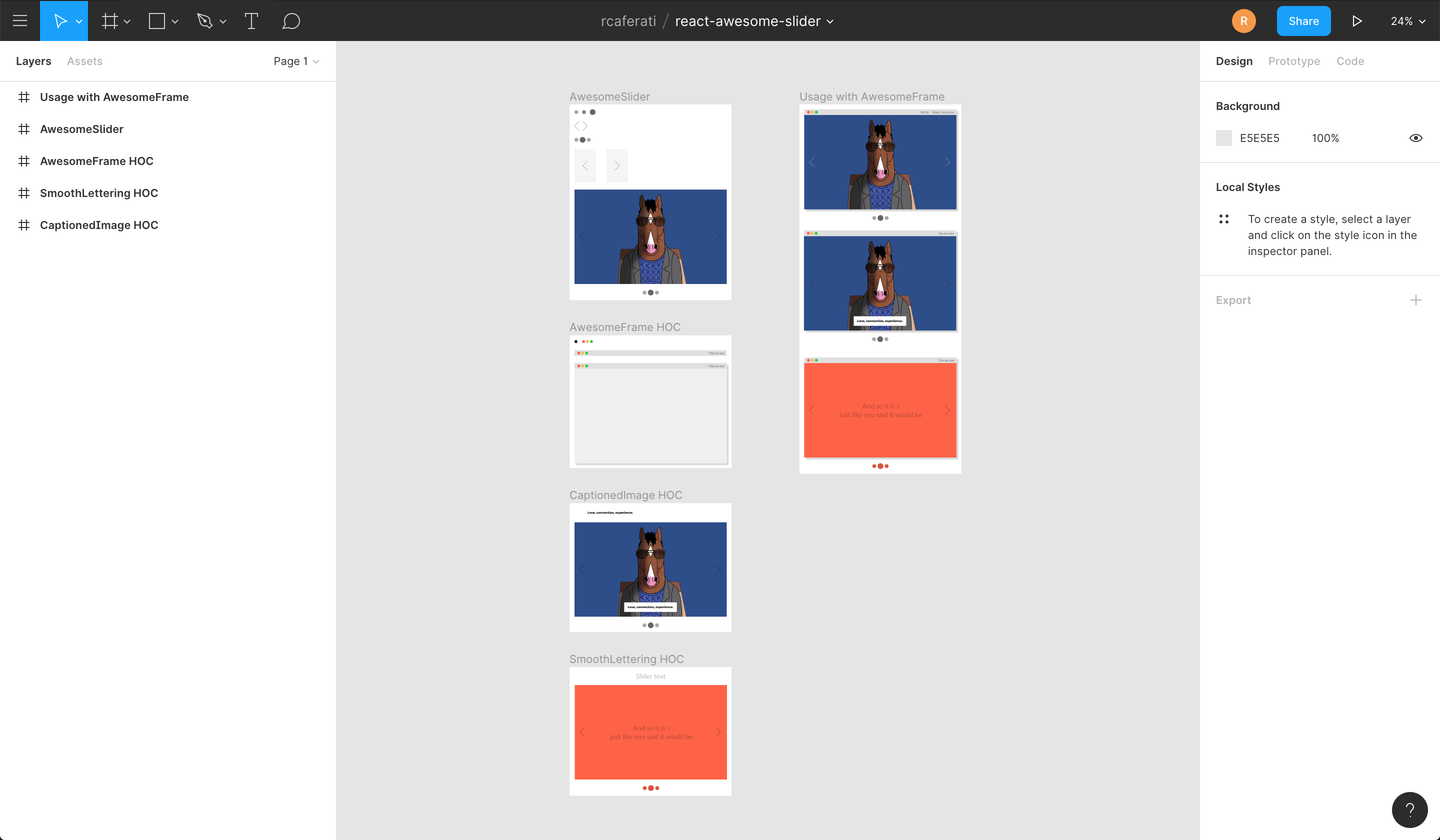
FULLPAGE navigation HOC
For using the full-screen navigation HOCs please checkout the GatsbyJS and NextJS examples on the ras fullpage strategies repository.
You can access the demo for the FULLPAGE navigation here: fullpage.caferati.me

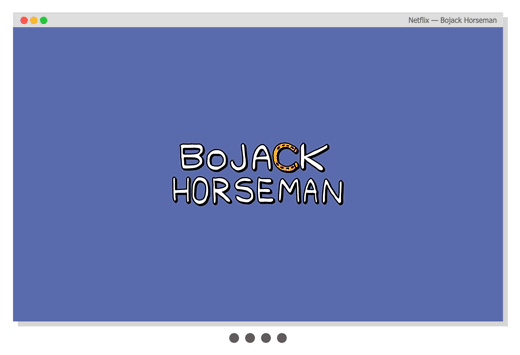
Basic usage
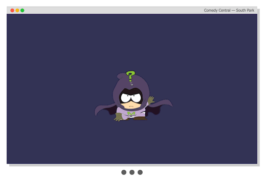
Basic usage with pure CSS
import AwesomeSlider from 'react-awesome-slider';
import 'react-awesome-slider/dist/styles.css';

const slider = (
  <AwesomeSlider>
    <div>1</div>
    <div>2</div>
    <div>3</div>
    <div>4</div>
  </AwesomeSlider>
);
Animation recipes: scale-out, fold-out, cube, open and fall.
For analysing how the animations are built, please check out to this folder. Collaborations with new creative ones are welcome, just open a PR.
Cube animation recipe
Checkout more recipes on the styled folder. For more animation recipes check out the styled folder.
import AwesomeSlider from 'react-awesome-slider';
import 'react-awesome-slider/dist/custom-animations/cube-animation.css';

const slider = (
  <AwesomeSlider animation="cubeAnimation">
    <div data-src="/path/to/image-0.png" />
    <div data-src="/path/to/image-1.png" />
    <div data-src="/path/to/image-2.jpg" />
  </AwesomeSlider>
);
Touch enabled
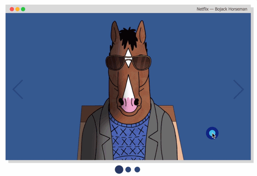
Live demo
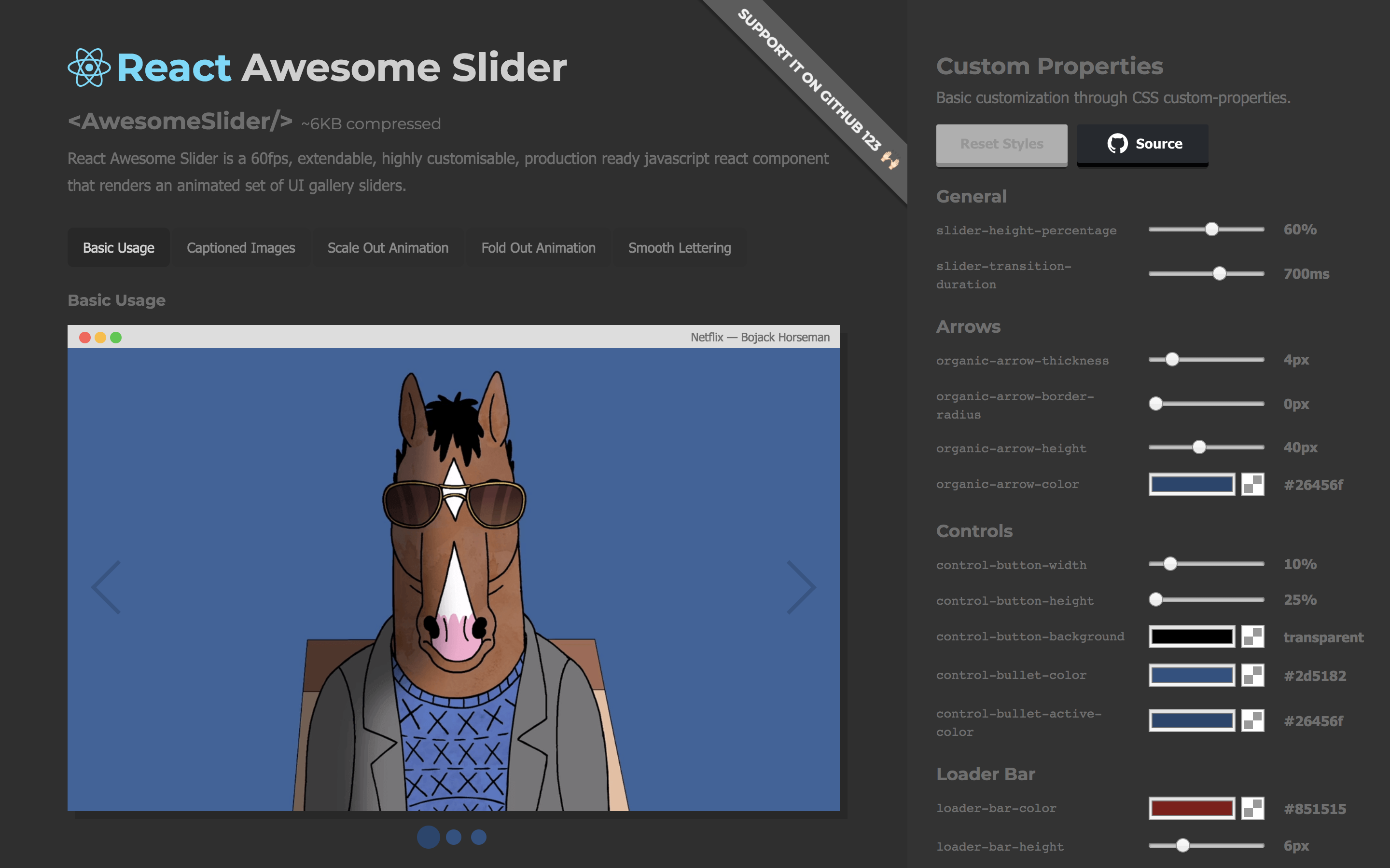
Checkout the CSS customizer at my portfolio
Figma File
Import the component directly into your Figma project.
Installing
npm install --save react-awesome-slider
or
yarn add react-awesome-slider
More Examples
Basic usage with Media object
import AwesomeSlider from 'react-awesome-slider';
import 'react-awesome-slider/dist/styles.css';

const slider = (
  <AwesomeSlider
    media={[
      {
        source: '/path/to/image-0.png',
      },
      {
        source: '/path/to/image-1.png',
      },
      {
        source: '/path/to/image-2.png',
      },
    ]}
  />
);
Basic usage with CSS Modules
import AwesomeSlider from 'react-awesome-slider';
import AwesomeSliderStyles from 'react-awesome-slider/src/styles';

const slider = (
  <AwesomeSlider cssModule={AwesomeSliderStyles}>
    <div data-src="/path/to/image-0.png" />
    <div data-src="/path/to/image-1.png" />
    <div data-src="/path/to/image-2.jpg" />
  </AwesomeSlider>
);
Fold-out animation recipe with CSS Modules
Checkout more recipes on the styled folder. For more animation recipes check out the styled folder.
Note that on v3 there's an adition of the animation prop. The animation name is the cammel-cased version of the animation css file.
import AwesomeSlider from 'react-awesome-slider';
import CoreStyles from 'react-awesome-slider/src/core/styles.scss';
import AnimationStyles from 'react-awesome-slider/src/styled/fold-out-animation/fold-out-animation.scss';

const slider = (
  <AwesomeSlider
    animation="foldOutAnimation"
    cssModule={[coreStyles, animationStyles]}
  >
    <div data-src="/path/to/image-0.png" />
    <div data-src="/path/to/image-1.png" />
    <div data-src="/path/to/image-2.jpg" />
  </AwesomeSlider>
);
Using the Autoplay HOC with plain CSS
import AwesomeSlider from 'react-awesome-slider';
import withAutoplay from 'react-awesome-slider/dist/autoplay';
import 'react-awesome-slider/dist/styles.css';

const AutoplaySlider = withAutoplay(AwesomeSlider);

const slider = (
  <AutoplaySlider
    play={true}
    cancelOnInteraction={false} // should stop playing on user interaction
    interval={6000}
  >
    <div data-src="/path/to/image-0.png" />
    <div data-src="/path/to/image-1.png" />
    <div data-src="/path/to/image-2.jpg" />
  </AutoplaySlider>
);
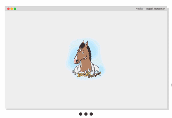
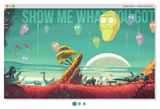
Using the Captioned HOC with plain CSS
import AwesomeSlider from 'react-awesome-slider';
import withCaption from 'react-awesome-slider/dist/captioned';
import 'react-awesome-slider/dist/styles.css';
import 'react-awesome-slider/dist/captioned.css';

const CaptionedSlider = withCaption(AwesomeSlider);

const component = (
  <CaptionedSlider
    startupScreen={StartupScreen}
    cssModule={CaptionedStyles}
    screens={[
      {
        backgroundColor: '#4a9c8c',
        media: '/images/series/ricknmorty-3.png',
        caption: 'I want to see what you got.',
      },
      {
        backgroundColor: '#4a9c8c',
        media: '/images/series/ricknmorty-3.png',
        caption: "The answer is -- Don't think about it.",
      },
    ]}
  />
);
Key Features
- Look and feel customisable and extendable via SASS and CSS Variables (custom-properties) (scss main file)
- Media pre-loader
- Touch enabled
- 60fps animations
- Animated transition recipes
- Extendable via custom plugin HOC components
- FullScreen achieved through the
fillParent prop
Main Props
| className | string | null | Add a className to the component container |
| cssModule | object | null | CSS Module object if you choose to use this styling approach |
| name | string | awesome-slider | Unique name of the rendered slider. Useful if you're navigating between multiple pages that contains a slider component. |
| selected | number | 0 | Sets the current active/selected screen |
| bullets | boolean | true | When set to true show the bullet controls underneath the slider |
| organicArrows | boolean | true | When set to true show the organic arrow next and prev controls |
| fillParent | boolean | false | When set to true the slider will fill the dimensions of the parent element. Usefull for using it in full-screen mode. |
| infinite | boolean | true | When set to true the slider will behave on an infinite fashion returing to the first slide after the last one. |
| startupScreen | node | null | Set's the startup screen component to be shown before the first screen is loaded. It works like a pre-loading screen. |
| startup | boolean | true | Used together with startupScreen controls whether or not the startupScreen should auto-start. |
| transitionDelay | number | 0 | Sets a delay in ms between the slide transitions. Useful if you're waiting for an exit animation to finish in the current slide. |
| mobileTouch | boolean | true | When set to true activates a swipe touch effect to navigate on mobile devices. |
| buttons | boolean | true | Should render the default left and right navigation buttons. |
| buttonContentRight | node | null | Add content as children of the right button. |
| buttonContentLeft | node | null | Add content as children of the left button. |
| customContent | node | null | Render extra content at the same level of the default buttons. Useful if you want to add an extra slider navigation layer or a fixed overlay element |
| onFirstMount | function | null | Called on componentDidMount passing the slider reference as an argument |
| onTransitionEnd | function | null | Called on at the slider transition end event passing the slider reference as an argument |
| onTransitionStart | function | null | Called on slider transition start passing the slider reference as an argument |
| onTransitionRequest | function | null | Called when a user interacts with the slider navigation (arrows or bullets) |
Contribute
If you have an idea for a missing feature or animation just craft your own hoc feature or animation style and send it up via PR to the src/components folder.
Author
Rafael Caferati
License
MIT. Copyright (c) 2018 Rafael Caferati.


