Research
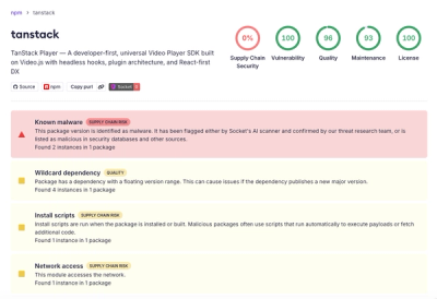
Malicious npm Package Brand-Squats TanStack to Exfiltrate Environment Variables
A brand-squatted TanStack npm package used postinstall scripts to steal .env files and exfiltrate developer secrets to an attacker-controlled endpoint.
react-bootstrap-grid-component
Advanced tools
React Bootstrap Grid is a made to make your life easier while using Bootstrap Grid inside your React project. Main concepts of the grid have been transformed into react components such as Container, Row and Column. By adding attributes that are defined bellow you can easily implement the grid to your liking or given specification.
Install react-bootstrap-grid-component
npm install react-bootstrap-grid-component
A Container should always wrap Rows as children.
import 'bootstrap/scss/bootstrap.scss';
import 'react-bootstrap-grid-component/dist/sizingbreakpoints.scss';
import { Container } from "react-bootstrap-grid-component/dist/Container";
import { Column } from "react-bootstrap-grid-component/dist/Column";
import { Row } from "react-bootstrap-grid-component/dist/Row";

<Container>
    <Row>
        <Column />
    </Row>
</Container>
The only property that this component support is the isFlud which when is defined sets the .container-fuild class on the wrapping tag
/**
 *  https://getbootstrap.com/docs/4.1/layout/grid/#how-it-works
 */
isFluid?: boolean
import 'bootstrap/scss/bootstrap.scss';
import 'react-bootstrap-grid-component/dist/sizingbreakpoints.scss';
import { Container } from "react-bootstrap-grid-component/dist/Container";
import { Column } from "react-bootstrap-grid-component/dist/Column";
import { Row } from "react-bootstrap-grid-component/dist/Row";

<Container>
    <Row>
        <Column />
    </Row>
</Container>
/**
 * https://getbootstrap.com/docs/4.0/layout/grid/#vertical-alignment
 */
verticalAlignment?: "center" | "baseline";
/**
 * https://getbootstrap.com/docs/4.0/layout/grid/#horizontal-alignment
 */
horizontalAlignment?: "start" | "center" | "between" | "end";
/**
   * https://getbootstrap.com/docs/4.0/layout/grid/#no-gutters
   */
  noGutters?: boolean;
/**
  * Rows must contain only columns to prevent negative margin issues
  */
children: Array<React.ReactElement<Column>> | React.ReactElement<Column>;
import 'bootstrap/scss/bootstrap.scss';
import 'react-bootstrap-grid-component/dist/sizingbreakpoints.scss';
import { Container } from "react-bootstrap-grid-component/dist/Container";
import { Column } from "react-bootstrap-grid-component/dist/Column";
import { Row } from "react-bootstrap-grid-component/dist/Row";

<Container>
    <Row>
    <Column size="6">
        <div>Content</div>
    </Column>
    <Column size={xs:12,md:6}>
        <div>Content</div>
    </Column>
    </Row>
</Container>
direction?: "row" | "col";

size?: 0 | 1 | 2 | 3 | 4 | 5 | 6 | 7 | 8 | 9 | 10 | 11 | 12;

verticalAlignment?: "top" | "center" | "bottom" | "justify";

horizontalAlignment?: "left" | "right" | "center" | "stretch";

offset?: 0 | 1 | 2 | 3 | 4 | 5 | 6 | 7 | 8 | 9 | 10 | 11 | 12;

order?:  0 | 1 | 2 | 3 | 4 | 5 | 6 | 7 | 8 | 9 | 10 | 11 | 12 | "first" | "last";
Note: If you set size to be equal to 0 the column will disappear
./src/components/sizingbreakpoints.scss
This SCSS-File extending the Bootstrap default width declaration (h-w-25, h-w-50, h-w-75, h-w-100) with breakpoints.
If you want to override some of the default classes of the bootstrap grid, use prefixes. There are prefixes for container, rows and columns
Depending if you want to apply changes globaly or only in one/couple of components then define the prefix on top of desired page
import prefixes from 'react-bootstrap-grid-component/dist/PrefixManager';

prefixes.container | prefixes.column | prefixes.row = 'h-';
$helper-css-prefix: "h-";
FAQs
React Bootstrap Grid
We found that react-bootstrap-grid-component demonstrated a not healthy version release cadence and project activity because the last version was released a year ago. It has 10 open source maintainers collaborating on the project.
Did you know?

Socket for GitHub automatically highlights issues in each pull request and monitors the health of all your open source dependencies. Discover the contents of your packages and block harmful activity before you install or update your dependencies.

Research
A brand-squatted TanStack npm package used postinstall scripts to steal .env files and exfiltrate developer secrets to an attacker-controlled endpoint.

Research
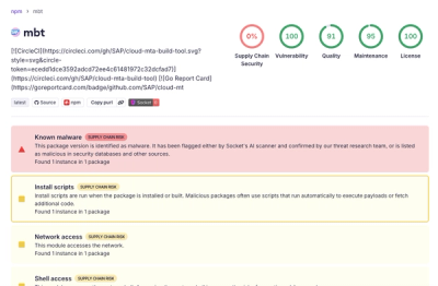
Compromised SAP CAP npm packages download and execute unverified binaries, creating urgent supply chain risk for affected developers and CI/CD environments.

Company News
Socket has acquired Secure Annex to expand extension security across browsers, IDEs, and AI tools.