React Bootstrap Spinner
🎉 React-Bootstrap-Spinner is a customizable and flexible spinner component for React applications. It allows you to create Bootstrap-style spinners using both predefined Bootstrap colors and custom color codes, with support for both border and grow animations.


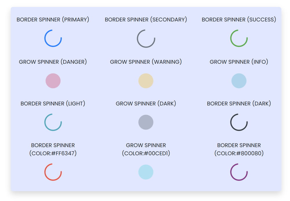
Showcase
Here’s how the react-bootstrap-spinner component looks:
✨ Features
- 🌀 Border and Grow animations
- 🎨 Custom color support (hex codes, RGB, etc.)
- 🖌️ Bootstrap color variants (primary, success, danger, etc.)
- ⚡ Easy integration into React projects
- 🔧 Adjustable spinner size
🚀 Install
To install the package, run the following command:
npm install react-bootstrap-spinner
📖 Usage
Here's an example of how to use the spinner component in your React project:
import React from 'react';
import Spinner from 'react-bootstrap-spinner';

const App = () => (
  <div>
    <h1>Loading...</h1>
    <Spinner animation="border" color="primary" size="4rem" />
    <Spinner animation="grow" color="#ff6347" size="2rem" />  {/* Custom color */}
  </div>
);

export default App;
Props
animation | string | "border" | The type of spinner animation ("border" or "grow"). |
color | string | "primary" | The color of the spinner. Can be a Bootstrap color or a custom hex code. |
size | string | "3rem" | The size of the spinner, defined in CSS units (e.g., "2rem", "50px"). |
🤝 Contributing
Pull requests are welcome. For major changes, please open an issue first to discuss what you would like to change.
Thanks ❤️
License
MIT © License
Author
Made with ❤️ by Ajay Marathe


