Research
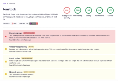
Malicious npm Package Brand-Squats TanStack to Exfiltrate Environment Variables
A brand-squatted TanStack npm package used postinstall scripts to steal .env files and exfiltrate developer secrets to an attacker-controlled endpoint.
react-bootstrap-wizard
Advanced tools
A react component package that allows you to split a complicated flow or a complicated form in multiple steps.
React Bootstrap Wizard is a react component package that allows you to split a complicated flow or a complicated form in multiple steps and it's made with reactstrap components and React using Creative Tim Now UI styles.
npm install --save react-bootstrap-wizard@latest
Import react-wizard in your component:
import ReactWizard from 'react-bootstrap-wizard';
After that, in your component render method add the following line:
<ReactWizard {...props} /> // where props are the properties you want
ReactWizard.defaultProps = {
  validate: false,
  previousButtonText: "Previous",
  finishButtonText: "Finish",
  nextButtonText: "Next",
  color: "primary",
  progressbar: false
};

ReactWizard.propTypes = {
  color: PropTypes.oneOf(["primary", "green", "orange", "red", "blue"]),
  previousButtonClasses: PropTypes.string,
  finishButtonClasses: PropTypes.string,
  nextButtonClasses: PropTypes.string,
  headerTextCenter: PropTypes.bool,
  navSteps: PropTypes.bool,
  validate: PropTypes.bool,
  finishButtonClick: PropTypes.func,
  previousButtonText: PropTypes.node,
  finishButtonText: PropTypes.node,
  nextButtonText: PropTypes.node,
  title: PropTypes.node,
  description: PropTypes.node,
  progressbar: PropTypes.bool,
  steps: PropTypes.arrayOf(
    PropTypes.shape({
      stepName: PropTypes.string.isRequired,
      stepIcon: PropTypes.string,
      component: PropTypes.func.isRequired,
      stepProps: PropTypes.object,
    })
  ).isRequired
};
This prop is used to create the background color of the header and can be one of (default is the first option):
1. 'primary'
2. 'green'
3. 'orange'
4. 'red'
5. 'blue'
This is a string prop that you can use it to add new classes to the previous button that appears in the footer.
This is a string prop that you can use it to add new classes to the next button that appears in the footer.
This is a string prop that you can use it to add new classes to the finish button that appears in the footer.
This is a prop used to add text/node to the previous button (default is Previous).
This is a prop used to add text/node to the next button (default is Next).
This is a prop used to add text/node to the previous button (default is Finish).
Use this prop to make the title and subtitle of the wizard center aligned.
Use this prop to make the wizard steps clickable.
Use this prop to add a nice title to your wizard.
Use this prop to add a nice description / subtitle to your wizard.
By setting this prop to true, a progressbar will we rendered instead of a moving tab for the active tab (default is false).
This is an array of objects. This objects have two properties:
var steps = [
  {
    stepName: "About",
    stepIcon: "tim-icons icon-single-02",
    component: Step1
  },
  {
    stepName: "Account",
    stepIcon: "tim-icons icon-settings-gear-63",
    component: Step2
  },
  {
    stepName: "Address",
    stepIcon: "tim-icons icon-delivery-fast",
    component: Step3,
    stepProps: {
      prop1: true,
      prop2: "A string"
    }
  }
];
This controls the validation of each step. The user won't be able to pass a step that isn't valid. The validation is done in each step's component class/function. You have to create a function isValidated with no parameters that will return one of true or false. If returned true, than the user will be able to go to the next step, else if returned false, than the user won't be able to go to the next step. If this prop is set, and the step component doesn't have the isValidated function, than the default will be considered true, and the user will be able to go to the next step.
This function is called when the user presses the finish button. See the bellow example to see how to use it.
function finishButtonClick(allStepStates)
import React from "react";
import ReactDOM from "react-dom";
import ReactWizard from "react-bootstrap-wizard";
import { Container, Row, Col } from "reactstrap";

import "bootstrap/dist/css/bootstrap.css";

class FirstStep extends React.Component {
  constructor(props) {
    super(props);
    this.state = {
      firstStep: "first step here"
    };
  }
  render() {
    return <div>Hey from First</div>;
  }
}
class SecondStep extends React.Component {
  constructor(props) {
    super(props);
    this.state = {
      secondStep: "second step here"
    };
  }
  isValidated() {
    // do some validations
    // decide if you will
    return true;
    // or you will
    // return false;
  }
  render() {
    return <div>Hey from Second</div>;
  }
}
class ThirdStep extends React.Component {
  constructor(props) {
    super(props);
    this.state = {
      thirdStep: "third step here"
    };
  }
  render() {
    return <div>Hey from Third</div>;
  }
}

var steps = [
  // this step hasn't got a isValidated() function, so it will be considered to be true
  { stepName: "First", component: FirstStep },
  // this step will be validated to false
  { stepName: "Second", component: SecondStep },
  // this step will never be reachable because of the seconds isValidated() steps function that will always return false
  { stepName: "Third", component: ThirdStep }
];

class WizardExample extends React.Component {
  finishButtonClick(allStates) {
    console.log(allStates);
  }
  render() {
    return (
      <Container fluid style={{ marginTop: "15px" }}>
        <Row>
          <Col xs={12} md={6} className="mr-auto ml-auto">
            <ReactWizard
              steps={steps}
              navSteps
              title="react-wizard"
              description="This will help you split a complicated flow or a complicated form in multiple steps."
              headerTextCenter
              validate
              color="primary"
              finishButtonClick={this.finishButtonClick}
            />
          </Col>
        </Row>
      </Container>
    );
  }
}

ReactDOM.render(<WizardExample />, document.getElementById("root"));
Note, since this plugin relays on its children (the steps that you pass to it), to have a ref, so that it can access the isValidated function, you will need to make sure you forward a ref, thus, you will need the React.forwardRef.
Check the bellow example to understand the issue better.
Note, since this plugin relays on its children (the steps that you pass to it), to have a ref, so that it can access the isValidated function, you will need to make sure that the wizard component will be able to access this.refs.stepName.isValidated (this is just an example), and that is why, we will need to use the React.useImperativeHandle to add a function here, named isValidated which will further call the isValidated function of the component, or we will set it to undefined. We also use it for retrieving the state of the component.
Check the bellow example to understand the issue better.
We use this function, to let the parent component, the wizard, access the isValidated prop/function of its children.
Check the bellow example to understand the issue better.
We use this property, to let the parent component, the wizard, access the state of its children.
Check the bellow example to understand the issue better.
import React from "react";
import ReactDOM from "react-dom";
import ReactWizard from "react-bootstrap-wizard";
import { Container, Row, Col } from "reactstrap";

import "bootstrap/dist/css/bootstrap.css";

const FirstStep = React.forwardRef((props, ref) => {
  const [randomState, setRandomState] = React.useState(
    "1. This is a random state for first step."
  );
  React.useImperativeHandle(ref, () => ({
    isValidated: undefined,
    state: {
      randomState,
    },
  }));
  return <div>Hey from First</div>;
});

const SecondStep = React.forwardRef((props, ref) => {
  const [randomState, setRandomState] = React.useState(
    "2. This is a random state for second step."
  );
  const isValidated = () => {
    // do some validations
    // decide if you will
    return true;
    // or you will
    // return false;
  };
  React.useImperativeHandle(ref, () => ({
    isValidated: () => {
      return isValidated();
    },
    state: {
      randomState,
    },
  }));
  return <div>Hey from Second</div>;
});

const ThirdStep = React.forwardRef((props, ref) => {
  const [randomState, setRandomState] = React.useState(
    "3. This is a random state for third step."
  );
  React.useImperativeHandle(ref, () => ({
    isValidated: undefined,
    state: {
      randomState,
    },
  }));
  return <div>Hey from Third</div>;
});

var steps = [
  // this step hasn't got a isValidated() function, so it will be considered to be true
  { stepName: "First", component: FirstStep },
  // this step will be validated to false
  { stepName: "Second", component: SecondStep },
  // this step will never be reachable because of the seconds isValidated() steps function that will always return false
  { stepName: "Third", component: ThirdStep },
];

function WizardExample() {
  const finishButtonClick = (allStates) => {
    console.log(allStates);
  };
  return (
    <Container fluid style={{ marginTop: "15px" }}>
      <Row>
        <Col xs={12} md={6} className="mr-auto ml-auto">
          <ReactWizard
            steps={steps}
            navSteps
            title="react-wizard"
            description="This will help you split a complicated flow or a complicated form in multiple steps."
            headerTextCenter
            validate
            color="primary"
            finishButtonClick={finishButtonClick}
          />
        </Col>
      </Row>
    </Container>
  );
}

ReactDOM.render(<WizardExample />, document.getElementById("root"));
You will need to change:
import ReactWizard from "react-bootstrap-wizard";
To:
import dynamic from 'next/dynamic'

const ReactWizard = dynamic(() => import('react-bootstrap-wizard'))

if (typeof window === "undefined") {
  global.window = {};
}
if (typeof document === "undefined") {
  global.document = {};
}
Be sure to include the styles in your project. You can either include the css:
import "react-bootstrap-wizard/dist/react-wizard.css"
Or the scss
import "react-bootstrap-wizard/dist/react-wizard.scss"
For this component to work properly you need to have the following libraries installed in your project:
npm install --save reactstrap
npm install --save bootstrap
FAQs
A react component package that allows you to split a complicated flow or a complicated form in multiple steps.
We found that react-bootstrap-wizard demonstrated a not healthy version release cadence and project activity because the last version was released a year ago. It has 3 open source maintainers collaborating on the project.
Did you know?

Socket for GitHub automatically highlights issues in each pull request and monitors the health of all your open source dependencies. Discover the contents of your packages and block harmful activity before you install or update your dependencies.

Research
A brand-squatted TanStack npm package used postinstall scripts to steal .env files and exfiltrate developer secrets to an attacker-controlled endpoint.

Research
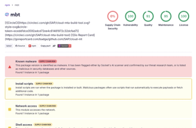
Compromised SAP CAP npm packages download and execute unverified binaries, creating urgent supply chain risk for affected developers and CI/CD environments.

Company News
Socket has acquired Secure Annex to expand extension security across browsers, IDEs, and AI tools.