React Card Carousel - Material UI v5
A full-screen card carousel designed in Material UI, drawing inspiration from the Tesla website.
Demo
This package supports both desktop and mobile devices. It behaves differently in both the devices.
Component Preview
Component in action
Installation
React Card Carousel requires Node.js v10+ to run.
npm i react-card-carousel-materialui@latest
Usage
Import Component
Import the component in your project
import { CardCarousel } from "react-card-carousel-materialui"
Add Component
Add the component in your project
<CardCarousel
  open={open}
  onClose={onClose}
  items={items}
/>
Basic Example
import { useState } from 'react';
import { CardCarousel } from "react-card-carousel-materialui";
import './App.css';

function App() {

    const [dialogOpen, setDialogOpen] = useState(false);

    return (
        <div className="App">
            {
                dialogOpen &&
                <CardCarousel
                    open={dialogOpen}
                    onClose={() => { setDialogOpen(!dialogOpen) }}
                    items={items}
                />
            }
            <button variant="contained" onClick={() => { setDialogOpen(!dialogOpen) }} style={{
                position: 'absolute',
                top: '50%',
                left: '50%',
                transform: 'translate(-50%, -50%)',
                zIndex: 1,
                width: '100px',
                height: '50px',
            }}>
                Open Dialog
            </button>
        </div>
    );
}

export default App;
Items
[
{
id: "1",
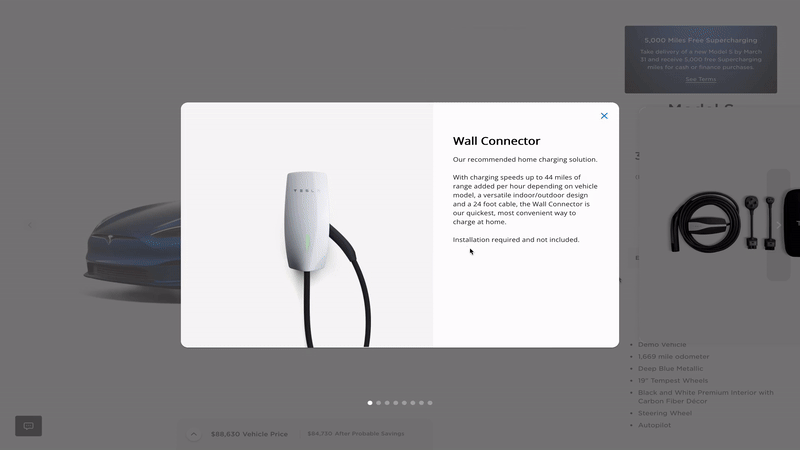
title: 'Wall Connector',
description: `Our recommended home charging solution.
With charging speeds up to 44 miles of range added per hour depending on vehicle model, a versatile indoor/outdoor design and a 24 foot cable, the Wall Connector is our quickest, most convenient way to charge at home.
Installation required and not included.`,
image: 'https://digitalassets-shop.tesla.com/image/upload/f_auto,q_auto/v1/content/dam/tesla/studio/CAR_ACCESSORIES/MODEL_S/CHARGING_ADAPTERS/1457768-01-F_0_2000.jpg?'
},
{
id: "2",
title: 'Auto Lane Change',
description: 'While driving on the highway, Automatic Lane Change will position your car in the optimal lane to prepare for merges and exits while overtaking slow cars. Drivers are given clear insight to upcoming lane changes as well as customization to Auto Lane Change functionality.',
image: 'https://via.placeholder.com/900x500',
video: 'https://digitalassets.tesla.com/co1n/video/upload/f_auto:video,q_auto:best/prod/static_assets/MODEL3/UI/lane_change.mp4',
actions: (
<Box>
<Box lineHeight={0} mb={2}>
<Stack direction="column" spacing={0} justifyContent="center" alignItems="center">
<Typography variant="body2" fontWeight="medium" >
Enhanced Autopilot
</Typography>
<Typography variant="body2" fontWeight="medium" >
₹ 60,000
</Typography>
</Stack>
</Box>
<Button variant="contained" color="info" fullWidth startIcon={<ShoppingCart />}>
Add Package
</Button>
</Box>
)
},
{
id: "3",
title: 'Smart Summon',
description: 'Activated by the Tesla App, your parked car will come find you and even park or unpark itself in tight spaces. Summon navigates complex parking situations while abiding by lane markings and stop signs, avoiding pedestrians and obstacles like traffic cones, trash bins and rogue shopping carts.',
image: 'https://via.placeholder.com/900x500',
video: 'https://digitalassets.tesla.com/co1n/video/upload/f_auto:video,q_auto:best/prod/static_assets/MODEL3/UI/summon_v2.mp4',
actions: (
<Box>
<Box lineHeight={0} mb={2}>
<Stack direction="column" spacing={0} justifyContent="center" alignItems="center">
<Typography variant="body2" fontWeight="medium" >
Enhanced Autopilot
</Typography>
<Typography variant="body2" fontWeight="medium" >
₹ 60,000
</Typography>
</Stack>
</Box>
<Button variant="contained" color="info" fullWidth startIcon={<ShoppingCart />}>
Add Package
</Button>
</Box>
)
},
{
id: "4",
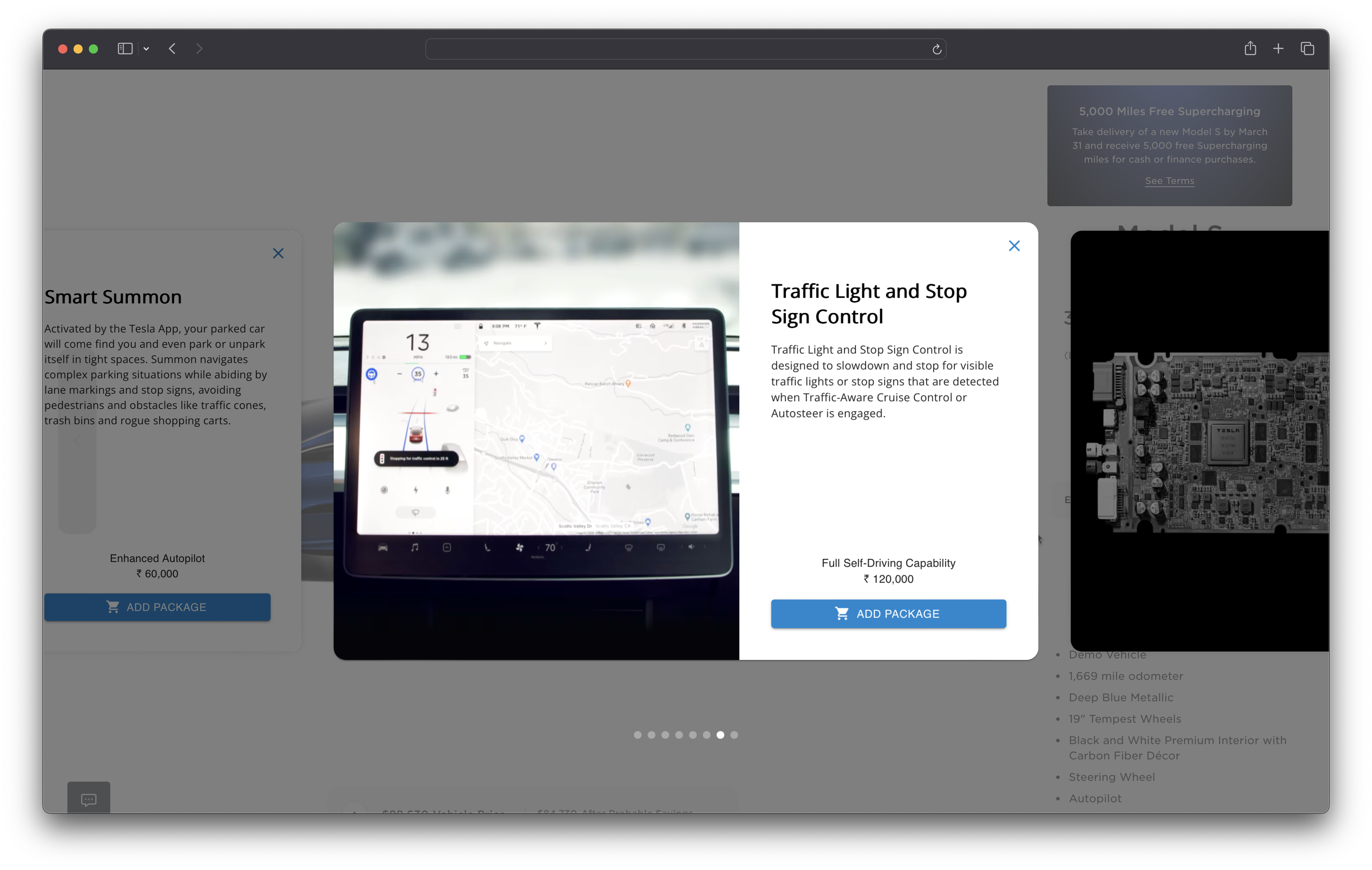
title: 'Traffic Light and Stop Sign Control',
description: `Traffic Light and Stop Sign Control is designed to slowdown and stop for visible traffic lights or stop signs that are detected when Traffic-Aware Cruise Control or Autosteer is engaged.`,
image: 'https://digitalassets.tesla.com/co1n/image/upload/f_auto,q_auto/prod/static_assets/MODEL3/UI/Traffic_Light_and_Stop_Sign.png?',
actions: (
<Box>
<Box lineHeight={0} mb={2}>
<Stack direction="column" spacing={0} justifyContent="center" alignItems="center">
<Typography variant="body2" fontWeight="medium" >
Full Self-Driving Capability
</Typography>
<Typography variant="body2" fontWeight="medium" >
₹ 120,000
</Typography>
</Stack>
</Box>
<Button variant="contained" color="info" fullWidth startIcon={<ShoppingCart />}>
Add Package
</Button>
</Box>
)
},
{
id: "5",
title: 'Full Self-Driving Computer',
description: `Tesla-designed silicon optimized for computer vision enables detailed, onscreen environment visualization and eventual Full Self-Driving Capability through over-the-air software updates.`,
image: 'https://digitalassets.tesla.com/co1n/image/upload/f_auto,q_auto/prod/static_assets/MODEL3/UI/FSDComputer.png?',
actions: (
<Box>
<Box lineHeight={0} mb={2}>
<Stack direction="column" spacing={0} justifyContent="center" alignItems="center">
<Typography variant="body2" fontWeight="medium" >
Full Self-Driving Capability
</Typography>
<Typography variant="body2" fontWeight="medium" >
₹ 120,000
</Typography>
</Stack>
</Box>
<Button variant="contained" color="info" fullWidth startIcon={<ShoppingCart />}>
Add Package
</Button>
</Box>
)
}
]
Props
| open | boolean | false | control dialog open and close | Yes |
| onClose | function | | Function called whenever dialog is closed | Yes |
| items | array | [] | Array of items to be shown in the dialog | Yes |
Item Props
| id | string | | Unique ID for item | Yes |
| title | string | | Title for item | Yes |
| description | string | | Description for item | No |
| image | string(url) | | Image shown for the item | No |
| video | string(url) | | Video shown for the item | No |
| actions | node | | Any custom UI to be shown below the description | No |
Upcoming Features
Below are the features that are planned to be added in the near future.
License
MIT
This is a free software: you can redistribute it and/or modify it under the terms of the MIT license. This software is provided without any warranty.


