
About
No more '>' in your button, no more complicated image customization.
Insert chevron image that perfectly fits with sibling text by the super-light library, which doesn't have any peer dependencies.
Installation
$ yarn add react-chervron
The React-chevron supports TypeScript.
Usage
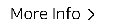
Default

import Chevron from 'react-chevron'
...
const myComponent = (...) => {
...
return (
<div>
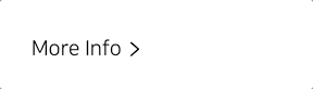
More Info <Chevron/>
</div>
)
}
Import and use. That's it!
Size & Color

import Chevron from 'react-chevron'

...

const myComponent = (...) => {
  ...

  return (
    <>
      <div style={ { 'fontSize': '24px' } }>
        More Info <Chevron/>
      </div>
      <div style={ { 'color': '#bb0000' } }>
        More Info <Chevron/>
      </div>
    </>
  )
}
As explained above, you don't have to customize chevron size. It will be automatically fit with sibling text.
*Inline styles are for the convenience of creating examples. You may use a CSS file or a Styled Component at all.
Direction
import Chevron from 'react-chevron'
...
const myComponent = (...) => {
...
return (
<>
<div>
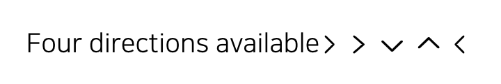
Four directions available
<Chevron/>
<Chevron direction={'right'}/>
<Chevron direction={'down'}/>
<Chevron direction={'up'}/>
<Chevron direction={'left'}/>
</div>
</>
)
}
Four direction options are available. The default direction is 'right'.
className
import Chevron from 'react-chevron'
import 'myStyle.css'

...

const myComponent = (...) => {
  ...

  return (
    <div>
    	More Info <Chevron className="tilt"/>
    </div>
  )
}
.tilt svg {
transform: rotate(30deg);
}
As same as other react components, you can pass className as props.
⚠️ Be aware the <span> that wrapping svg exists.
Rotate animation
import Chevron from 'react-chevron'
import 'myStyle.css'

...

const myComponent = (...) => {
  ...

  const [ reversed, setReversed ] = useState<boolean>(false)
  return (
     <div onClick={() => setReversed(!reversed) }>
       More Info <Chevron reversed={ reversed }/>
     </div>
  )
}
You can toggle direction as opposed by toggle status.
Copyright
Open License 😎
You can use it for commercial, non-commercial either without any charge.
Also, there is no need to specify the author's name separately.
Author: blueStragglr (Oortcloud1599@gmail.com) [https://bluestragglr.com]


