Research
/Security News
Intercom’s npm Package Compromised in Ongoing Mini Shai-Hulud Worm Attack
Compromised intercom-client@7.0.4 npm package is tied to the ongoing Mini Shai-Hulud worm attack targeting developer and CI/CD secrets.
react-col-def-table
Advanced tools

This is built upon React Virtualized, created by bvaughn


Demo @ Codesandbox
import { Table } from "library-name";
import { colDef, data } from "./somewhere";
const App = () => <Table colDef={colDef} list={data} />;
With this data below we want to have a table with id, name and age.
Data:
[
  {
    id: "1",
    name: "Steve",
    age: "29"
  },
  {
    id: "2",
    name: "Roger",
    age: "33"
  },
  {
    id: "3",
    name: "Sarah",
    age: "27"
  }
];
For this to work we will have to create a column definition.
Column Definition defines how we want to map the respective values from the data:
const columnDefinition = [
  {
    key: "id",
    label: "Id",
    size: 50
  },
  {
    key: "name",
    label: "User Name",
    size: 150
  },
  {
    key: "age",
    label: "User Age",
    size: 50
  }
];
As we can see from above it has three important characteristics: key, size and label.
| key | Description | required? |
|---|---|---|
key | What key we want to map with from the data. | YES |
size | the size of the column | YES |
| label | The label in the header that will be shown for the mapped value | NO |
| checkbox | if we want to render checkboxes for a column | NO |
| component | to render a custom component with the data | NO |
Checkbox column and a custom component:
export const customColDef = [
  {
    key: "checkbox",
    size: 50
  },
  {
    label: "Hotel",
    key: "hotel",
    size: 250,
    component: ({ rowData }) => {
      return <a href={rowData.link}>{rowData.hotel}</a>;
    }
  }
];
| key | Description | default |
|---|---|---|
list | Your data. | |
colDef | Defines how to map the values into the grid | |
fixedRowCount | number | |
fixedColumnCount | number | |
fixedHeight | number | |
fixedWidth | number | |
rowHeight | number | |
headerHeight | number | |
isBoxShadow | boolean, | true |
hoverOnX | boolean | false |
hoverOnY | boolean | false |
isZebra | boolean | false |
isSortOn | boolean | false |
isEditable | boolean | false |
onCellChange | function callback with changed cell (only when using isEditable) | |
onLabelClick | function callback with clicked label info | |
footer | function | example: lib/footer |
| key | Description |
|---|---|
| Table | has to be set on style prop |
| Row | .table--row-even .table--row-odd |
| th | .c-table--th |
| td | .c-table--td |
| th when sorting (when active) | .c-table--th-sort .c-table--th-sort-active |
| sort icon button (when active) | .c-sort-button .c-sort-button--active |
| hover cell (when active) | .c-table--td-hover-cell |
| Fixed rows styles (when active) | .c-table--top-left-grid .c-table--top-right-grid .c-table--bottom-left-grid .c-table--bottom-right-grid |
| editable cell input (when active) | .c-editable-cell--input |
| sub header (when active) | .c-table--sub-header .c-table--sub-header-title |
| Checkbox (when active) | .c-checkbox-cell .c-checkbox-cell--input id="c-checkbox-label-checkboxKey for="c-checkbox-label-checkboxKey |
npm run build
FAQs
Col Def Table
The npm package react-col-def-table receives a total of 9 weekly downloads. As such, react-col-def-table popularity was classified as not popular.
We found that react-col-def-table demonstrated a not healthy version release cadence and project activity because the last version was released a year ago. It has 1 open source maintainer collaborating on the project.
Did you know?

Socket for GitHub automatically highlights issues in each pull request and monitors the health of all your open source dependencies. Discover the contents of your packages and block harmful activity before you install or update your dependencies.

Research
/Security News
Compromised intercom-client@7.0.4 npm package is tied to the ongoing Mini Shai-Hulud worm attack targeting developer and CI/CD secrets.

Research
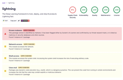
Socket detected a malicious supply chain attack on PyPI package lightning versions 2.6.2 and 2.6.3, which execute credential-stealing malware on import.

Research
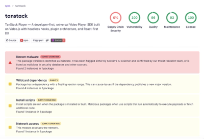
A brand-squatted TanStack npm package used postinstall scripts to steal .env files and exfiltrate developer secrets to an attacker-controlled endpoint.