
Research
Security News
The Growing Risk of Malicious Browser Extensions
Socket researchers uncover how browser extensions in trusted stores are used to hijack sessions, redirect traffic, and manipulate user behavior.
By Kush Pandya - Jun 13, 2025
react-color
Advanced tools
The react-color npm package is a collection of color pickers for React applications. It provides a variety of UI components that allow users to select and manipulate colors in a user-friendly way. It supports different color models (RGB, HSL, etc.) and offers customizable styles and interfaces.
Color Picker Components
react-color provides various color picker components like SketchPicker, which can be easily integrated into a React application to allow users to pick colors.
import { SketchPicker } from 'react-color';
function App() {
const [color, setColor] = useState('#fff');
const handleChangeComplete = (color) => {
setColor(color.hex);
};
return (
<SketchPicker
color={color}
onChangeComplete={handleChangeComplete}
/>
);
}Customizable Styles
The components provided by react-color can be styled and customized to fit the design of the application. Users can adjust dimensions, colors, and more.
import { PhotoshopPicker } from 'react-color';

function App() {
  const [color, setColor] = useState('#fff');

  const styles = reactCSS({
    'default': {
      picker: {
        width: '300px',
        height: '400px',
      },
    },
  });

  return (
    <div style={ styles.picker }>
      <PhotoshopPicker
        color={color}
        onChangeComplete={(color) => setColor(color.hex)}
      />
    </div>
  );
}
Color Representation
react-color supports different color representations such as HEX, RGB, and HSL. Users can work with the color model that best suits their needs.
import { CompactPicker } from 'react-color';

function App() {
  const [color, setColor] = useState({ r: 255, g: 0, b: 0, a: 1 });

  return (
    <CompactPicker
      color={color}
      onChangeComplete={(color) => setColor(color.rgb)}
    />
  );
}react-colorful is a modern, lightweight, and dependency-free color picker for React. It is similar to react-color but focuses on performance and size, offering a smaller bundle size and faster parsing.
coloreact is another React color picker component that provides a simple and flexible interface for color selection. It is less feature-rich compared to react-color but offers a minimalistic approach for developers who need a straightforward solution.
rc-color-picker is a React color picker component that is part of the rc-components family. It offers a different set of UI components and customization options compared to react-color, catering to developers who are already using other rc-components in their projects.


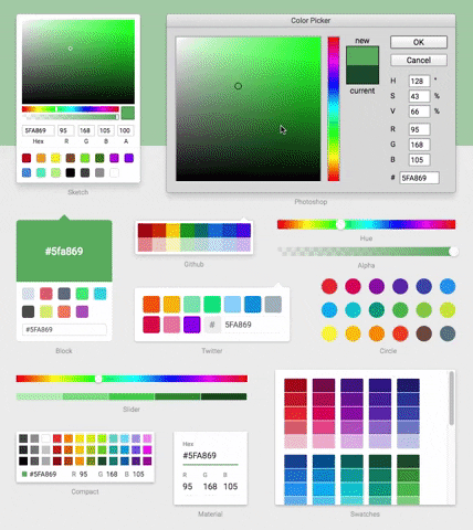
13 Different Pickers - Sketch, Photoshop, Chrome and many more
Make Your Own - Use the building block components to make your own
npm install react-color --save
import React from 'react'
import { SketchPicker } from 'react-color'

class Component extends React.Component {

  render() {
    return <SketchPicker />
  }
}
You can import AlphaPicker BlockPicker ChromePicker CirclePicker CompactPicker GithubPicker HuePicker MaterialPicker PhotoshopPicker SketchPicker SliderPicker SwatchesPicker TwitterPicker respectively.
100% inline styles via ReactCSS
FAQs
A Collection of Color Pickers from Sketch, Photoshop, Chrome & more
The npm package react-color receives a total of 1,492,371 weekly downloads. As such, react-color popularity was classified as popular.
We found that react-color demonstrated a not healthy version release cadence and project activity because the last version was released a year ago. It has 1 open source maintainer collaborating on the project.
Did you know?

Socket for GitHub automatically highlights issues in each pull request and monitors the health of all your open source dependencies. Discover the contents of your packages and block harmful activity before you install or update your dependencies.
Research
Security News
Socket researchers uncover how browser extensions in trusted stores are used to hijack sessions, redirect traffic, and manipulate user behavior.

Research
Security News
An in-depth analysis of credential stealers, crypto drainers, cryptojackers, and clipboard hijackers abusing open source package registries to compromise Web3 development environments.

Security News
pnpm 10.12.1 introduces a global virtual store for faster installs and new options for managing dependencies with version catalogs.