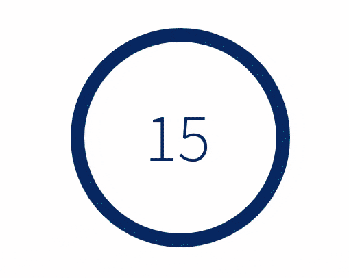
React Countdown Circle Timer


React countdown timer component in a circle shape with color and progress animation.


Features
:zap: Performance optimized with single requestAnimationFrame loop to animate color and progress
:rainbow: Transition between colors during the countdown
:european_castle: Fully customizable content in the center of the circle
Install
yarn add react-countdown-circle-timer
Usage
Component
Check the CodeSandbox demo to get started.
import { CountdownCircleTimer } from 'react-countdown-circle-timer'

const UrgeWithPleasureComponent = () => (
  <CountdownCircleTimer
    isPlaying
    duration={7}
    colors={['#004777', '#F7B801', '#A30000', '#A30000']}
    colorsTime={[7, 5, 2, 0]}
  >
    {({ remainingTime }) => remainingTime}
  </CountdownCircleTimer>
)
Hook
The package exports a hook useCountdown, which accepts the same props as the component and returns all props needed to render your own circle.
import { useCountdown } from 'react-countdown-circle-timer'

const {
  path,
  pathLength,
  stroke,
  strokeDashoffset,
  remainingTime,
  elapsedTime,
  size,
  strokeWidth,
} = useCountdown({ isPlaying: true, duration: 7, colors: '#abc' })
Props
| duration | number | required | Countdown duration in seconds |
| colors | string | string[] | required | colors prop is either:
- Single valid color in any format or URL to a gradient
- Array of colors in HEX format. At least 2 colors should be provided |
| colorsTime | number[] | - | Indicates the time when a color should switch to the next color. The first number is the countdown duration and the last one is 0 or goal. Works only when colors is an array of HEX colors |
| isPlaying | boolean | false | Play or pause animation |
| initialRemainingTime | number | - | Set the initial remaining time if it is different than the duration |
| updateInterval | number | 0 | Update interval in seconds. Determines how often the timer updates. When set to 0 the value will update on each key frame |
| size | number | 180 | Width and height of the SVG element |
| strokeWidth | number | 12 | Path stroke width |
| trailStrokeWidth | number | strokeWidth | Trail stroke width |
| strokeLinecap | round | square | butt | round | Path stroke line cap |
| rotation | clockwise | counterclockwise | clockwise | Progress path rotation direction |
| isGrowing | boolean | false | Indicated if the progress path should be growing instead of shrinking |
| trailColor | string | #d9d9d9 | Circle trail color - takes any valid color format |
| isSmoothColorTransition | boolean | true | Indicates if the colors should smoothly transition to the next color |
| children | (props: { remainingTime: number, elapsedTime: number, color: string }) => ReactNode | - | Render function to customize the time/content in the center of the circle |
| onComplete | (totalElapsedTime: number) => void | { shouldRepeat: boolean, delay?: number, newInitialRemainingTime?: number } | - | On animation complete event handler |
| onUpdate | (remainingTime: number) => void | - | On remaining time update event handler |
Browser support
The component and hook support all modern browsers targeting ES6. Internet Explorer (IE) is not longer supported.
Recipes
Changing duration prop
Once the component is mounted the duration prop can be changed the the timer will respect the new duration. In case the new duration is bigger than the previous one then the timer will continue to the new duration. In case the new duration is smaller then the previous one then the timer will be over. If you want to restart the timer when the duration changes then pass a new key prop to CountdownCircleTimer component and the timer will start over with the new values provided.
Restart timer at any given time
Pass a key prop to CountdownCircleTimer and change the key when the timer should be restarted. Check this demo to find out one possible implementation.
Repeat timer when countdown is completed
Return an object from onComplete handler, which indicates if the animation should be repeated. Example:
const UrgeWithPleasureComponent = () => (
  <CountdownCircleTimer
    isPlaying
    duration={10}
    colors="#A30000"
    onComplete={() => {
      // do your stuff here
      return { shouldRepeat: true, delay: 1.5 } // repeat animation in 1.5 seconds
    }}
  />
)
Set the initial remaining time different then the duration provided
Pass the remaining time to initialRemainingTime prop. Example:
const UrgeWithPleasureComponent = () => (
  <CountdownCircleTimer
    isPlaying
    duration={60}
    initialRemainingTime={15}
    colors="#A30000"
  />
)
In the example above, the countdown will start at 15 seconds (one quarter before it's done) and it will animate for 15 seconds until it reaches 0.
Time formatting functions
children prop of CountdownCircleTimer component will receive as a prop remainingTime in seconds. Below are a few functions that can be used to get different time formatting:
- Format
mm:ss (minutes and seconds)
const children = ({ remainingTime }) => {
  const minutes = Math.floor(remainingTime / 60)
  const seconds = remainingTime % 60

  return `${minutes}:${seconds}`
}
- Format
hh:mm:ss (hours, minutes and seconds)
const children = ({ remainingTime }) => {
  const hours = Math.floor(remainingTime / 3600)
  const minutes = Math.floor((remainingTime % 3600) / 60)
  const seconds = remainingTime % 60

  return `${hours}:${minutes}:${seconds}`
}
Add a11y support
- Wrapper the timer in an element and add the following attribute
aria-label={your-aria-label}
- Add the following element with
role="timer" to your children function that will make the screen reader read the remaining time while the timer is running.
const children = ({ remainingTime }) => (
  <div role="timer" aria-live="assertive">
    {remainingTime} seconds
  </div>
)
Add gradient
Define the SVG gradient outside the Timer component and pass the gradient ID to the Timer component as a single color:
<svg>
  <defs>
    <linearGradient id="your-unique-id" x1="1" y1="0" x2="0" y2="0">
      <stop offset="5%" stopColor="gold" />
      <stop offset="95%" stopColor="red" />
    </linearGradient>
  </defs>
</svg>
<CountdownCircleTimer colors="url(#your-unique-id)">
  {({ remainingTime }) => remainingTime}
</CountdownCircleTimer>
Slide down time animation
Check the CodeSandbox demo to find out how you can implement it yourself
Days, hours, minutes, seconds countdown
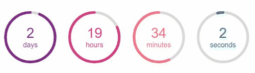
Check the CodeSandbox demo for one possible solution


