Research
/Security News
DuckDB npm Account Compromised in Continuing Supply Chain Attack
Ongoing npm supply chain attack spreads to DuckDB: multiple packages compromised with the same wallet-drainer malware.
react-credit-cards
Advanced tools
A slick credit card component for React.

npm install --save react-credit-cards
import React from 'react';
import Cards from 'react-credit-cards';

export default class PaymentForm extends React.Component {
  state = {
    cvc: '',
    expiry: '',
    focus: '',
    name: '',
    number: '',
  };

  handleInputFocus = (e) => {
    this.setState({ focus: e.target.name });
  }

  handleInputChange = (e) => {
    const { name, value } = e.target;

    this.setState({ [name]: value });
  }

  render() {
    return (
      <div id="PaymentForm">
        <Cards
          cvc={this.state.cvc}
          expiry={this.state.expiry}
          focused={this.state.focus}
          name={this.state.name}
          number={this.state.number}
        />
        <form>
        	<input
            type="tel"
            name="number"
            placeholder="Card Number"
            onChange={this.handleInputChange}
            onFocus={this.handleInputFocus}
          />
          ...
        </form>
      </div>
    );
  }
}
Don't forget to import the react-credit-cards/lib/styles.scss if you are using SASS in your project.
Or you can import the CSS:
import 'react-credit-cards/es/styles-compiled.css';
name {string}: Name on card. *number {string|number}: Card number. *expiry {string|number}: Card expiry date. 10/20 or 012017 *cvc {string|number}: Card CVC/CVV. *focused {string}: Focused card field. name|number|expiry|cvclocale {object}: Localization text (e.g. { valid: 'valid thru' }).placeholders {object}: Placeholder text (e.g. { name: 'YOUR NAME HERE' }).preview {bool}: To use the card to show scrambled data (e.g. **** 4567).issuer {string}: Set the issuer for the preview mode (e.g. visa|mastercard|...)acceptedCards {array}: If you want to limit the accepted cards. (e.g. ['visa', 'mastercard']callback {func}: A callback function that will be called when the card number has changed with 2 paramaters: type ({ issuer: 'visa', maxLength: 19 }), isValid ({boolean})* Required fields
Credit Card sizing
$rccs-card-ratio: Card ratio. Defaults to 1.5858$rccs-size: Card width. Defaults to 290pxCredit Card fonts
$rccs-name-font-size: Defaults to 17px$rccs-name-font-family: Defaults to Consolas, Courier, monospace$rccs-number-font-size: Defaults to 17px$rccs-number-font-family: Defaults to Consolas, Courier, monospace$rccs-valid-font-size: Defaults to 10px$rccs-expiry-font-size: Defaults to 16px$rccs-expiry-font-family: Defaults to Consolas, Courier, monospace$rccs-cvc-font-size: Defaults to 14px$rccs-cvc-font-family: Defaults to Consolas, Courier, monospace$rccs-cvc-color: Defaults to #222Credit Card styling
$rccs-shadow: Defaults to 0 0 20px rgba(#000, 0.2)$rccs-light-text-color: Card text color for dark cards. Defaults to #fff$rccs-dark-text-color: Card text color for light cards. Defaults to #555$rccs-stripe-bg-color: Stripe background color in the back. Defaults to #2a1d16$rccs-signature-background: Signature background in the back. Defaults to repeating-linear-gradient(0.1deg, #fff 20%, #fff 40%, #fea 40%, #fea 44%, #fff 44%)$rccs-default-background: Default card background. Defaults to linear-gradient(25deg, #939393, #717171)$rccs-unknown-background: Unknown card background. Defaults to linear-gradient(25deg, #999, #999)$rccs-background-transition: Card background transition. Defaults to all 0.5s ease-out$rccs-animate-background: Card background animation. Defaults to trueCredit Card brands
$rccs-amex-background: Defaults to linear-gradient(25deg, #308c67, #a3f2cf)$rccs-dankort-background: Defaults to linear-gradient(25deg, #ccc, #999)$rccs-dinersclub-background: Defaults to linear-gradient(25deg, #fff, #eee)$rccs-discover-background: Defaults to linear-gradient(25deg, #fff, #eee)$rccs-mastercard-background: Defaults to linear-gradient(25deg, #e8e9e5, #fbfbfb)$rccs-visa-background: Defaults to linear-gradient(25deg, #0f509e, #1399cd)$rccs-elo-background: Defaults to linear-gradient(25deg, #211c18, #aaa7a2)$rccs-hipercard-background: Defaults to linear-gradient(25deg, #8b181b, #de1f27)Here's how you can get started developing locally:
$ git clone https://github.com/amarofashion/react-credit-cards.git
$ cd react-credit-cards
$ npm install
$ npm start
Now, if you go to http://localhost:3000 in your browser, you should see the demo page.
Please read CONTRIBUTING.md for details on our code of conduct, and the process of contributing to the project.
EBANK's test numbers
Adyen's test numbers
Worldpay's test card numbers
Brazilian cards patterns
This project is licensed under the MIT License.
FAQs
Beautiful credit cards for your payment forms
The npm package react-credit-cards receives a total of 18,205 weekly downloads. As such, react-credit-cards popularity was classified as popular.
We found that react-credit-cards demonstrated a not healthy version release cadence and project activity because the last version was released a year ago. It has 2 open source maintainers collaborating on the project.
Did you know?

Socket for GitHub automatically highlights issues in each pull request and monitors the health of all your open source dependencies. Discover the contents of your packages and block harmful activity before you install or update your dependencies.

Research
/Security News
Ongoing npm supply chain attack spreads to DuckDB: multiple packages compromised with the same wallet-drainer malware.

Security News
The MCP Steering Committee has launched the official MCP Registry in preview, a central hub for discovering and publishing MCP servers.

Product
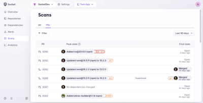
Socket’s new Pull Request Stories give security teams clear visibility into dependency risks and outcomes across scanned pull requests.