Research
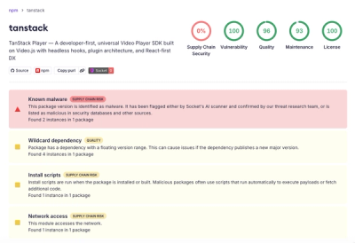
Malicious npm Package Brand-Squats TanStack to Exfiltrate Environment Variables
A brand-squatted TanStack npm package used postinstall scripts to steal .env files and exfiltrate developer secrets to an attacker-controlled endpoint.
react-crossfade-image
Advanced tools
Simple component for crossfading images. Just pass it a new src prop and enjoy the fade!

npm install react-crossfade-image
Clone and run npm start for demo.
Sample component:
<CrossfadeImage src={imageSrc} />
Image source as string - required
Duration of the fade, in ms - default to 300
Support all CSS timing functions - default to 'ease'
Duration of the delay before fading, in ms - default to 0
Custom styling for the image - default to { maxWidth: '100%', maxHeight: '100%' } for responsive image scaling
Custom class string for the container element - default to 'CrossfadeImage'
MIT
FAQs
Simple React component for crossfading images
The npm package react-crossfade-image receives a total of 416 weekly downloads. As such, react-crossfade-image popularity was classified as not popular.
We found that react-crossfade-image demonstrated a not healthy version release cadence and project activity because the last version was released a year ago. It has 1 open source maintainer collaborating on the project.
Did you know?

Socket for GitHub automatically highlights issues in each pull request and monitors the health of all your open source dependencies. Discover the contents of your packages and block harmful activity before you install or update your dependencies.

Research
A brand-squatted TanStack npm package used postinstall scripts to steal .env files and exfiltrate developer secrets to an attacker-controlled endpoint.

Research
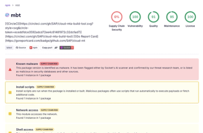
Compromised SAP CAP npm packages download and execute unverified binaries, creating urgent supply chain risk for affected developers and CI/CD environments.

Company News
Socket has acquired Secure Annex to expand extension security across browsers, IDEs, and AI tools.