Research
/Security News
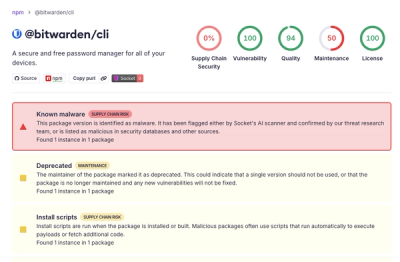
Bitwarden CLI Compromised in Ongoing Checkmarx Supply Chain Campaign
Bitwarden CLI 2026.4.0 was compromised in the Checkmarx supply chain campaign after attackers abused a GitHub Action in Bitwarden’s CI/CD pipeline.
react-date-fns
Advanced tools
A React component library for displaying formatted dates using date-fns. This package provides several components: DateDisplay, DateSelect, and CountdownTimer. These components can be customized with various date patterns and CSS classes.
To install the package, run:
npm install react-date-fns
You can import the components in your React application as follows:
import React from "react";
import { DateDisplay, CountdownTimer } from "react-date-fns";

const App = () => {
  const handleDateChange = (date) => {
    console.log("Selected date:", date);
  };

  return (
    <div>
      <DateDisplay className="date-class" pattern="MM/dd/yyyy">
        {new Date()}
      </DateDisplay>
      <CountdownTimer
        className="countdown-class"
        targetDate={new Date(new Date().getTime() + 10000)}
      />
    </div>
  );
};

export default App;
The DateDisplay component accepts the following props:
children (Date): The date to be formatted and displayed.className (string, optional): A CSS class to apply to the <span> element.pattern (string): The date format pattern. It can be one of the predefined patterns or any custom string pattern compatible with date-fns.The CountdownTimer component accepts the following props:
targetDate (Date): The date to count down to.className (string, optional): Additional CSS classes to apply to the container element.timeLeftText (string, optional): Text to display when the countdown reaches zero. Defaults to "Time’s up!".Here are some of the predefined patterns you can use:
"MMMM""yyyy-MM-dd""MM/dd/yyyy""dd-MM-yyyy""dd/MM/yyyy""yyyy/MM/dd""dd MMMM yyyy""EEEE, MMMM do, yyyy""MM-dd-yyyy""yyyy-MM-dd'T'HH:mm:ss""yyyy-MM-dd HH:mm:ss""HH:mm:ss""hh:mm:ss a""EEEE""MMM d, yyyy""MMMM do, yyyy""dd MMM yyyy""d MMM yyyy""dd MMM""d MMM""MMMM yyyy""MMM yyyy""EEE, MMM d, ''yy""h:mm a""h:mm:ss a""HH:mm""HH:mm:ss""h:mm:ss a zzz""h:mm a zzz""EEEE, MMMM do, yyyy, h:mm a"You can also use any custom string pattern compatible with date-fns.
To build the package, run:
npm run build
To start the development server, run:
npm run dev
Contributions are welcome! Please open an issue or submit a pull request.
This project is licensed under the MIT License.
FAQs
Modern React library build on top of date-fns
We found that react-date-fns demonstrated a not healthy version release cadence and project activity because the last version was released a year ago. It has 0 open source maintainers collaborating on the project.
Did you know?

Socket for GitHub automatically highlights issues in each pull request and monitors the health of all your open source dependencies. Discover the contents of your packages and block harmful activity before you install or update your dependencies.

Research
/Security News
Bitwarden CLI 2026.4.0 was compromised in the Checkmarx supply chain campaign after attackers abused a GitHub Action in Bitwarden’s CI/CD pipeline.

Research
/Security News
Docker and Socket have uncovered malicious Checkmarx KICS images and suspicious code extension releases in a broader supply chain compromise.

Product
Stay on top of alert changes with filtered subscriptions, batched summaries, and notification routing built for triage.