Research
/Security News
DuckDB npm Account Compromised in Continuing Supply Chain Attack
Ongoing npm supply chain attack spreads to DuckDB: multiple packages compromised with the same wallet-drainer malware.
react-dnd-list
Advanced tools
Light and customizable drag and drop list for React, with no additional dependencies.
Check out the demo page here. See the code in the demo directory of this repo.
npm install --save react-dnd-list
import DnDList from 'react-dnd-list'
const Item = props => {
  const dnd = props.dnd

  return (
    <li
      style={{ ...dnd.item.styles, ...dnd.handler.styles }}
      className={dnd.item.classes}
      ref={dnd.item.ref}
      {...dnd.handler.listeners}
    >
      {props.item}
    </li>
  )
}
dnd props are essential for the drag and drop functionality. Assign dnd.item.styles, dnd.item.classes, and dnd.item.ref to the outer DOM component. Do not override transform and transition styles of that component!
dnd.handler.listeners is an object containing two keys: onMouseDown and onTouchStart, with appropriate functions as values. Together with dnd.handler.styles, assign it to a component that will initiate drag on click or touch.
The item prop is just a value from your array of items (look below).
Warning! Do not use margins on item components – use padding instead. Support for margins will be added in near future.
const MyList = () => {
  const [list, setList] = useState(['1', '2', '3'])

  return (
    <ul>
      <DnDList
        items={list}
        itemComponent={Item}
        setList={setList}
      />
    </ul>
  )
}
You need to provide DnDList with an array of items, its update function, and the item component (the one we created earlier).
That's it, you now have a functional drag and drop list!
You have access to a few more props inside your item component:
| Name | Types | Description |
|---|---|---|
| itemInDrag | boolean | true if the item is being dragged. |
| listInDrag | boolean | true if any of the items in your list is being dragged. |
| index | number | Item's index in the list. |
| last | boolean | true if the item is last in the list. |
There are several props you can pass to DnDList to customize it:
| Name | Type | Default | Description |
|---|---|---|---|
| horizontal | boolean | false | Let's you swap items horizontally if set to true. |
| transitionStyles | object | – | Let's you override default CSS transition styles, for example { transtitionDuration: '.5s' }. |
| disableTransitions | boolean | false | Disables swap transitions if set to true. |
Function props:
| Name | Args | Returns | Description |
|---|---|---|---|
| setSwapThreshold | size (number) | number | Let's you set a swap threshold for every item in the list individually, based on their size (height or width, depending on the type of the list). For example size => size * 0.5 will result in elements being swapped after the dragged element has traversed more than 50% of their size. |
| setOverflowThreshold | size (number) | number | Function similar to setSwapThreshold. Let's you set how far the dragged item can be moved over the list container bounds, based on its (the dragged item) size. |
By default swap threshold is set to 1, and overflow threshold to 0.
FAQs
Light and customizable drag and drop list for React
The npm package react-dnd-list receives a total of 708 weekly downloads. As such, react-dnd-list popularity was classified as not popular.
We found that react-dnd-list demonstrated a not healthy version release cadence and project activity because the last version was released a year ago. It has 1 open source maintainer collaborating on the project.
Did you know?

Socket for GitHub automatically highlights issues in each pull request and monitors the health of all your open source dependencies. Discover the contents of your packages and block harmful activity before you install or update your dependencies.

Research
/Security News
Ongoing npm supply chain attack spreads to DuckDB: multiple packages compromised with the same wallet-drainer malware.

Security News
The MCP Steering Committee has launched the official MCP Registry in preview, a central hub for discovering and publishing MCP servers.

Product
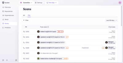
Socket’s new Pull Request Stories give security teams clear visibility into dependency risks and outcomes across scanned pull requests.