Research
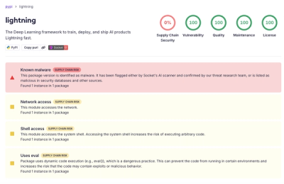
lightning PyPI Package Compromised in Supply Chain Attack
Socket detected a malicious supply chain attack on PyPI package lightning versions 2.6.2 and 2.6.3, which execute credential-stealing malware on import.
react-dropdown
Advanced tools
Simple Dropdown component for React, inspired by react-select
// with npm
$ npm install react-dropdown --save
// with yarn
$ yarn add react-dropdown
If you want to support React version under v0.13, use react-dropdown@v0.6.1
This is the basic usage of react-dropdown
import Dropdown from 'react-dropdown';
import 'react-dropdown/style.css';

const options = [
  'one', 'two', 'three'
];
const defaultOption = options[0];
<Dropdown options={options} onChange={this._onSelect} value={defaultOption} placeholder="Select an option" />;
Options
Flat Array options
const options = [
  'one', 'two', 'three'
];
Object Array options
const options = [
  { value: 'one', label: 'One' },
  { value: 'two', label: 'Two', className: 'myOptionClassName' },
  {
   type: 'group', name: 'group1', items: [
     { value: 'three', label: 'Three', className: 'myOptionClassName' },
     { value: 'four', label: 'Four' }
   ]
  },
  {
   type: 'group', name: 'group2', items: [
     { value: 'five', label: 'Five' },
     { value: 'six', label: 'Six' }
   ]
  }
];
When using Object options you can add to each option a className string to further customize the dropdown, e.g. adding icons to options
Disabling the Dropdown
Just pass a disabled boolean value to the Dropdown to disable it. This will also give you a .Dropdown-disabled class on the element, so you can style it yourself.
<Dropdown disabled onChange={this._onSelect} value={defaultOption} placeholder="Select an option" />;
className
The className prop is passed down to the wrapper div, which also has the Dropdown-root class.
<Dropdown className='myClassName' />;
controlClassName
The controlClassName prop is passed down to the control div, which also has the Dropdown-control class.
<Dropdown controlClassName='myControlClassName' />;
placeholderClassName
The placeholderClassName prop is passed down to the placeholder div, which also has the Dropdown-placeholder class.
<Dropdown placeholderClassName='myPlaceholderClassName' />;
menuClassName
The menuClassName prop is passed down to the menu div (the one that opens and closes and holds the options), which also has the Dropdown-menu class.
<Dropdown menuClassName='myMenuClassName' />;
arrowClassName
The arrowClassName prop is passed down to the arrow span , which also has the Dropdown-arrow class.
<Dropdown arrowClassName='myArrowClassName' />;
arrowClosed, arrowOpen
The arrowClosed & arrowOpen props enable passing in custom elements for the open/closed state arrows.
<Dropdown
  arrowClosed={<span className="arrow-closed" />}
  arrowOpen={<span className="arrow-open" />}
/>;
Check more examples in the example folder.
Run example
$ npm start
MIT | Build for CSViz project @Wiredcraft
FAQs
React dropdown component
The npm package react-dropdown receives a total of 56,398 weekly downloads. As such, react-dropdown popularity was classified as popular.
We found that react-dropdown demonstrated a not healthy version release cadence and project activity because the last version was released a year ago. It has 1 open source maintainer collaborating on the project.
Did you know?

Socket for GitHub automatically highlights issues in each pull request and monitors the health of all your open source dependencies. Discover the contents of your packages and block harmful activity before you install or update your dependencies.

Research
Socket detected a malicious supply chain attack on PyPI package lightning versions 2.6.2 and 2.6.3, which execute credential-stealing malware on import.

Research
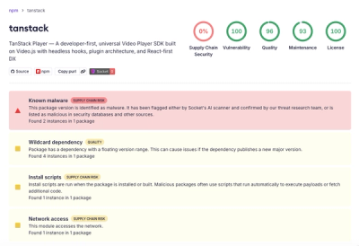
A brand-squatted TanStack npm package used postinstall scripts to steal .env files and exfiltrate developer secrets to an attacker-controlled endpoint.

Research
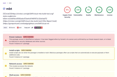
Compromised SAP CAP npm packages download and execute unverified binaries, creating urgent supply chain risk for affected developers and CI/CD environments.