New Case Study:See how Anthropic automated 95% of dependency reviews with Socket.Learn More
Socket
Sign inDemoInstall
Socket

react-dynamic-accordion

Package Overview
Dependencies
Maintainers
0
Versions
14
Alerts
File Explorer

Advanced tools

Socket logo

Install Socket

Detect and block malicious and high-risk dependencies

Install

react-dynamic-accordion

A simple, reusable React accordion component that auto-manages accordion sections based on an array of items

  • 1.0.15
  • latest
  • npm
  • Socket score

Version published
Weekly downloads
1
decreased by-80%
Maintainers
0
Weekly downloads
 
Created
Source
# react-dynamic-accordion

A simple, reusable React accordion component that auto-manages accordion sections based on an array of items.

## Installation

```bash
npm install react-dynamic-accordion


```bash
npm install react-face-login
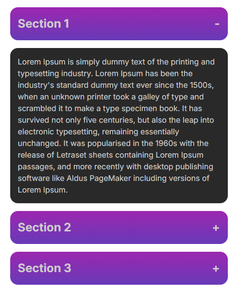
Demo

Demo Screenshot

Screenshot

Usage

Importing the Package

import React from 'react';
import { Accordion } from 'react-dynamic-accordion';
import 'react-dynamic-accordion/dist/Accordion.css';

const App = () => {
  const accordionItems = [
    {
      title: 'Section 1',
      content: <p>Content for section 1.</p>,
    },
    {
      title: 'Section 2',
      content: <p>Content for section 2.</p>,
    },
    {
      title: 'Section 3',
      content: <p>Content for section 3.</p>,
    },
  ];

  return (
    <div>
      <Accordion items={accordionItems} className='design-class'/>
    </div>
  );
};

export default App;

How to styles?

Need style like as demo (screenshot) copy and paste into your exiting stylesheet that you have

    <style>
      .design-class{
        color: #ffffff;
      }
      .design-class .accordion-title{
        display: flex;
        justify-content: space-between;
        width: 100%;
        color: #cccccc;
        margin-bottom: 1rem;
        padding: 1rem;
        background: linear-gradient(0deg, #673AB7, #9C27B0);
        border-radius: 1rem;
        font-size: 1.5rem;
        font-weight: bold;
      }
      .design-class .accordion-content{
        color: #cccccc;
        margin-bottom: 1rem;
        padding: 1rem;
        background: #292929;
        border-radius: 1rem;
      }
    </style>

Keywords

FAQs

Package last updated on 03 Sep 2024

Did you know?

Socket

Socket for GitHub automatically highlights issues in each pull request and monitors the health of all your open source dependencies. Discover the contents of your packages and block harmful activity before you install or update your dependencies.

Install

Related posts

SocketSocket SOC 2 Logo

Product

  • Package Alerts
  • Integrations
  • Docs
  • Pricing
  • FAQ
  • Roadmap
  • Changelog

Packages

npm

Stay in touch

Get open source security insights delivered straight into your inbox.


  • Terms
  • Privacy
  • Security

Made with ⚡️ by Socket Inc