ElementPopper
A small React component to create a variety of elements that require Popper, such as dropdowns, modals, multiselects, and more.
Installation
npm
npm install --save react-element-popper
yarn
yarn add react-element-popper
Demo
https://shahabyazdi.github.io/react-element-popper/
Usage
import React from "react";
import ElementPopper from "react-element-popper";
import "react-element-popper/build/element_popper.css";
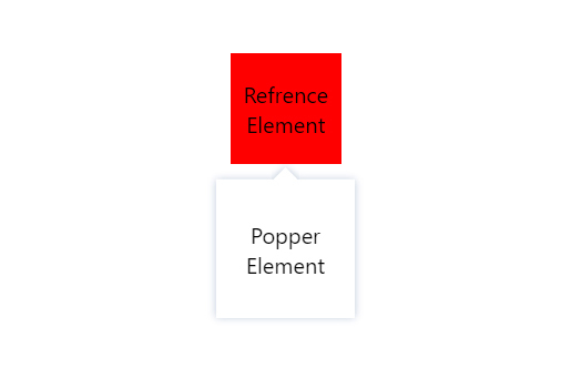
export default function Example() {
const Component = ({ size, backgroundColor, children }) => {
return (
<div
style={{
width: size + "px",
height: size + "px",
backgroundColor,
textAlign: "center",
display: "flex",
flexDirection: "column",
justifyContent: "center",
}}
>
{children}
</div>
);
};
return (
<ElementPopper
element={
<Component size="80" backgroundColor="red">
Refrence Element
</Component>
}
popper={
<Component size="100" backgroundColor="white">
Popper Element
</Component>
}
arrow
popperShadow
/>
);
}
Availble props
| element | React.ReactElement | |
| popper | React.ReactElement | |
| position | String | "bottom-center" |
| arrow | Boolean or React.ReactElement | false |
| fixMainPosition | Boolean | false |
| fixRelativePosition | Boolean | false |
| animations | Array | [] |
| popperShadow | Boolean | false |
| active | Boolean | true |
| offsetY | Number | 0 |
| offsetX | Number | 0 |
| zIndex | Number | 0 |
| containerStyle | React.CSSProperties | |
| arrowStyle | React.CSSProperties | |
| containerClassName | String | |
| arrowClassName | String | |
| ref | React.RefObject | |
| onChange | Function | |
| portal | Boolean | false |
| portalTarget | HTMLElement | |
Availble Positions
| top | top-center |
| bottom | bottom-center |
| left | left-center |
| right | right-center |
| top-start | top-left |
| top-end | top-right |
| bottom-start | bottom-left |
| bottom-end | bottom-right |
| left-start | left-top |
| left-end | left-bottom |
| right-start | right-top |
| right-end | right-bottom |
Browser (none react-app)
<!DOCTYPE html>
<html lang="en">
<head>
<meta charset="UTF-8" />
<meta http-equiv="X-UA-Compatible" content="IE=edge" />
<meta name="viewport" content="width=device-width, initial-scale=1.0" />
<script src="https://unpkg.com/react@17/umd/react.production.min.js"></script>
<script src="https://unpkg.com/react-dom@17/umd/react-dom.production.min.js"></script>
<script src="https://cdn.jsdelivr.net/npm/react-element-popper@latest/build/browser.min.js"></script>
<link
rel="stylesheet"
href="https://cdn.jsdelivr.net/npm/react-element-popper@latest/build/element_popper.css"
/>
<title>React Element Popper</title>
</head>
<body>
<div
id="elementPopper"
style="
position: fixed;
left: 50%;
top: 50%;
transform: translate(-50%, -50%);
"
/>
</body>
<script>
function Component({ size, backgroundColor, children }) {
return React.createElement(
"div",
{
style: {
width: size + "px",
height: size + "px",
backgroundColor,
display: "flex",
flexDirection: "column",
justifyContent: "center",
textAlign: "center",
},
},
children
);
}
ReactDOM.render(
React.createElement(ElementPopper, {
element: React.createElement(
Component,
{
size: 80,
backgroundColor: "red",
},
"Refrence Element"
),
popper: React.createElement(
Component,
{
size: 100,
backgroundColor: "white",
},
"Popper Element"
),
popperShadow: true,
arrow: true,
}),
document.getElementById("elementPopper")
);
</script>
</html>