Rect Es Drager 拖拽组件

🌈介绍
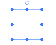
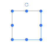
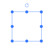
基于 react18 + typescript + vite 的可拖拽、缩放、旋转的组件
- 拖拽&区域拖拽
- 支持缩放
- 旋转
- 网格拖拽缩放
- 拖拽编辑器
运行项目
git clone https://github.com/kakajun/react-es-drager.git
pnpm install
pnpm dev
pnpm build
pnpm build:demo
主要目录介绍
| packages/docs | 项目示例文档、编辑器展示 |
| packages/editor | 编辑器核心代码 |
| packages/drager | es-drager组件 |
综合案例
下面是基于 react-es-drager 实现的一个简单可视化拖拽编辑器
ES Drager Editor
相关文章
可拖拽、缩放、旋转组件实现细节
网格效果及使用方法
辅助线和撤销回退
元素组合与拆分
菜单操作栏、json数据导入导出
⚡ 使用说明
安装依赖
npm i react-es-drager -D
组件中直接使用
import Drager from 'react-es-drager'
const dragList = []
const BasicComponent = () => {
  return (
    <>
      {dragList.map((list, index) =>
        list.map((item, index2) => (
          <Drager
            key={`${index}-${index2}`}
            width={100}
            height={100}
            left={index2 * 150 + 30}
            top={index * 150 + 30}
            {...item}
            style={{ color: item.color }}
          >
            {item.text}
          </Drager>
        ))
      )}
    </>
  )
}

export default BasicComponent
Drager API
Drager 属性
| tag | component组件的标签属性 | ^[string] | div |
| type | 类型,rect, text, image | ^[string] | rect |
| defaultSize | 默认值 | object | {width: 100, height: 100, left: 0, top: 0, angle: 0 } |
| size | 外部传入属性值 | object(内部属性同上) | - |
| color | 颜色 | ^[string] | #3a7afe |
| resizable | 是否可缩放 | ^[boolean] | true |
| rotatable | 是否可旋转 | ^[boolean] | - |
| boundary | 是否判断边界(最近定位父节点,考虑性能谨慎使用) | ^[boolean] | - |
| disabled | 是否禁用 | ^[boolean] | - |
| minWidth | 最小宽度 | ^[number] | 1 |
| minHeight | 最小高度 | ^[number] | 1 |
| maxWidth | 最大宽度 | ^[number] | 9999 |
| maxHeight | 最大高度 | ^[number] | 9999 |
| selected | 控制是否选中 | ^[boolean] | - |
| checkCollision | 是否开启碰撞检测 | ^[boolean] | - |
| snapToGrid | 开启网格 | ^[boolean] | - |
| gridX | 网格X大小 | ^[number] | 50 |
| gridY | 网格Y大小 | ^[number] | 50 |
| snap | 开启吸附 | ^[boolean] | - |
| snapThreshold | 吸附阈值 | ^[number] | 10 |
| markline | 辅助线[可自定义](demo markline) | ^[boolean]^[Function] | - |
| extraLines | 添加除了es-drager元素以外的对齐线,例如添加中心点对齐([可参考](demo markline)) | ^[Function] | |
| scaleRatio | 缩放比 | ^[number] | 1 |
| disabledKeyEvent | 禁用方向键移动 | ^[boolean] | - |
| border | 是否显示边框 | ^[boolean] | true |
| aspectRatio | 宽高缩放比 | ^[number] | - |
| equalProportion | 宽高等比缩放(该属性和aspectRatio互斥,同时使用会存在问题) | ^[boolean] | - |
| resizeList | 显示的缩放handle列表,top, bottom, left, right, top-left, top-right, bottom-left, bottom-right | ^[string[]] | - |
Drager 事件
| onChange | 位置、大小改变 | ^[Function](dragData) => void |
| onDrag | 拖拽中 | ^[Function](dragData) => void |
| onDragStart | 拖拽开始 | ^[Function](dragData) => void |
| onDragEnd | 拖拽结束 | ^[Function](dragData) => void |
| onResize | 缩放中 | ^[Function](dragData) => void |
| onResizeStart | 缩放开始 | ^[Function](dragData) => void |
| onResizeEnd | 缩放结束 | ^[Function](dragData) => void |
| onRotate | 旋转中 | ^[Function](dragData) => void |
| onRotateStart | 旋转开始 | ^[Function](dragData) => void |
| onRotateEnd | 旋转结束 | ^[Function](dragData) => void |
| onFocus | 获取焦点/选中 | ^[Function](selected) => void |
| onBlur | 失去焦点/非选中 | ^[Function](selected) => void |
export type DragData = {
  width: number
  height: number
  left: number
  top: number
  angle: number
}
Drager 插槽
| default | 自定义默认内容 |
| resize | 缩放handle |
| rotate | 旋转handle |
引用
本工程属于经原创同意,vue转react项目, 引用自es-drager, 本项目将会长期更新, 欢迎issue和pr