react-file-input-previews-base64
This package provides an easy to use, ready to go and customizable wrapper around file input, with option for image previews and returning file as base64 string.
Installation
npm install --save react-file-input-previews-base64
Basic Usage
import FileInputComponent from 'react-file-input-previews-base64'
Example Code
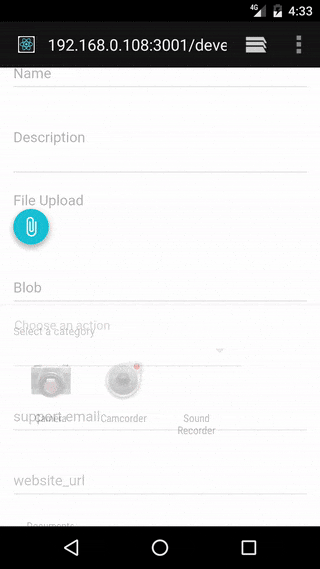
<FileInputComponent
  labelText="Select file"
  labelStyle={{fontSize:14}}
  multiple={true}
  callbackFunction={(file_arr)=>{console.log(file_arr)}}
  accept="image/*"
/>
Options
| labelText | string | The text to show in label | "File Upload" |
| multiple | boolean | Whether multiple files can be selected or not | true |
| accept | string | string which is passed to accept field of input tag, to specify the types of files that can be selected | "*" |
| imagePreview | boolean | Whether preview section is shown or not | true |
| textBoxVisible | boolean | Whether a controlled text field showing information be shown | false |
| useTapEventPlugin | boolean | Whether to use onTouchTap or onClick | false |
| callbackFunction | function | The function to be called when files are processed, can take either array of file describing objects or single object depending on if multiple files are allowed | ()=>{} |
| nonPreviewComponent | component | Component to show in preview section for non-image files, title, size and type are passed to this as props | included <NonPreviewDefaultComponent /> |
| buttonComponent | component | The component to show for button, onClick or onTouchTap will be merged to its props to trigger the file selector box to show internally | <button type="button">Attach</button> |
| textFieldComponent | component | The component to show for controlled text field, onClick or onTouchTap will be merged to its props to trigger the file selector box to show internally, along with value prop for showing information like "foobar.jpg", "2 files selected", "No file selected" etc | <input type="text" /> |
| imageContainerStyle | object | Object passed to style prop of image preview section container div | {display:"flex", flexDirection:"row", width:"100%", flexWrap:"wrap"} |
| imageStyle | object | Object passed to style prop of image previews | {marginTop: 5, marginBottom: 5, marginRight: 5, width: "auto", height: "30vmin", boxShadow:"rgba(0, 0, 0, 0.188235) 0px 10px 30px, rgba(0, 0, 0, 0.227451) 0px 6px 10px"} |
| parentStyle | object | Object passed to style prop of container div of whole component | {marginTop:14} |
| labelStyle | object | Object passed to style prop of label | {fontSize: 16,color:'rgba(0, 0, 0, 0.298039)',display:'block'} |
| inputId | string | String passed to id prop of input and htmlFor tag of label components, if not present clicking on label won't trigger the file sector to show | none |
| inputName | string | String passed to name prop of input, if not present, using this component as part of form will not work. | none |
| defaultFiles | array | Array consisting of urls of files to show as pre-selections, useful for edit forms, currently only supports urls to image files | [] |
Note
- onTouchTap is implmented by react-tap-event-plugin and is used in the amazing material-ui.
- I am using this with material-ui library and the default props for styles follows the material design pattern.
- The structure of file describing object is:
{
  name: "IMG_20160813_102226.jpg",
  type: "image/jpeg",
  size: 645,
  base64: "data:image/jpeg;base64,/9j/4SzyRXhpZgAATU0AKgA...",
  file: File
}


