
Product
Introducing Reports: An Extensible Reporting Framework for Socket Data
Explore exportable charts for vulnerabilities, dependencies, and usage with Reports, Socket’s new extensible reporting framework.
By André Staltz - Apr 21, 2026
react-heatmap-grid
Advanced tools
Created a new version of this having smaller size and a better interface. Check it out.
A React component for heatmap in grid layout using div.
Live example here.
yarn add react-heatmap-grid
or
npm install react-heatmap-grid --save
Mandatory fields
| Name | Type | Sample |
|---|---|---|
xLabels | Array of string | ['1am', '2am', '3am'] |
yLabels | Array of string | ['Sun', 'Mon'] |
data | 2D Array of numbers having yLabels.length rows and xLabels.length rows | [[2,3,5][5,6,9]] |
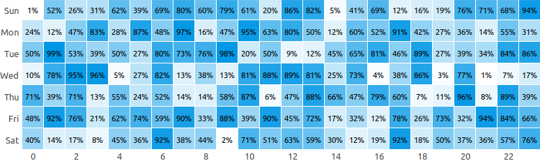
const xLabels = new Array(24).fill(0).map((_, i) => `${i}`);
const yLabels = ["Sun", "Mon", "Tue"];
const data = new Array(yLabels.length)
  .fill(0)
  .map(() =>
    new Array(xLabels.length).fill(0).map(() => Math.floor(Math.random() * 100))
  );

ReactDOM.render(
  <HeatMap xLabels={xLabels} yLabels={yLabels} data={data} />,
  document.getElementById("app")
);
Configuration
| Name | Type | Description | Default Value |
|---|---|---|---|
| background | string | The base color for the heatmap | "#329fff" |
| height | number | Height of each cell of the heatmap in px | 30 |
| onClick | function | Adds an handler to cell click | undefined |
| squares | boolean | If set to true will render cells as square | false |
| xLabelWidth | number | Width of the x label area in pixel | 60 |
| yLabelWidth | number | Width of the y label area in pixel | 40 |
| yLabelTextAlign | string | Text alignment of the yLabels | "right" |
| xLabelsLocation | string | Location of y labels. It can be top or bottom | "top" |
| xLabelsVisibility | [boolean] | Array of bool conveying which x labels to display. For ex: [true, false, true, false] means the 1st and the 3rd labels will be displayed and the 2nd and 4th will be hidden | |
| unit | string | Unit to display next to the value on hover | |
| cellRender | function | Render custom content in cell | () => null |
| cellStyle | function | To set custom cell style. It is useful for using own colour scheme | |
| title | function | To render custom title in each cell | ${value} ${unit} |
Example
const xLabels = new Array(24).fill(0).map((_, i) => `${i}`);

// Display only even labels
const xLabelsVisibility = new Array(24)
  .fill(0)
  .map((_, i) => (i % 2 === 0 ? true : false));

const yLabels = ["Sun", "Mon", "Tue"];
const data = new Array(yLabels.length)
  .fill(0)
  .map(() =>
    new Array(xLabels.length).fill(0).map(() => Math.floor(Math.random() * 100))
  );

ReactDOM.render(
  <HeatMap
    xLabels={xLabels}
    yLabels={yLabels}
    xLabelsLocation={"bottom"}
    xLabelsVisibility={xLabelsVisibility}
    xLabelWidth={50}
    data={data}
    squares
    onClick={(x, y) => alert(`Clicked ${x}, ${y}`)}
    cellStyle={(background, value, min, max, data, x, y) => ({
      background: `rgba(66, 86, 244, ${1 - (max - value) / (max - min)})`,
      fontSize: "11px",
    })}
    cellRender={(value) => value && `${value}%`}
    title={(value, unit) => `${value}`}
  />,
  document.getElementById("app")
);
New build
npm run build
Run dev server
npm run dev
Run test
npm run test

FAQs
React component for heatmap on grid layout
The npm package react-heatmap-grid receives a total of 7,505 weekly downloads. As such, react-heatmap-grid popularity was classified as popular.
We found that react-heatmap-grid demonstrated a not healthy version release cadence and project activity because the last version was released a year ago. It has 1 open source maintainer collaborating on the project.
Did you know?

Socket for GitHub automatically highlights issues in each pull request and monitors the health of all your open source dependencies. Discover the contents of your packages and block harmful activity before you install or update your dependencies.
Product
Explore exportable charts for vulnerabilities, dependencies, and usage with Reports, Socket’s new extensible reporting framework.

Product
Socket for Jira lets teams turn alerts into Jira tickets with manual creation, automated ticketing rules, and two-way sync.

Company News
Socket won two 2026 Reppy Awards from RepVue, ranking in the top 5% of all sales orgs. AE Alexandra Lister shares what it's like to grow a sales career here.