React Hexa UI
React Hexa UI is a modern, flexible, and lightweight React component library built with Vite and styled with Tailwind CSS. It offers a wide range of customizable and reusable components that simplify UI development for your React applications.
Features
- 🚀 Fast and Lightweight: Developed with Vite, ensuring high performance and fast builds.
- 🎨 Tailwind CSS Integration: Styled with Tailwind CSS for utility-first, responsive design out of the box.
- ⚙️ Highly Customizable: Modify styles easily with Tailwind classes, extend themes, or use component-specific variants and themes.
- 📚 Developer Friendly: Intuitive API, comprehensive documentation, and live examples.
- 🛠️ Built for Scalability: Suited for projects of any size—from small apps to large-scale applications.
Installation
Step 1: Install React Hexa UI via NPM:
To get started with React Hexa UI, install the library via npm:
npm install react-hexa@latest
Step 2: Install Tailwind CSS
React Hexa UI comes with built-in Tailwind CSS styles. However, if you want to use Tailwind classes or extend its configuration, you need to set up Tailwind in your project. Here's how to install Tailwind CSS with Vite and React:
- Install Tailwind CSS and its peer dependencies:
npm install -D tailwindcss postcss autoprefixer
- Initialize Tailwind by creating the default configuration files:
npx tailwindcss init -p
- Configure tailwind.config.js to include all of your React files and components by adding this content:
module.exports = {
  content: ["./index.html", "./src/**/*.{js,ts,jsx,tsx}"],
  theme: {
    extend: {},
  },
  plugins: [],
};
- Add the Tailwind directives to your CSS file (e.g., src/main.css):
@tailwind base;
@tailwind components;
@tailwind utilities;
Step 3: Wrap Your App with HexaUI Provider and Import Hexa UI's CSS
To use React Hexa UI, you must import Hexa UI's CSS and wrap your app with the HexaUI provider. This is required to set up the necessary context for the components.
In your main application file (e.g., src/main.jsx or src/main.tsx), add the following:
import { HexaUI } from "react-hexa";
import "react-hexa/css";

function Main() {
  return (
    <HexaUI>
      <App />
    </HexaUI>
  );
}

export default Main;
Optional: Customize the HexaUI Provider
You can pass optional colors and gradients to the HexaUI provider to override theme variant/s:
<HexaUI
  colors={{ primary: "blue-500" } as TColorPalette}
  gradients={{ success: "from-blue-400 via-green-500 to-blue-700" } as TGradientPalette}
>
  <App />
</HexaUI>
These props are optional, but the provider must always wrap your app for Hexa UI to function properly.
Usage
Once installed, you can start using the components by importing them into your project. Here's a quick example of how to use the Button component:
import { Flex, Button } from "react-hexa";

function App() {
  return (
    <Flex className="gap-4">
      <Button options={{ bgVariant: "success" }}>Ok</Button>
      <Button options={{ bgVariant: "failure" }}>Cancel</Button>
    </Flex>
  );
}

export default App;

Customization
React Hexa UI components are built with Tailwind CSS at their core, offering extensive customization options to match your project’s needs:
- Utility Classes: Override component styles on the fly by passing in your own Tailwind utility classes.
- Theme Extension: Customize your entire application by extending Tailwind's configuration to introduce your own design tokens.
- Variants: Use built-in component variants to apply predefined styles consistently across your app.
- Component Themes: For more advanced styling, override the default component themes to enforce a cohesive design language throughout your project.
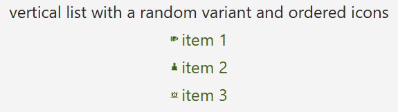
Here’s an example of extending themes with the List component:
import { useTheme, List, ListStyleTypes, Sizes } from "react-hexa";

function App() {
  const { colors } = useTheme();

  const listOptions = {
    items: ["item 1", "item 2", "item 3"],
    textVariant: colors.Primary,
    listStyle: ListStyleTypes.Decimal,
    fontSize: Sizes.Sm,
    gap: 1,
  };

  return <List options={listOptions} />;
}

export default App;
Documentation
For detailed documentation, usage examples, and a complete list of components, please visit the React Hexa UI Documentation Website.
Author
Yehonatan Moravia - yehonatan604@gmail.com
Collaborators
Moshe Shoker - moshe@shoker.co.il
License
React Hexa UI is licensed under the MIT License. See the LICENSE file for more information.


