


react-id-swiper ( Newest version 4.0.0 )
A library to use Swiper as a ReactJs component
What is Swiper?
Swiper - is the free and most modern mobile touch slider with hardware accelerated transitions and amazing native behavior.
It is intended to be used in mobile websites, mobile web apps, and mobile native/hybrid apps. Designed mostly for iOS, but also works great on latest Android, Windows Phone 8 and modern Desktop browsers.
Swiper is not compatible with all platforms, it is a modern touch slider which is focused only on modern apps/platforms to bring the best experience and simplicity. Swiper does work well with Gatsby.
Props
| ContainerEl | String | 'div' | Element type for container |
| containerClass | String | swiper-container | Swiper container class name |
| WrapperEl | String | 'div' | Element type for wrapper |
| wrapperClass | String | swiper-wrapper | Swiper wrapper class name |
| slideClass | String | swiper-slide | Swiper slide class name |
| shouldSwiperUpdate | Boolean | false | Update swiper when component is updated |
| rebuildOnUpdate | Boolean | false | Rebuild swiper when component is updated |
| noSwiping | Boolean | false | Disable swiping by condition |
| activeSlideKey | String | null | Initial slide index |
| renderPrevButton | function | | Render props function for prev button |
| renderNextButton | function | | Render props function for next button |
| renderScrollbar | function | | Render props function for scrollbar |
| renderPagination | function | | Render props function for pagination |
| renderParallax | function | | Render props function for parallax |
If you want to use Swiper custom build to reduce bundle size, you need to use extra props below.
| Swiper | Class | | Swiper class |
| modules | array | | Array of Swiper necessary modules |
NOTE:
- You can also use Swiper's original params too. Swiper API documentation HERE
- Find more info about Swiper custom build HERE
- <= 3.x documentation
Documentation
Installation and setup
- From version 2.0.0, it requires React & ReactDOM ver >=16.8.0 to use Hooks
- From version 2.4.0, it requires Swiper ver >= 5.0.0
Npm package
By npm
npm install --save react-id-swiper@latest swiper@latest
By Yarn
yarn add react-id-swiper@latest swiper@latest
CDN
<script src="https://unpkg.com/react-id-swiper@3.0.0/lib/react-id-swiper.js"></script>
<script src="https://unpkg.com/react-id-swiper@3.0.0/lib/react-id-swiper.min.js"></script>
Styling
Swiper stylesheet file is required
Use Swiper stylesheet file from CDN
<link rel="stylesheet" href="https://unpkg.com/swiper/css/swiper.css">
<link rel="stylesheet" href="https://unpkg.com/swiper/css/swiper.min.css">
Or from Swiper package
You should import directly from Swiper package which supports css, scss and less
css
import 'swiper/css/swiper.css'
scss
import 'swiper/swiper.scss'
less
import 'swiper/swiper.less'
Examples
Numerous live examples:
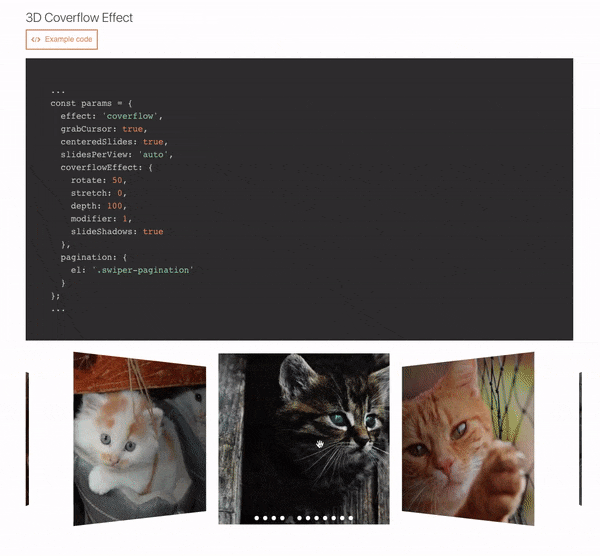
Navigation, Pagination, Pagination / Dynamic Bullets, Progress Pagination, Fraction Pagination, Custom Pagination, Scrollbar, Vertical slider, Space Between Slides, Mutiple Slides Per View, Auto Slides Per View / Carousel Mode, Centered Slides, Centered Slides + Auto Slides Per View, Free Mode / No Fixed Positions, Scroll Container, Multiple Row Slides Layout, Nested Swipers, Grab Cursor, Loop Mode / Infinite Loop, Loop Mode With Multiple Slides Per Group, Fade Effect, 3D Cube Effect, 3D Coverflow Effect, 3D Flip Effect, Mousewheel-control, Auto Play, Thumbs Gallery With Two-way Control, RTL Layout, Parallax, Lazyload Image, Responsive Breakpoints, Manipulating component outside Swiper, Customized Component
Default
import React from 'react';
import Swiper from 'react-id-swiper';
import 'swiper/css/swiper.css';

const SimpleSwiper = () => (
  <Swiper>
    <div>Slide 1</div>
    <div>Slide 2</div>
    <div>Slide 3</div>
    <div>Slide 4</div>
    <div>Slide 5</div>
  </Swiper>
)

export default SimpleSwiper;
Using params
import React from 'react';
import Swiper from 'react-id-swiper';

const SimpleSwiperWithParams = () => {
  const params = {
    pagination: {
      el: '.swiper-pagination',
      type: 'bullets',
      clickable: true
    },
    navigation: {
      nextEl: '.swiper-button-next',
      prevEl: '.swiper-button-prev'
    },
    spaceBetween: 30
  }

  return(
    <Swiper {...params}>
      <div>Slide 1</div>
      <div>Slide 2</div>
      <div>Slide 3</div>
      <div>Slide 4</div>
      <div>Slide 5</div>
    </Swiper>
  )
}

export default SimpleSwiperWithParams;
Manipulating swiper from outside swiper component
import React, { useState, useRef } from 'react';
import Swiper from 'react-id-swiper';

const ManipulatingSwiper = () => {
  const [swiper, setSwiper] = useState(null);

  const ref = useRef(null);

  const goNext = () => {
    if (ref.current !== null && ref.current.swiper !== null) {
      swiper.slideNext();
    }
  };

  const goPrev = () => {
    if (ref.current !== null && ref.current.swiper !== null) {
      swiper.slidePrev();
    }
  };

  return (
    <div>
      <Swiper ref={ref}>
        <div>Slide 1</div>
        <div>Slide 2</div>
        <div>Slide 3</div>
        <div>Slide 4</div>
        <div>Slide 5</div>
      </Swiper>
      <button onClick={goPrev}>Prev</button>
      <button onClick={goNext}>Next</button>
    </div>
  );
};

export default ManipulatingSwiper;
Custom build Swiper
You can find the WORKING DEMO REPO HERE
import React from 'react';
import ReactIdSwiperCustom from 'react-id-swiper/lib/ReactIdSwiper.custom';
import { Swiper, Navigation, Pagination } from 'swiper/js/swiper.esm';
const CustomBuildSwiper = () => {
const params = {
Swiper,
modules: [Navigation, Pagination],
pagination: {
el: '.swiper-pagination',
type: 'bullets',
clickable: true
},
navigation: {
nextEl: '.swiper-button-next',
prevEl: '.swiper-button-prev'
},
spaceBetween: 30
}
return(
<ReactIdSwiperCustom {...params}>
<div>Slide 1</div>
<div>Slide 2</div>
<div>Slide 3</div>
<div>Slide 4</div>
<div>Slide 5</div>
</ReactIdSwiperCustom>
)
}
export default CustomBuildSwiper;
NOTE:
- If you use Webpack & Babel you need to setup Babel loader config in
webpack.config.js like below:
module: {
  rules: [
    {
      exclude: [/node_modules\/(?!(swiper|dom7)\/).*/, /\.test\.js(x)?$/],
      test: /\.js(x)?$/,
      use: [{ loader: 'babel-loader' }],
    }
  ],
}
Adding customized css classes
const params = {
pagination: {
el: '.swiper-pagination.customized-swiper-pagination',
},
navigation: {
nextEl: '.swiper-button-next.customized-swiper-button-next',
prevEl: '.swiper-button-prev.customized-swiper-button-prev'
},
containerClass: 'customized-swiper-container'
}
Adding customized components
For customized rendering to work, you have to use same classname with params el.
const params = {
  navigation: {
    nextEl: '.swiper-button-next',
    prevEl: '.swiper-button-prev'
  },
  renderPrevButton: () => <button className="swiper-button-prev">Prev</button>,
  renderNextButton: () => <button className="swiper-button-next">Next</button>,
}
Workable slides
Each slide should be wrapped by HTML element
BAD CODE :thumbsdown:
<Swiper {...params}>
  Slide content
</Swiper>
GOOD CODE :thumbsup:
<Swiper {...params}>
  <span>Slide content</span>
</Swiper>
Bug report
Please use the prepared Codesanbox below to reproduce your issue. Thank you!!

Authors
See also the list of contributors who participated in this project.
Buy me a coffee

License
This project is licensed under the MIT License - see the LICENSE file for details


