Security News
Browserslist-rs Gets Major Refactor, Cutting Binary Size by Over 1MB
Browserslist-rs now uses static data to reduce binary size by over 1MB, improving memory use and performance for Rust-based frontend tools.
react-interaction
Advanced tools
Collection of components for interaction
📢️ Please check it. Currently, this module supports React 16.8 and later.
 |  |
 |  |
npm install --save react-interaction
import { toast, notice, check, Tooltip } from 'react-interaction';
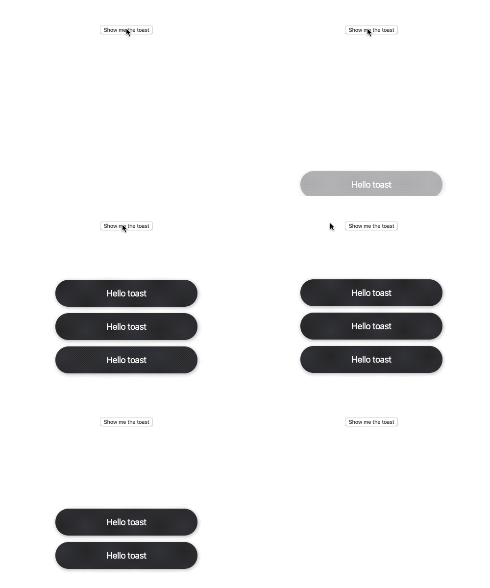
toast(message, options)
| Name | Type | Default | Description |
|---|---|---|---|
| time | number | 3000 | The millisecond time that the message is displayed. |
| className | string | ||
| style | CSSProperties |
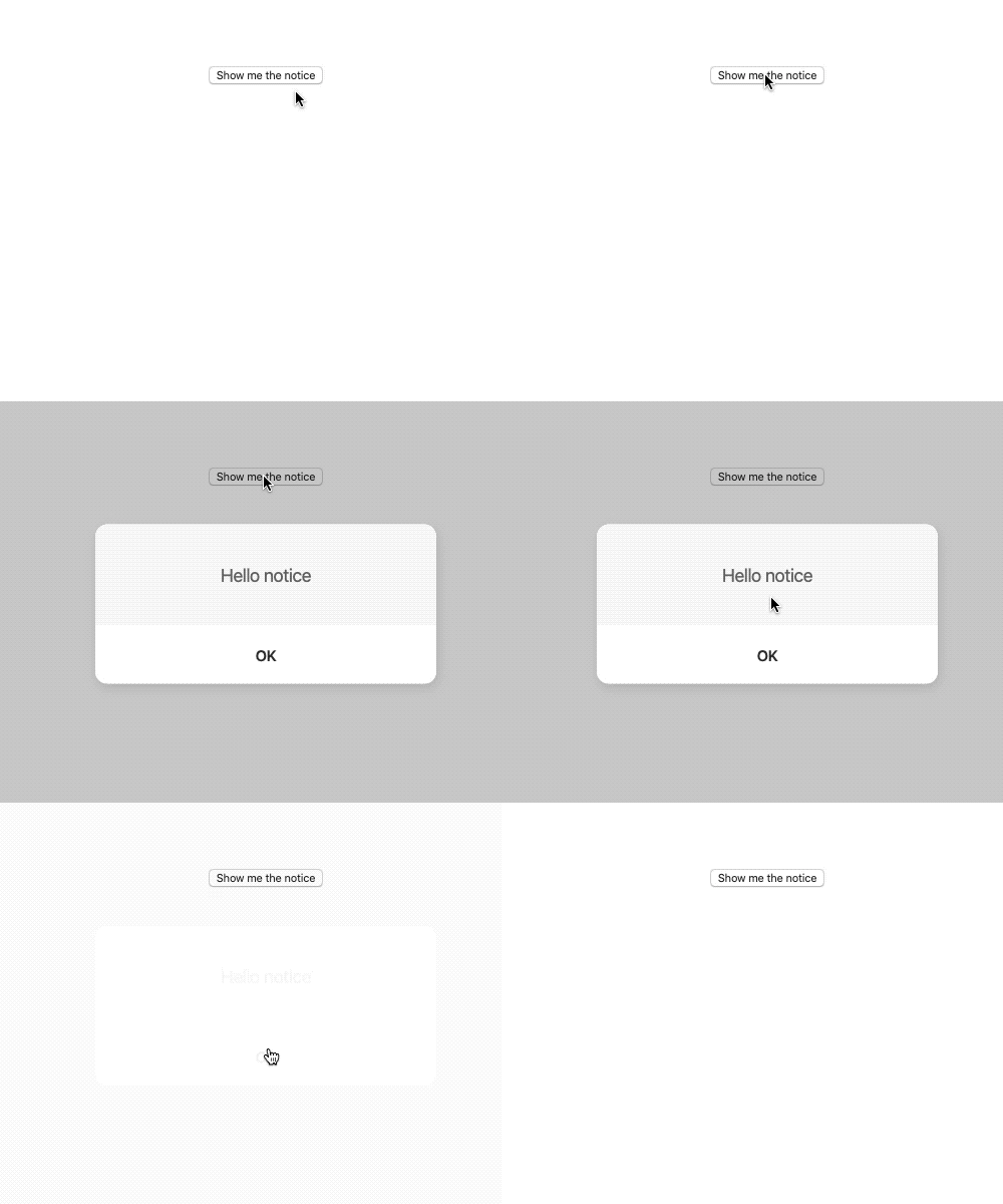
Promise based notice component such as alert
notice(message, options).then(() => console.log('closed'));
| Name | Type | Default | Description |
|---|---|---|---|
| dimmedClassName | string | ||
| dimmedStyle | CSSProperties | ||
| contentClassName | string | ||
| contentStyle | CSSProperties | ||
| messageClassName | string | ||
| messageStyle | CSSProperties | ||
| okClassName | string | ||
| okStyle | CSSProperties | ||
| okText | string | 'OK' |
Promise based check component such as confirm
check(message, options).then(isConfirmed => console.log(isConfirmed));
| Name | Type | Default | Description |
|---|---|---|---|
| dimmedClassName | string | ||
| dimmedStyle | CSSProperties | ||
| contentClassName | string | ||
| contentStyle | CSSProperties | ||
| messageClassName | string | ||
| messageStyle | CSSProperties | ||
| okClassName | string | ||
| okStyle | CSSProperties | ||
| okText | string | 'OK' | |
| cancelClassName | string | ||
| cancelStyle | CSSProperties | ||
| cancelText | string | 'Cancel' |
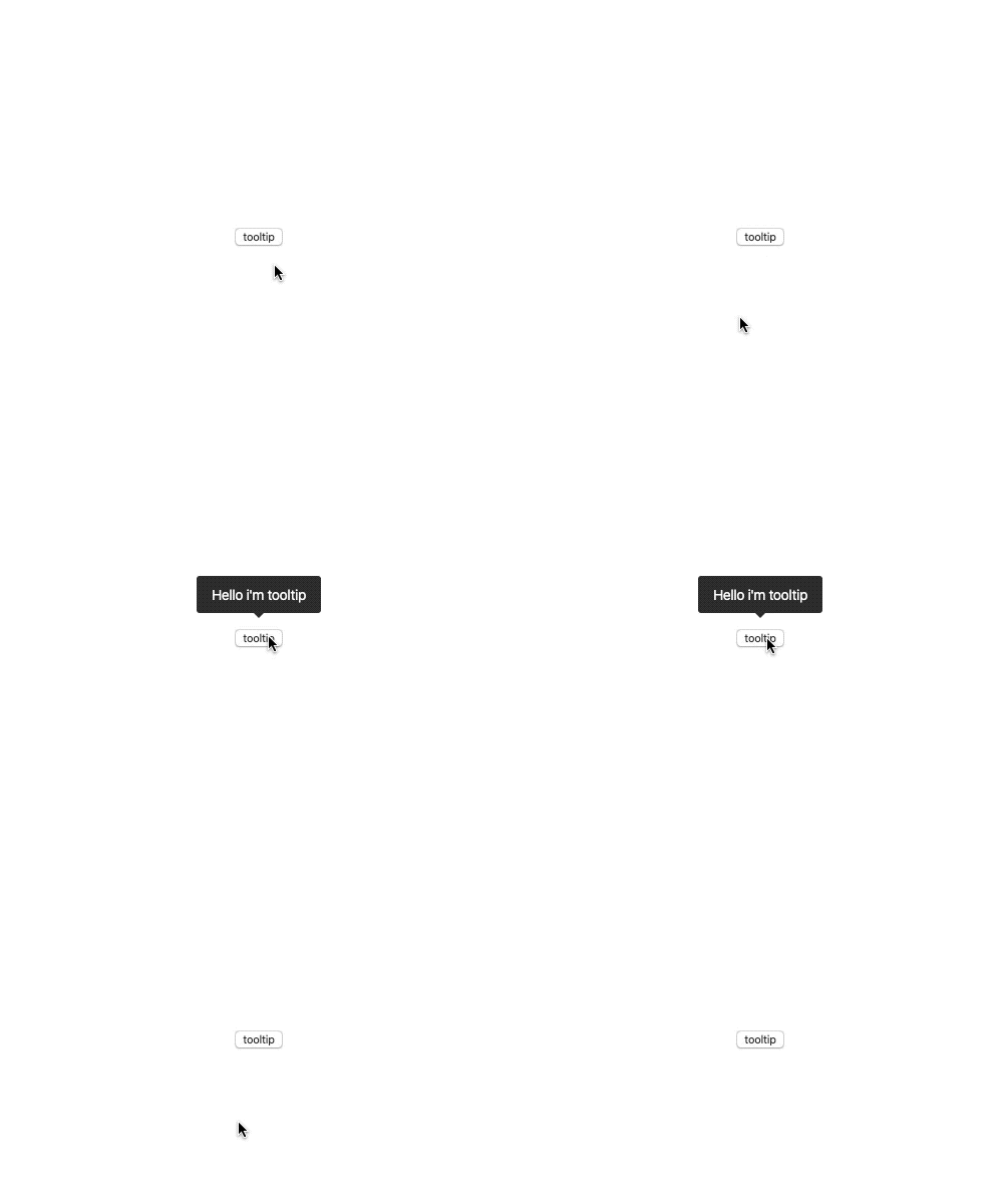
The position of the tooltip is calculated automatically.
<Tooltip message="Tooltip message">tooltip</Tooltip>
| Name | Type | Default | Description |
|---|---|---|---|
| style | CSSProperties | ||
| className | string | ||
| message | ReactNode | ||
| messageStyle | CSSProperties | ||
| messageClassName | string | ||
| toggle | boolean | false |
MIT © almond-bongbong
FAQs
Collection of components for interaction
The npm package react-interaction receives a total of 0 weekly downloads. As such, react-interaction popularity was classified as not popular.
We found that react-interaction demonstrated a not healthy version release cadence and project activity because the last version was released a year ago. It has 1 open source maintainer collaborating on the project.
Did you know?

Socket for GitHub automatically highlights issues in each pull request and monitors the health of all your open source dependencies. Discover the contents of your packages and block harmful activity before you install or update your dependencies.

Security News
Browserslist-rs now uses static data to reduce binary size by over 1MB, improving memory use and performance for Rust-based frontend tools.

Research
Security News
Eight new malicious Firefox extensions impersonate games, steal OAuth tokens, hijack sessions, and exploit browser permissions to spy on users.

Security News
The official Go SDK for the Model Context Protocol is in development, with a stable, production-ready release expected by August 2025.