react-jquery-data-table
Welcome to DataTableReact, your ultimate solution for integrating jQuery DataTable-like functionality into React components! With DataTableReact, effortlessly enhance your React applications with dynamic and responsive data tables. Harness a rich array of customizable options, empowering you to efficiently manage and visualize data within your projects. Seamlessly integrate DataTableReact into your workflow for streamlined data presentation and enhanced user experience.
Installation
$ npm install --save react-jquery-data-table
$ yarn add react-jquery-data-table
// For DataTable
$ import {
DataTable,
} from "react-jquery-data-table";
// For PageNation
$ import {
PageNation,
} from "react-jquery-data-table";
Features
- Dynamic Data Rendering: Render dynamic data tables with ease, supporting a variety of data sources and formats.
- Customizable Columns: Define and customize columns to suit your data presentation needs, including sorting, filtering, and formatting options.
- Pagination: Enable pagination to efficiently navigate through large datasets, with customizable page sizes and page indicators.
- Search and Filtering: Implement search and filtering functionality to quickly locate and narrow down specific data entries.
- Responsive Design: Ensure optimal viewing experience across devices with responsive design that adapts to different screen sizes.
- Integration with React Applications: Seamlessly integrate DataTableReact into your existing React applications without any hassle.
- Extensible and Configurable: Configure DataTableReact to meet your specific requirements and extend its functionality with ease.
- Performance Optimization: Optimize performance for large datasets with efficient rendering and data handling mechanisms.
- Theming and Styling: Customize the look and feel of your data tables with flexible theming and styling options.
- Cross-Browser Compatibility: Support a wide range of modern browsers for consistent behavior and performance.
The gist
Default
import React, { useEffect, useState } from "react";
import { DataTable } from "react-jquery-data-table";
import "bootstrap/dist/css/bootstrap.min.css";
import { GetCountries } from "react-country-state-city";
export default function App() {
  const [countries, setCountries] = useState([]);
  useEffect(() => {
    GetCountries().then((res) => {
      setCountries(res);
    });
  }, []);
  return (
    <DataTable
      title="Countries"
      data={countries}
      heads={[
        { name: "Name", fieldname: "name" },
        { name: "Capital", fieldname: "capital" },
        { name: "Currency", fieldname: "currency" },
        { name: "Currency Symbol", fieldname: "currency_symbol" },
        { name: "Native", fieldname: "native" },
        { name: "Region", fieldname: "region" },
        {
          name: "Name With Custom View",
          fieldname: "",
          view: (item) => <h5>{item.name}</h5>,
        },
      ]}
    />
  );
}
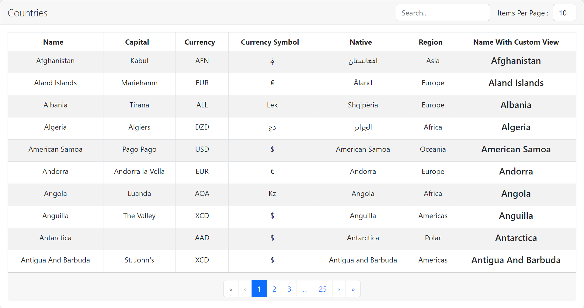
Data Table Example
The Data Table Properties
Properties used to customise the rendering:
| title | string | The title for the table |
| heads | HeadProps | Head text for the table head and field name to fetched from data and display in | |
| data | Array | Data records for the table |
| currentPage | number | optional Current page in pagination |
| itemsperpage | number | optional The number of items you want per page default is 10. |
| hasItemsPerPageDropdown | boolean | optional Items per page change dropdown are displayed when true and not displayed when false. default is true. |
| hasPagination | boolean | optional Bottom pagination buttons are displayed when true and not displayed when false. default is true. |
| searchEnabled | boolean | optional Search box are displayed when true and not displayed when false. default is true. |
HeadProps Properties
The same country select properties and additionally
| name | string | required Title of the table head |
| fieldname | string | required Which field of object need to be displayed from data array to | |
| view | FC | optional Custom component to display fieldname |
PageNation
import React, { useState } from "react";
import "./app.css";
import { PageNation } from "react-jquery-data-table";
import "bootstrap/dist/css/bootstrap.min.css";
export default function App() {
  const [currentPage, setCurrentPage] = useState(1);
  return (
    <PageNation
      currentPage={currentPage}
      totalPages={100}
      onPageChange={(_pageno) => setCurrentPage(_pageno)}
      className="justify-content-center mb-0 mt-2"
    />
  );
}
PageNation Example

The PageNation Properties
Properties used to customise the rendering:
| currentPage | number | required The current active page number being displayed. |
| totalPages | number | required The total number of pages available for pagination. |
| onPageChange | function | Function that gets called when the user requests a page change, typically used to update the current page number in the component. |
| className | string | Custom CSS class applied to the pagination component, allowing for styling adjustments. |
Demo
A demo is worth a thousand words
Contribute
Show your ❤️ and support by giving a ⭐. Any suggestions are welcome! venkatmcajj@gmail.com
License
Licensed under MIT


