React Keyboard Package
✨React-Keyboard-Package is a customizable virtual keyboard component for React applications, with support for light and dark themes.


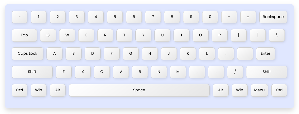
Showcase
Here’s how the react-keyboard-package component looks:
Installation
Use npm to install react-keyboard-package:
npm install react-keyboard-package
Usage
Import and use the Keyboard component in your React app:
import React from 'react';
import Keyboard from 'react-keyboard-package';

const App = () => {
  return (
    <div>
      <h1>Virtual Keyboard</h1>
      <Keyboard currentKey="a" theme="dark" />
    </div>
  );
};

export default App;
Props
theme | string | "light" | Sets the theme of the keyboard. Can be "light" or "dark". |
onInit | function | undefined | Callback function triggered when the keyboard initializes. |
currentKey | string | null | The current key being pressed or active. |
Customization
To customize the keyboard styles, you can override the styles in your project by importing the package's SCSS files and adjusting the variables.
For example:
//Light Theme Variables
$background-color-light:
$key-button-bg-light:
$key-button-hover-bg-light:
$key-text-color-light:
//Dark Theme Variables
$background-color-dark:
$key-button-bg-dark:
$key-button-hover-bg-dark:
$key-text-color-dark:
//Global Variables
$keyboard-border-radius: 6px; // Border radius of keys
$keyboard-padding: 10px; // Padding inside the keyboard
$keyboard-shadow: 0 4px 8px rgba(0, 0, 0, 0.2); // Box shadow of keyboard
To override these variables, import the SCSS file and redefine the variables in your own project:
@import 'react-keyboard-package/dist/styles/Keyboard.scss';
// Example: Override theme variables
$background-color-light:
$key-button-bg-light:
$key-button-hover-bg-light:
Contributing
Pull requests are welcome. For major changes, please open an issue first
to discuss what you would like to change.
Thanks ❤️
License
MIT © License
Author
Made with ❤️ by Ajay Marathe


