react-language-selector-lite
react-language-selector-lite is a lightweight and customizable React component for selecting languages, featuring ISO 639 macrolanguage support, and TypeScript compatibility. It offers search functionality, themes (light and dark), and flexible configurations. This package is built using styled-components for seamless integration into any React project🚀.
✨ Features
- 🗂️ Select from a comprehensive list of over 184 languages
- 🔍 Search functionality to quickly find languages
- 🌗 Supports light and dark themes
- 🎨 Fully customizable labels, placeholders & appearance
- 🌍 Supports ISO 639 macrolanguages
- 📋 Option to include detailed language information
- 🔄 Flexible sorting and filtering of languages
- 📦 Lightweight and easy to integrate
- 📱 Responsive design
- 🎯 TypeScript support
- 📜 Licensed under MIT
About ISO 639 Macrolanguage
ISO 639 is a set of international standards that lists short codes for language names. The ISO 639-1 and ISO 639-2 codes are primarily used, and these codes cover the majority of languages in the world. This package uses ISO 639 macrolanguages to ensure comprehensive and accurate representation of languages.
For more information about ISO 639 macrolanguage, visit the Wikipedia page.
📦 Installation
Install the package via npm or yarn:
npm install react-language-selector-lite
or
yarn add react-language-selector-lite
🚀 Quick Start
import React from 'react';
import LanguageSelector from 'react-language-selector-lite';
const App = () => {
const handleLanguageSelect = (language) => {
console.log('Selected language:', language);
};
return (
<div>
<LanguageSelector onSelect={handleLanguageSelect} />
</div>
);
};
export default App;
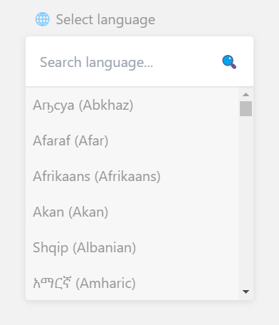
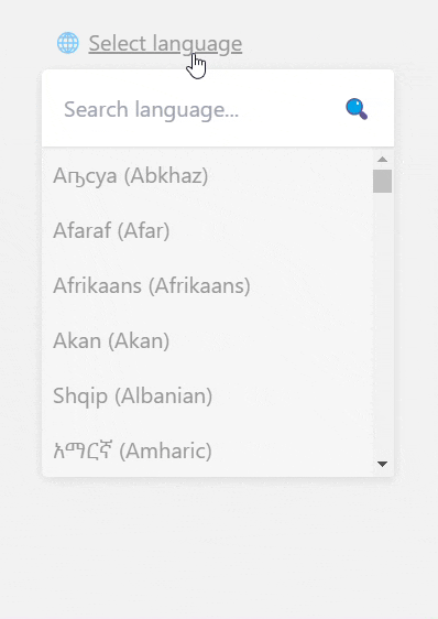
Preview in Action
🎨 Advanced Usage
Using custom toggle button
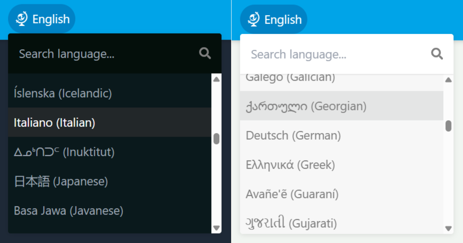
You can use your own custom toggle button for rendering the select container. Just pass your custom button reference to the buttonRef prop. This will override the default toggle button. Here's an example: Easy peasy!
import React, { useRef } from 'react';
import { RiTranslateAi2 } from "react-icons/ri";
import LanguageSelector from 'react-language-selector-lite';
const App = () => {
const customButtonRef = useRef(null);
const handleLanguageSelect = (language) => {
console.log('Selected language:', language);
};
return (
<div className="relative w-full">
<button ref={customButtonRef}>
<RiTranslateAi2 className="size-6" />
</button>
<LanguageSelector
onSelect={handleLanguageSelect}
theme="dark"
includeDetails={true}
buttonRef={customButtonRef}
/>
</div>
);
};
export default App;
Limiting Language Options
You can limit the available options by passing an array of language codes to the options prop:
<LanguageSelector
  onSelect={handleLanguageSelect}
  options={['en', 'es', 'fr']}
/>
useSate Hook
Using the useState hook to select a language:
import React, { useState } from 'react';
const [selectedLanguage, setSelectedLanguage] = useState(null);

<LanguageSelector
  onSelect={(lang) => setSelectedLanguage(lang)}
/>
🔗 Useful Links
⚙️ Props Reference
onSelect | (language: any) => void | Required | Callback function triggered when a language is selected. |
defaultLang | string / null | "browser" | Default language code to pre-select. Set preferred language code (e.g., "en") to override the browser's default language. Set tonull to disable pre-selection. |
includeDetails | boolean | false | Whether to include detailed language info in onSelect. |
geoCoverage | string: "local" / "international" / "both" | "both" | Display local names or international names of languages. |
reverseNames | boolean | false | Reverse the order of the language names when geoCoverage is set to both. |
enableSearch | boolean | true | Enable search functionality. |
options | string[] | [] | Array of language codes to limit available options. |
sortOptions | boolean | true | Whether to sort the list of languages alphabetically. |
buttonLabel | string: "local" / "international" / "both" | "Select language" | Label for the toggle button, if set to "local" / "international" / "both", the label will be dynamic based on the selected language, you can also set it to a custom label. When set to an empty string "" the label will not show up. |
placeholder | string | "Search language..." | Placeholder text for the search input. |
notFoundLabel | string | "Language not found" | Label for the not found message. When set to an empty string "" the message will not show up. |
width | string | "20rem" | Adjust the width of the selector container. |
className | string | "" | Custom CSS class for styling the selector container. |
toggleBtnClass | string | "" | Custom CSS class for styling the default toggle button. |
btnLabelClass | string | "" | Custom CSS class for styling the label of the toggle button. |
searchClass | string | "" | Custom CSS class for styling the search input container. |
optionClass | string | "" | Custom CSS class for styling each option. |
toggleBtnIcon | React.ReactNode / string | "🌐" | Customizes the icon displayed on the toggle button. You can use an emoji (e.g., "🌍"), a React component (e.g., <FaGlobe />), or a custom SVG. |
searchIcon | React.ReactNode / string | "🔍" | Customizes the icon displayed inside the search input. You can use an emoji (e.g., "🔦"), a React component (e.g., <FaSearch />), or a custom SVG. |
buttonRef | React.RefObject< HTMLButtonElement> | null | A reference to a custom button that toggles the visibility of the language selector container, if not provided, the default toggle button will be rendered. |
render | string: "onClick" / "onHover" | "onClick" | To render / display the language selector container onclick or onhover event of the toggle button. |
theme | "light" / "dark" | "light" | Theme of the component. |
🎨 Styling / Customization
You can add custom styling by utilizing the following props; className for the selector container, toggleBtnClass for the default toggle button, searchClass for the search container, and optionClass for each option. Supports both traditional CSS classes and utility classes from UI libraries like Tailwind CSS, Bootstrap, etc. (e.g., toggleBtnClass="bg-sky-600 rounded-full").
Default Toggle Button Label
You can dynamically label the buttonLabel based on the selected language by setting the prop to "local", "international" or "both". Alternatively, you can provide a custom string for a personalized label. Setting it to an empty string "" will hide the label.
<LanguageSelector
onSelect={handleLanguageSelect}
buttonLabel="local"
/>
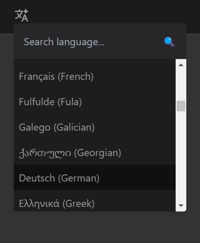
Dark Theme
To use the dark theme, simply set the theme prop to "dark":
<LanguageSelector onSelect={handleLanguageSelect} theme="dark" />
Advanced Theming
You can take the theme to another level beyond the simple default theme, in this case your main focus should be on 3 key classes, className, searchClass, and optionClass. The following example shows how to customize the dark theme using Tailwind CSS:
<LanguageSelector
onSelect={handleLanguageSelect}
className="dark:bg-[#0b191c]"
searchClass="dark:bg-gray-800"
optionClass="dark:hover:bg-[#222729] dark:text-gray-400 dark:hover:text-white"
/>
Customizable Icons
You can customize the default toggle button icon and search icon by passing either strings (like emojis) or React nodes (like components from react-icons or custom SVGs).
Using Emojis
<LanguageSelector
  onSelect={handleLanguageSelect}
  toggleBtnIcon="🌍"
  searchIcon="🔦"
/>
Using React Components
import { FaGlobe, FaSearch } from "react-icons/fa";

<LanguageSelector
  onSelect={handleLanguageSelect}
  toggleBtnIcon={<FaGlobe />}
  searchIcon={<FaSearch />}
/>
Using Custom SVGs
import GlobeIcon from "./your-path-to-svgs/GlobeIcon.svg";
import SearchIcon from "./your-path-to-svgs/SearchIcon.svg";

<LanguageSelector
  onSelect={handleLanguageSelect}
  toggleBtnIcon={<img src={GlobeIcon} alt="Globe" />}
  searchIcon={<img src={SearchIcon} alt="Search" />}
/>
Fully Customized Preview
📄 License
This project is licensed under the MIT License by Jamiu Shaibu
🤝 Contributing
Contributions are welcome! Please fork the repository and submit a pull request for review.
Steps to Contribute
- Fork the repository: GitHub repository
- Create a new branch:
git checkout -b feature-branch-name.
- Make your changes and commit:
git commit -m 'Add some feature'.
- Push to the branch:
git push origin feature-branch-name.
- Open a pull request.
💬 Support
If you encounter any issues or have questions:
Acknowledgments
- langs - For language data.
☕ Support the Developer
If you find this package useful:
- Star⭐️ the repository on GitHub and share it with other developers!
- Consider buying me a coffee to support development!

👨💻 Author
Happy coding! 🎉