React-Maxwell-Modal


React-Maxwell-Modal Github Page
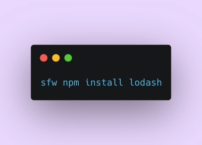
Install
npm install react-maxwell-modal --save
Usage
There are four types of modals available
Content Modal
Props
| onShow | function | false |
| onHide | function | true |
| isOpen | bool | false |
| shouldCloseOnOverlayClick | bool | false |
import { ContentModal } from 'react-maxwell-modal';

class ContentModalExample extends React.Component {
  constructor(props) {
    super(props);
    this.state = {
      isOpen: false
    }
    this.displayName = 'ContentModalExample';
    this.toggleModal = this.toggleModal.bind(this);
  }

  toggleModal() {
    this.setState({
      isOpen: !this.state.isOpen
    })
  }
  render() {
    return (
      <div className="ClickMeMaxwellModal">
      <button onClick={this.toggleModal}>Load Modal</button>
      <ContentModal
      ref="mymodal"
      isOpen={this.state.isOpen}
      shouldCloseOnOverlayClick={true}
      onHide={this.toggleModal}
      >
        <span>A bunch of useless stuff</span>
        </ContentModal>
      </div>
      );
  }
}
Maxwell Modal
Props
| footer | ReactComponent/String | false |
| onShow | function | false |
| onHide | function | true |
| title | string | false |
| isOpen | bool | false |
| dismissable | bool | false |
| shouldCloseOnOverlayClick | bool | false |
import { MaxwellModal } from 'react-maxwell-modal';

class MaxwellModalExample extends React.Component {
  constructor(props) {
    super(props);
    this.state = {
      isOpen: false
    }
    this.displayName = 'MaxwellModalExample';
    this.toggleModal = this.toggleModal.bind(this);
  }

  toggleModal() {
    this.setState({
      isOpen: !this.state.isOpen
    })
  }
  render() {
    return (
      <div className="ClickMeMaxwellModal">
      <button onClick={this.toggleModal}>Load Modal</button>
      <MaxwellModal
      ref="mymodal"
      isOpen={this.state.isOpen}
      title={"this is a title"}
      shouldCloseOnOverlayClick={true}
      onHide={this.toggleModal}
      >
        <span>A bunch of useless stuff</span>
        </MaxwellModal>
      </div>
      );
  }
}
Confirm Modal
A replacement for the confirm box.
This produces a modal with two buttons, yes and no. Their labels are configurable, as well as what occurs on yes and no.
####Props
| onYes | function | false |
| onNo | function | false |
| yesLabel | string | false |
| noLabel | string | false |
| onShow | function | false |
| onHide | function | true |
| title | string | false |
| isOpen | bool | false |
| dismissable | bool | false |
| shouldCloseOnOverlayClick | bool | false |
import { ConfirmModal } from 'react-maxwell-modal';

class ConfirmModalExample extends React.Component {
  constructor(props) {
    super(props);
    this.state = {
      isOpen: false
    }
    this.displayName = 'ConfirmModalExample';
    this.toggleModal = this.toggleModal.bind(this);
    this.onYes = this.onYes.bind(this);
    this.onNo = this.onNo.bind(this);
  }
  onYes(closeModal) {
    closeModal(true)
  }
  onNo(closeModal) {
    closeModal(true)
  }
  toggleModal() {
    this.setState({
      isOpen: !this.state.isOpen
    })
  }
  render() {
    return (
      <div className="ClickMeMaxwellModal">
      <button onClick={this.toggleModal}>Load Modal</button>
      <ConfirmModal
      ref="mymodal"
      isOpen={this.state.isOpen}
      shouldCloseOnOverlayClick={true}
      onHide={this.toggleModal}
      onYes={this.onYes}
      onNo={this.onNo}
      >
        <span>A bunch of useless stuff</span>
        </ConfirmModal>
      </div>
      );
  }
}
Alert Modal
A replacement for the alert box
Props
| onYes | function | false |
| yesLabel | string | false |
| onShow | function | false |
| onHide | function | true |
| title | string | false |
| isOpen | bool | false |
| dismissable | bool | false |
| shouldCloseOnOverlayClick | bool | false |
import { AlertModal } from 'react-maxwell-modal';

class AlertModalExample extends React.Component {
  constructor(props) {
    super(props);
    this.state = {
      isOpen: false
    }
    this.displayName = 'AlertModalExample';
    this.toggleModal = this.toggleModal.bind(this);
    this.onYes = this.onYes.bind(this);
  }
  onYes(closeModal) {
    closeModal(true)
  }
  toggleModal() {
    this.setState({
      isOpen: !this.state.isOpen
    })
  }
  render() {
    return (
      <div className="ClickMeMaxwellModal">
      <button onClick={this.toggleModal}>Load Modal</button>
      <AlertModal
      ref="mymodal"
      isOpen={this.state.isOpen}
      shouldCloseOnOverlayClick={true}
      onHide={this.toggleModal}
      onYes={this.onYes}
      >
        <span>A bunch of useless stuff</span>
        </AlertModal>
      </div>
      );
  }
}