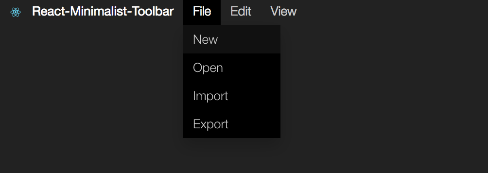
react-minimalist-toolbar
A Minimalist toolbar react component

Install
npm install --save react-minimalist-toolbar
Import
import Toolbar from 'react-minimalist-toolbar'
Example
import Toolbar from 'react-minimalist-toolbar'
newFile(){
}
newFile(){
}
openFile(){
}
render() {
var menu = [
{
text: "file",
items: [
{
text: "New",
callback: this.newFile
},
{
text: "Open",
callback: this.openFile
}
]
},
{
text: "edit",
items: [
{
text: "Undo",
callback: this.undo
},
{
text: "Redo",
callback: this.redo
}
]
},
];
return (
<Toolbar menu={menu} logo={logo} brand="React-Minimalist-Toolbar"></Toolbar>
);
}
##Customizing
The UI components can be customized by overwriting css classes:(see lib/index.css)
    :root {
        --main-color: #000;
        --main-color-high:#222;
        --text-color:#cccccc;
        --text-hover: #fff;
    }

    .minimalist-toolbar{

    }
    .minimalist-toolbar .dropdown{

    }
    .minimalist-toolbar .dropdown-content{

    }
Contributing
There are still many things to be added to this component, e.g. svg icons for each option or shortcuts.
This component was created using Yeoman Generator :
generator-create-react-component:
npm install -g yo
npm install -g generator-create-react-component
create a new component:
yo create-react-component
Storyboard
This component has storyboard -- check it to see an example of how to use this component. To do that clone this repository:
npm install
npm start


