
Research
2025 Report: Destructive Malware in Open Source Packages
Destructive malware is rising across open source registries, using delays and kill switches to wipe code, break builds, and disrupt CI/CD.
By Kush Pandya - Dec 24, 2025
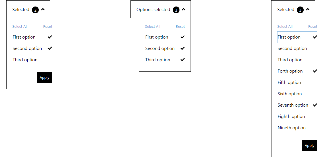
react-multiselect-button-dropdown
Advanced tools
A Dropdown Button which toggle a Multiselect List. React component accessible (A11y).
A Dropdown Button which toggle a Multiselect List. React component accessible (A11y).
Finally, Typescript compatible
Try it out in this Live Demo
npm i react-multiselect-button-dropdown
or
yarn add react-multiselect-button-dropdown
and import in your app
import MultiSelect from "react-multiselect-button-dropdown";
list: Array<listItem> (required)
listItem is:
{ label: PropTypes.string.isRequired, id: PropTypes.string.isRequired, name: PropTypes.string, checked: PropTypes.bool.isRequired }
Provides a list of checkboxes to the component
dropdownButtonText: string (required)
The text for the button dropdown
isRightAligned: boolean (optional)
Used in order to align dropdown to the right of the button. The default is left aligned
onOptionChanged (optionState) => {} (optional)
A callback function to get the state of options selected/unselected.
onSelectionApplied: (list) => {} (optional)
A callback function to get the state of checkbox list. If this property is added, it activates the footer of the component, containing the "Apply" and "Reset" buttons
selectAllButtonText: string (optional)
The text to the select all button default: "Select All"
resetButtonText: string (optional)
The text to the reset button default: "Reset"
applyButtonText: string (optional)
The text to the apply button default: "Apply"
closeDropdownOnApply: boolean (optional)
Used in order to close the dropdown when user click on Apply button
const props = {
    list: [
        {
            label: 'First option',
            name: 'first-option',
            id: 'first-option-1',
            checked: true
        },
        {
            label: 'Second option',
            name: 'second-option',
            id: 'second-option-2',
            checked: false
        },
        {
            label: 'Third option',
            name: 'third-option',
            id: 'third-option-3',
            checked: false
        }
    ],
    onSelectionApplied: selection => {
    console.log('Selected : ', selection);
    },
    dropdownButtonText: 'Selected',
    resetButtonText: 'Reset',
    applyButtonText: 'Apply'
    closeDropdownOnApply: true
};

<MultiSelect {...props} />
FAQs
Did you know?

Socket for GitHub automatically highlights issues in each pull request and monitors the health of all your open source dependencies. Discover the contents of your packages and block harmful activity before you install or update your dependencies.
Research
Destructive malware is rising across open source registries, using delays and kill switches to wipe code, break builds, and disrupt CI/CD.

Security News
Socket CTO Ahmad Nassri shares practical AI coding techniques, tools, and team workflows, plus what still feels noisy and why shipping remains human-led.

Research
/Security News
A five-month operation turned 27 npm packages into durable hosting for browser-run lures that mimic document-sharing portals and Microsoft sign-in, targeting 25 organizations across manufacturing, industrial automation, plastics, and healthcare for credential theft.