react-native-action-button
customizable multi-action-button component for react-native


Known Issues
- Doesn't Work While Android Debugging. See issue #79.
Installation
npm i react-native-action-button --save
Link react-native-vector-icons native dependencies to your project with:
react-native link react-native-vector-icons
or just:
react-native link
to link all libraries with native dependencies in your project.
Usage
First, require it from your app's JavaScript files with:
import ActionButton from 'react-native-action-button';
ActionButton
ActionButton component is the main component which wraps everything and provides a couple of props (see Config below).
ActionButton.Item
ActionButton.Item specifies an Action Button. You have to include at least 1 ActionButton.Item.
Example
The following Basic example can be found in example/Basic.
import React, { Component } from 'react';
import { StyleSheet, View } from 'react-native';
import ActionButton from 'react-native-action-button';
import Icon from 'react-native-vector-icons/Ionicons';
class App extends Component {
render() {
return (
<View style={{flex:1, backgroundColor: '#f3f3f3'}}>
{/* Rest of the app comes ABOVE the action button component !*/}
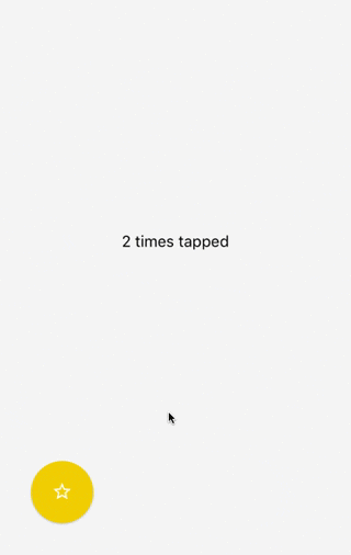
<ActionButton buttonColor="rgba(231,76,60,1)">
<ActionButton.Item buttonColor='#9b59b6' title="New Task" onPress={() => console.log("notes tapped!")}>
<Icon name="md-create" style={styles.actionButtonIcon} />
</ActionButton.Item>
<ActionButton.Item buttonColor='#3498db' title="Notifications" onPress={() => {}}>
<Icon name="md-notifications-off" style={styles.actionButtonIcon} />
</ActionButton.Item>
<ActionButton.Item buttonColor='#1abc9c' title="All Tasks" onPress={() => {}}>
<Icon name="md-done-all" style={styles.actionButtonIcon} />
</ActionButton.Item>
</ActionButton>
</View>
);
}
}
const styles = StyleSheet.create({
actionButtonIcon: {
fontSize: 20,
height: 22,
color: 'white',
},
});
This will create a floating Button in the bottom right corner with 3 action buttons.
Also this example uses react-native-vector-icons for the button Icons.
FAB Example
<ActionButton
  buttonColor="rgba(231,76,60,1)"
  onPress={() => { console.log("hi")}}
/>
Show/hide the FAB on scroll
Take a look at this gist for showing and hiding the floating action button depending on the scroll direction.
Configuration
ActionButton:
| size | number | 56 | use this to change the size of the Button |
| resetToken | any | null | use this to reset the internal component state (expand/collapse) in a re-render cycle. Synchronize the component state. |
| active | boolean | false | action buttons visible or not |
| autoInactive | boolean | true | Auto hide ActionButtons when ActionButton.Item is pressed. |
| hideShadow | boolean | false | use this to hide the default elevation and boxShadow |
| position | string | "right" / "center" | one of: left center and right |
| bgColor | string | "transparent" | background color when ActionButtons are visible |
| buttonColor | string | "rgba(0,0,0,1)" | background color of the +Button (must be rgba value!) |
| spacing | number | 20 | spacing between the ActionButton.Items |
| offsetX | number | 30 | offset from the left/right side of the screen |
| offsetY | number | 30 | offset from the bottom/top of the screen |
| btnOutRange | string | props.buttonColor | button background color to animate to |
| outRangeScale | number | 1 | changes size of button during animation |
| onPress | function | null | fires, when ActionButton is tapped |
| onPressIn | function | null | fires, before ActionButton is released |
| onPressOut | function | null | fires, after ActionButton is released |
| onLongPress | function | null | fires, when ActionButton is long pressed |
| renderIcon | function | null | Function to render the component for ActionButton Icon. It is passed a boolean, active, which is true if the FAB has been expanded, and false if it is collapsed, allowing you to show a different icon when the ActionButton Items are expanded. |
| icon | Component | + | Deprecated, use renderIcon Custom component for ActionButton Icon |
| backdrop | Component | false | Custom component for use as Backdrop (i.e. BlurView, VibrancyView) |
| degrees | number | 135 | degrees to rotate icon |
| buttonText | string | + | use this to set a different text on the button |
| buttonTextStyle | style | null | use this to set the textstyle of the button's text |
| onReset | function | null | use this to set the callback that will be called after the button reset's it's items |
| verticalOrientation | string | "up" | direction action buttons should expand. One of: up or down |
| backgroundTappable | boolean | false | make background tappable in active state of ActionButton |
| activeOpacity | number | 0.85 | activeOpacity props of TouchableOpacity |
| shadowStyle | style | null | The custom shadow style you want to pass in the action button |
| useNativeFeedback | boolean | true | Android: Whether to use a TouchableNativeFeedback |
| fixNativeFeedbackRadius | boolean | false | Android: Activate this to fix TouchableNativeFeedback Ripple UI problems |
| nativeFeedbackRippleColor | string | 'rgba(255,255,255,0.75)' | Android: Pass a color to the Ripple Effect of a TouchableNativeFeedback |
ActionButton.Item:
| size | number | parentSize | use this to change the size of the Button |
| title | string | undefined | the title shown next to the button. When undefined the title is not hidden |
| onPress | func | null | required function, triggers when a button is tapped |
| buttonColor | string | same as + button | background color of the Button |
| titleColor | string | "#444" | color of title, removed in v2.5. use textStyle instead |
| titleBgColor | string | "white" | background color of title, removed in v2.5. use textStyle instead |
| textContainerStyle | style | null | use this to set the textstyle of the button's item text container |
| textStyle | style | null | use this to set the textstyle of the button's item text |
| spaceBetween | number | 15 | use this to set the space between the Button and the text container |
| activeOpacity | number | 0.85 | activeOpacity props of TouchableOpacity |
| hideLabelShadow | boolean | same as hideShadow | use this to hide the button's label default elevation and boxShadow |
| shadowStyle | style | null | The custom shadow style you want to pass in the action button item |
| useNativeFeedback | boolean | true | Android: Whether to use a TouchableNativeFeedback |
| fixNativeFeedbackRadius | boolean | false | Android: Activate this to fix TouchableNativeFeedback Ripple UI problems |
| nativeFeedbackRippleColor | string | 'rgba(255,255,255,0.75)' | Android: Pass a color to the Ripple Effect of a TouchableNativeFeedback |


