Research
/Security News
Critical Vulnerability in NestJS Devtools: Localhost RCE via Sandbox Escape
A flawed sandbox in @nestjs/devtools-integration lets attackers run code on your machine via CSRF, leading to full Remote Code Execution (RCE).
react-native-action-sheet-component
Advanced tools
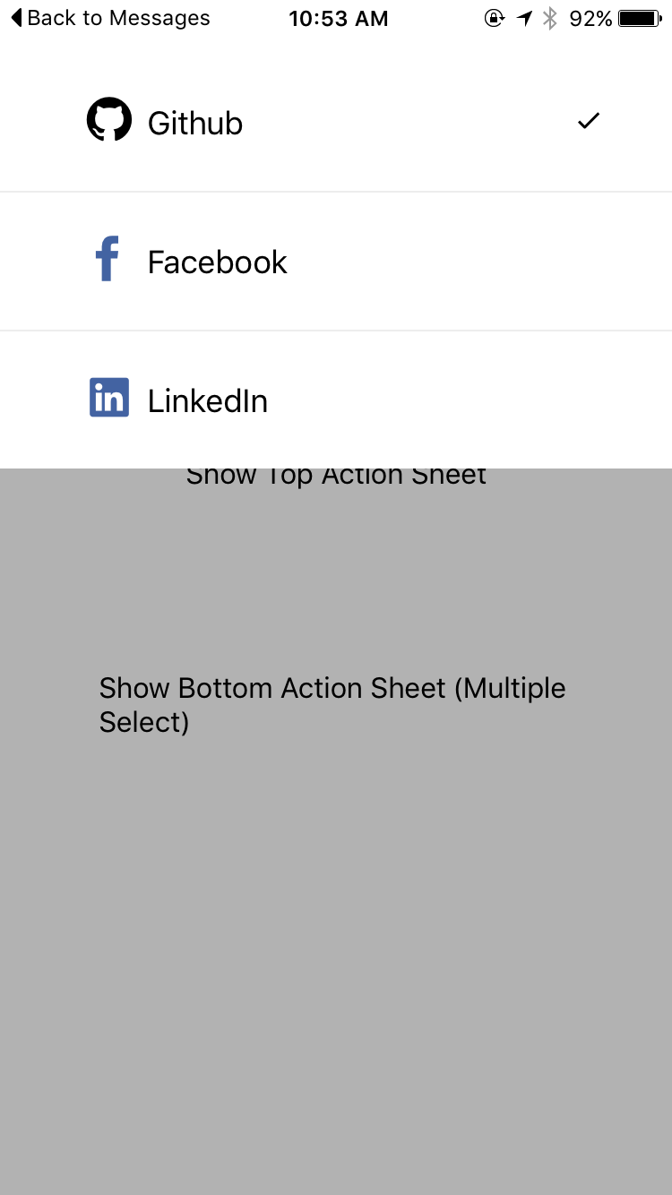
React Native Action Sheet Component for iOS & Android.
React Native Action Sheet Component for iOS & Android.
Pull request are welcomed. Please follow the Airbnb style guide Airbnb JavaScript


yarn add react-native-action-sheet-component
npm install --save react-native-action-sheet-component
ActionSheetManagerimport { EvilIcons, Ionicons } from '@exponent/vector-icons';
import ActionSheetManager { ActionSheet, ActionSheetItem } from 'react-native-action-sheet-component';
const actionSheetItems = [
  <ActionSheetItem
    key='item-1'
    text="Github"
    value="github"
    selectedIcon={checkedIcon}
    icon={
      <EvilIcons name="sc-github" size={42} />
    }
    onPress={this.onItemPress}
  />,
  <ActionSheetItem
    key='item-2'
    text="Facebook"
    value="facebook"
    selectedIcon={checkedIcon}
    icon={
      <EvilIcons name="sc-facebook" color="#4363A2" size={42} />
    }
    onPress={this.onItemPress}
  />,
];

const options = {
  defaultValue: ['github'],
  children: actionSheetItems,
  onChange: (value, index, selectedData) => {
  },
}
ActionSheetManager.show(options, () => {
  console.log('callback');
});
ActionSheetManager.update(options, () => {
  console.log('callback');
});
ActionSheetManager.hide(() => {
  console.log('callback');
});
ActionSheetimport { EvilIcons, Ionicons } from '@exponent/vector-icons';
import { ActionSheet, ActionSheetItem } from 'react-native-action-sheet-component';
class Example extends Component {
  constructor(props) {
    super(props) {

      this.state = {
        defaultSelectedValues: ['github'],
      }
    }
  }

  render() {
    return (
      <View style={{ flex: 1, alignItems: 'center', justifyContent: 'center' }}>
        <ActionSheet
          ref={(actionSheet) => { this.topActionSheet = actionSheet; }}
          position="top"
          onChange={this.onChange}
          defaultValue={this.state.defaultSelectedValues}
          multiple
        >
          <ActionSheetItem
            text="Github"
            value="github"
            selectedIcon={checkedIcon}
            icon={
              <EvilIcons name="sc-github" size={42} />
            }
            onPress={this.onItemPress}
          />
          <ActionSheetItem
            text="Facebook"
            value="facebook"
            selectedIcon={checkedIcon}
            icon={
              <EvilIcons name="sc-facebook" color="#4363A2" size={42} />
            }
            onPress={this.onItemPress}
          />
        </ActionSheet>
      </View>
    )
  }
}
actionSheet.show(() => {
  console.log('callback - show');
})
actionSheet.hide(() => {
  console.log('callback - hide');
})
| Prop | Type | Default | Note |
|---|---|---|---|
value? | any | null | |
defaultValue? | any | null | |
onShow? | Function | () => {} | |
onHide? | Function | () => {} | |
style? | any | null | |
onChange? | Function | () => {} | |
show? | boolean | false | |
showSelectedIcon? | boolean | true | |
multiple? | boolean | false | |
hideOnSelceted? | boolean | true | |
hideOnHardwareBackPress? | boolean | true | |
showSparator? | boolean | true | |
animationDuration? | number | 250 | |
overlayOpacity? | number | 0.3 | |
position? | string | top | |
maxHeight? | number | Dimensions.get('window').height / 2 | |
children? | any | null |
| Prop | Type | Default | Note |
|---|---|---|---|
text | any | null | |
icon? | any | null | |
index? | number | null | |
selectedIcon? | number | require('./img/checkmark.png') | |
selected? | boolean | false | |
showSelectedIcon? | boolean | true | |
onPress? | Function | () => {} | |
style? | any | null |
FAQs
React Native Action Sheet Component for iOS & Android.
The npm package react-native-action-sheet-component receives a total of 74 weekly downloads. As such, react-native-action-sheet-component popularity was classified as not popular.
We found that react-native-action-sheet-component demonstrated a not healthy version release cadence and project activity because the last version was released a year ago. It has 1 open source maintainer collaborating on the project.
Did you know?

Socket for GitHub automatically highlights issues in each pull request and monitors the health of all your open source dependencies. Discover the contents of your packages and block harmful activity before you install or update your dependencies.

Research
/Security News
A flawed sandbox in @nestjs/devtools-integration lets attackers run code on your machine via CSRF, leading to full Remote Code Execution (RCE).

Product
Customize license detection with Socket’s new license overlays: gain control, reduce noise, and handle edge cases with precision.

Product
Socket now supports Rust and Cargo, offering package search for all users and experimental SBOM generation for enterprise projects.