react-native-alert-notification
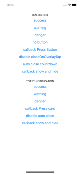
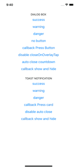
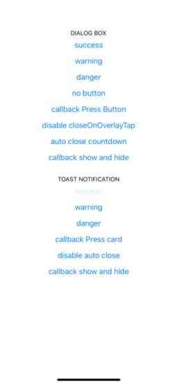
Example Dialog Box
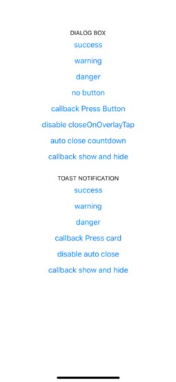
Example Toast Notification
Installation
- Installing:
yarn add react-native-alert-notification
- Installing dependencies:
yarn add react-native-safe-area-context

pod install
expo install react-native-safe-area-context
Usage
import { ALERT_TYPE, Dialog, AlertNotificationRoot, Toast } from 'react-native-alert-notification';

<AlertNotificationRoot>
  <View>
    // dialog box
    <Button
      title={'dialog box'}
      onPress={() =>
        Dialog.show({
          type: ALERT_TYPE.SUCCESS,
          title: 'Success',
          textBody: 'Congrats! this is dialog box success',
          button: 'close',
        })
      }
    />
    // toast notification
    <Button
      title={'toast notification'}
      onPress={() =>
        Toast.show({
          type: ALERT_TYPE.SUCCESS,
          title: 'Success',
          textBody: 'Congrats! this is toast notification success',
        })
      }
    />
  </View>
</AlertNotificationRoot>;
Documentation:
Root Component
A React node that will be most likely wrapping your whole app.
| theme | select theme light dark (by default is auto) | | auto | 'light','dark' |
| colors | custom colors | | | [IColors, IColors] |
| dialogConfig | config dialog box global | | | {closeOnOverlayTap:bool, autoClose:bool / number} |
| toastConfig | config toast global | | | {autoClose:bool / number, titleStyle?: StyleProp , textBodyStyle?: StyleProp} |
type IProps = {
dialogConfig?: Pick<IConfigDialog, 'closeOnOverlayTap' | 'autoClose'>;
toastConfig?: Pick<IConfigToast, 'autoClose' | 'titleStyle' | 'textBodyStyle'>;
theme?: 'light' | 'dark';
colors?: [IColors, IColors] ;
};
type IColors = {
label: string;
card: string;
overlay: string;
success: string;
danger: string;
warning: string;
};
Dialog Box Component
| title | The title text | | | String |
| type | Defines the type ("Success", "Warning" or "Error") | true | | "SUCCESS", "DANGER", "WARNING" |
| textBody | The text body | | | String |
| button | name button (for hide button: undefined) | | | String |
| autoClose | Defines time auto close dialog box in ms | | face | bool / number |
| closeOnOverlayTap | allow close if click in overlay | | true | bool |
| onPressButton | (if not declared and isset button action is close) | | String | () => void |
| onShow | action after end animation open | | | () => void |
| onHide | action after end animation close | | | () => void |
type IConfig = {
  type: ALERT_TYPE;
  title?: string;
  textBody?: string;
  button?: string;
  autoClose?: number | boolean;
  closeOnOverlayTap?: boolean;
  onPressButton?: () => void;
  onShow?: () => void;
  onHide?: () => void;
};
Toast Notification Component
| title | The title text | | | String |
| type | Defines the type ("Success", "Warning" or "Error") | | | "SUCCESS", "DANGER", "WARNING" |
| textBody | The text body | | | String |
| autoClose | Defines time auto close dialog box in ms | | 5000 | bool / number |
| onPress | action click in card | | | bool |
| onShow | event after end animation open | | | () => void |
| onHide | event after end animation close | | | () => void |
type IConfig = {
  type?: ALERT_TYPE;
  title?: string;
  textBody?: string;
  autoClose?: number | boolean;
  titleStyle?: StyleProp<TextStyle>;
  textBodyStyle?: StyleProp<TextStyle>;
  onPress?: () => void;
  onShow?: () => void;
  onHide?: () => void;
};
Dialog.hide();
Toast.hide();
Author
Rodolphe Jerez | https://codingbyjerez.com
See the contributing guide to learn how to contribute to the repository and the development workflow.
License
MIT