RadioInput Component
This package was created with the intention of simplifying the use of the radio components, it is the lightest functional radio among all libraries.
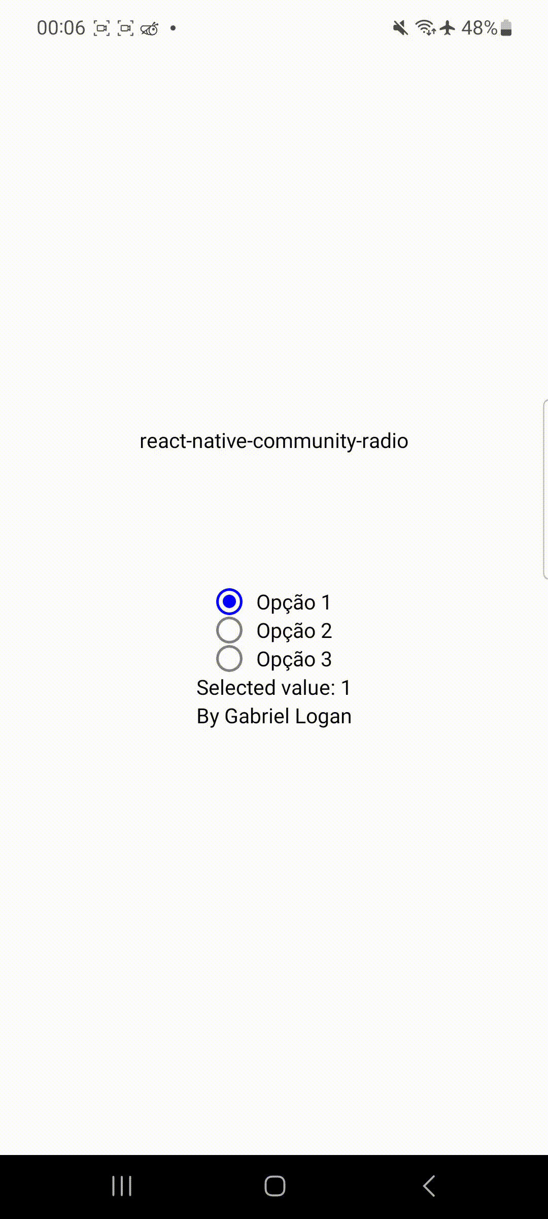
The radio component is a customizable radio component for React Native and Expo projects.
Installation
To use the radio component in your React Native project, follow these steps:
- Install the required dependencies by running the following command:
npm install react-native-community-radio
yarn add react-native-community-radio
- Import the
radio component in your desired file:
import RadioInput from 'react-native-community-radio';
Usage
Here's an example of how to use the radio component:
import React from "react";
import { StyleSheet, View } from "react-native";

import RadioInput from "react-native-community-radio";

export default function App() {
	const [selectedValue, setSelectedValue] = React.useState("");

	const options = [
		{ label: "Option 1", value: "1" },
		{ label: "Option 2", value: "2" },
		{ label: "Option 3", value: "3" },
	];

	const handleValueChange = (value: string) => {
		setSelectedValue(value);
	};

	return (
		<View style={styles.container}>
			<RadioInput
				options={options}
				selectedValue={selectedValue}
				onValueChange={handleValueChange}
			/>
		</View>
	);
}

const styles = StyleSheet.create({
	container: {
		flex: 1,
		backgroundColor: "#fff",
		alignItems: "center",
		justifyContent: "center",
	},
});
Customization
Optional !!!
<RadioInput
	options={options}
	selectedValue={selectedValue}
	onValueChange={handleValueChange}
	styles={{
		width: number,
		height: number,
		borderRadius: number,
		borderWidth: number,
		fillPercent: number
	}}
/>
You can customize the radio component by passing the following props:
type Styles = {
    width: number;
    height: number;
    borderRadius: number;
    borderWidth: number;
    fillPercent: number;
}