react-native-confirmation-code-field


A simple react-native confirmation code field compatible with iOS, Android.
Links
Component features:
- 🔮 Simple and tiny
3.8 KB. Easy to use;
- 🚀 React Compiler compatible;

- 🚮 Clearing part of the code by clicking on the cell;
- 🍎 Support "fast paste SMS-code" on iOS & Web. And custom code paste for Android;
- ⚡ TextInput
ref support;
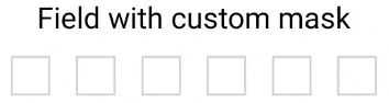
- 🛠 Highly customizable. Can be used as masked TextInput;
- 🤓 Readable changelog.
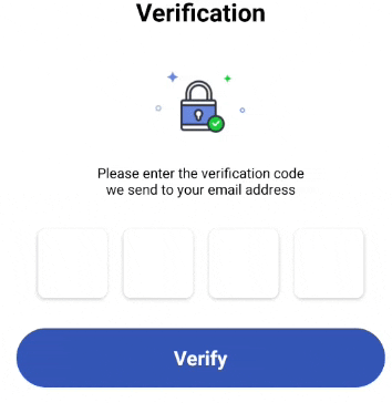
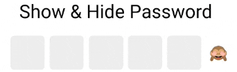
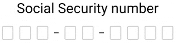
Screenshots
Install
yarn add react-native-confirmation-code-field
How it works
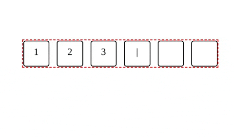
I use an invisible <TextInput/> component that will be stretched over <Cell/> components.
JSX structure looks like that:
<View style={rootStyle}>
<Cell>1</Cell>
<Cell>2</Cell>
<Cell>3</Cell>
<Cell>|</Cell>
<Cell></Cell>
<Cell></Cell>
<TextInput value="123"/>
</View>
It needs to solve next problems:
- When user pastes code from SMS on iOS issue#25
- Better UX when user types fast, or system sluggish, characters might lost when component switching focus between
<TextInput/>.
Basic example
I took a minimal implementation approach.
It mean that this component provides low-level functionality so you can create incredible UI without tears 😭.
I recommend you start with creating your own wrapper where you apply all styles and basic configuration.
You can use a ready-made solution out of the box:
import React, {useState} from 'react';
import {SafeAreaView, Text, StyleSheet, Platform} from 'react-native';
import type {TextInputProps} from 'react-native';
import {
CodeField,
Cursor,
useBlurOnFulfill,
useClearByFocusCell,
} from 'react-native-confirmation-code-field';
const styles = StyleSheet.create({
root: {flex: 1, padding: 20},
title: {textAlign: 'center', fontSize: 30},
codeFieldRoot: {marginTop: 20},
cell: {
width: 40,
height: 40,
lineHeight: 38,
fontSize: 24,
borderWidth: 2,
borderColor: '#00000030',
textAlign: 'center',
color: '#000',
},
focusCell: {
borderColor: '#000',
},
});
const CELL_COUNT = 6;
const autoComplete = Platform.select<TextInputProps['autoComplete']>({
android: 'sms-otp',
default: 'one-time-code',
});
function App() {
const [value, setValue] = useState('');
const ref = useBlurOnFulfill({value, cellCount: CELL_COUNT});
const [props, getCellOnLayoutHandler] = useClearByFocusCell({
value,
setValue,
});
return (
<SafeAreaView style={styles.root}>
<Text style={styles.title}>Verification</Text>
<CodeField
ref={ref}
{...props}
// Use `caretHidden={false}` when users can't paste a text value, because context menu doesn't appear
value={value}
onChangeText={setValue}
cellCount={CELL_COUNT}
rootStyle={styles.codeFieldRoot}
keyboardType="number-pad"
textContentType="oneTimeCode"
autoComplete={autoComplete}
testID="my-code-input"
renderCell={({index, symbol, isFocused}) => (
<Text
key={index}
style={[styles.cell, isFocused && styles.focusCell]}
onLayout={getCellOnLayoutHandler(index)}>
{symbol || (isFocused && <Cursor />)}
</Text>
)}
/>
</SafeAreaView>
);
};
export default App;
Compatibility
For react-native@0.63.x and below use yarn add react-native-confirmation-code-field@6, otherwise use the latest version yarn add react-native-confirmation-code-field