
Product
Socket for Jira Is Now Available
Socket for Jira lets teams turn alerts into Jira tickets with manual creation, automated ticketing rules, and two-way sync.
By Jeppe Hasseriis - Apr 20, 2026
react-native-dialog
Advanced tools
A flexible pure JavaScript React-Native dialog that follows closely the native UI guidelines.
Install the library using npm or yarn:
# Using npm:
$ npm install react-native-dialog
# Using yarn:
$ yarn add react-native-dialog
React-native-dialog exposes a set of components that can be used to build the UI of the dialog:
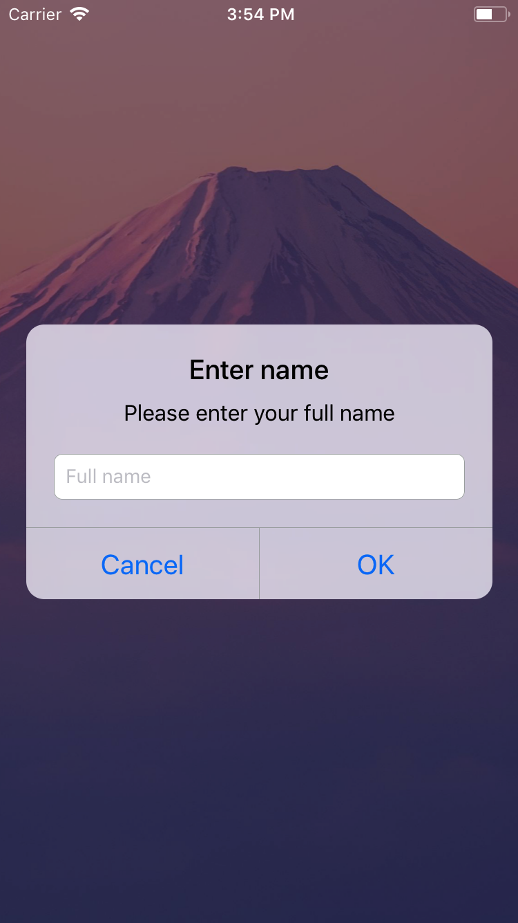
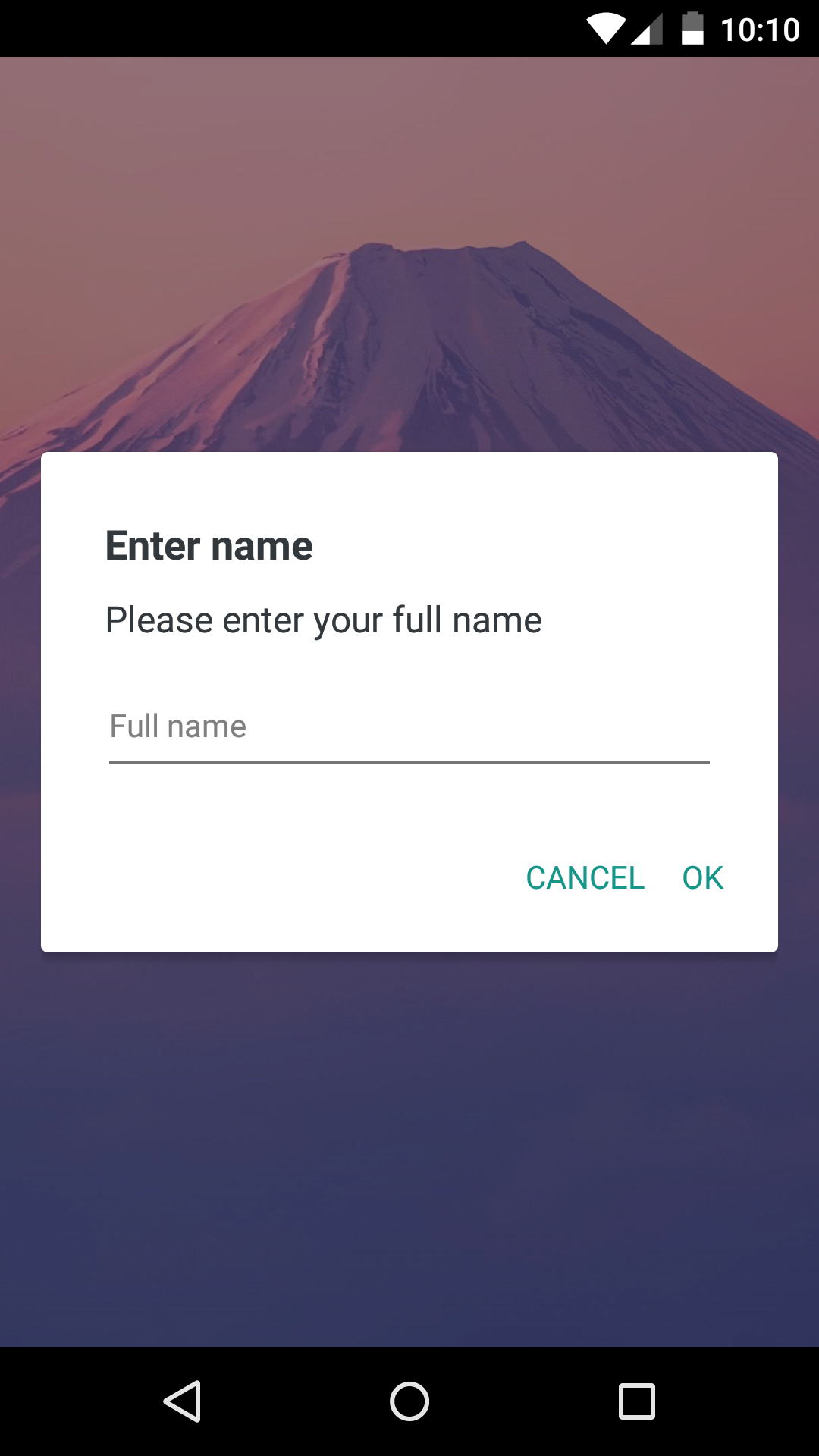
Text component styled as a native dialog title.Text component styled as a native dialog description.TextInput component styled as a native dialog input.TextInput component styled as one time code input.Switch component with an optional label.import Dialog from "react-native-dialog";
return (
<View>
<Dialog.Container>
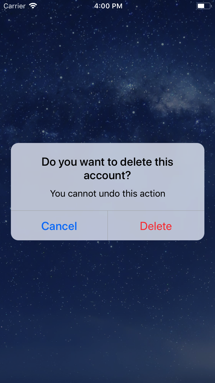
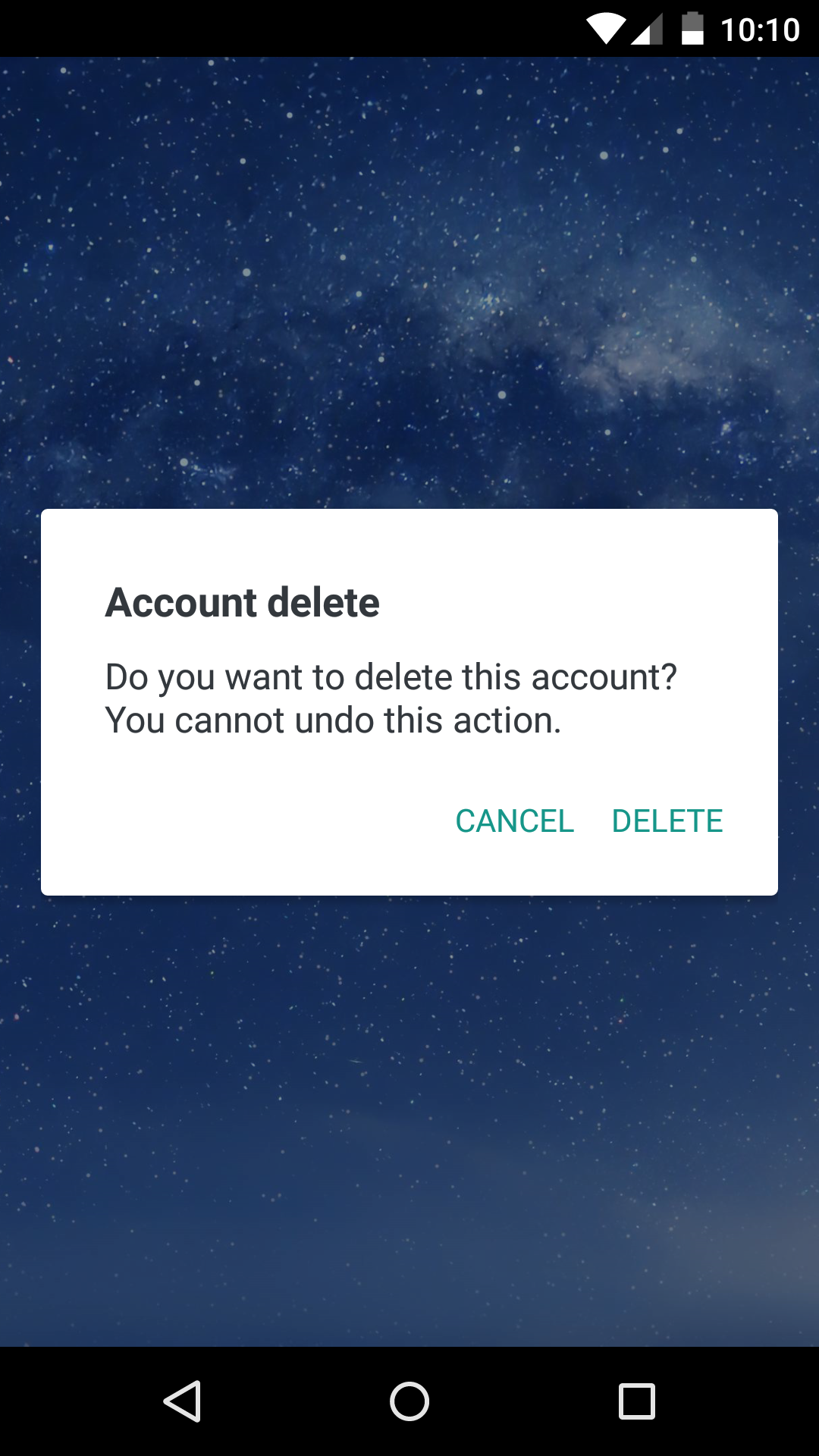
<Dialog.Title>Account delete</Dialog.Title>
<Dialog.Description>
Do you want to delete this account? You cannot undo this action.
</Dialog.Description>
<Dialog.Button label="Cancel" />
<Dialog.Button label="Delete" />
</Dialog.Container>
</View>
);
visible prop to true:return (
<View>
<Dialog.Container visible={true}>
<Dialog.Title>Account delete</Dialog.Title>
<Dialog.Description>
Do you want to delete this account? You cannot undo this action.
</Dialog.Description>
<Dialog.Button label="Cancel" />
<Dialog.Button label="Delete" />
</Dialog.Container>
</View>
);
The visible prop is the only prop you'll really need to make the dialog work: you should control this prop value by saving it in your state and setting it to true or false when needed.
The following example consists in a component (DialogTester) with a button and a dialog.
The dialog is controlled by the dialogVisible state variable and it is initially hidden since its value is false.
Pressing the button sets dialogVisible to true, making the dialog visible.
Inside the dialog there are two buttons that, when pressed, set dialogVisible to false, hiding the dialog.
import React, { useState } from "react";
import { Button, StyleSheet, View } from "react-native";
import Dialog from "react-native-dialog";

export default function App() {
  const [visible, setVisible] = useState(false);

  const showDialog = () => {
    setVisible(true);
  };

  const handleCancel = () => {
    setVisible(false);
  };

  const handleDelete = () => {
    // The user has pressed the "Delete" button, so here you can do your own logic.
    // ...Your logic
    setVisible(false);
  };

  return (
    <View style={styles.container}>
      <Button title="Show dialog" onPress={showDialog} />
      <Dialog.Container visible={visible}>
        <Dialog.Title>Account delete</Dialog.Title>
        <Dialog.Description>
          Do you want to delete this account? You cannot undo this action.
        </Dialog.Description>
        <Dialog.Button label="Cancel" onPress={handleCancel} />
        <Dialog.Button label="Delete" onPress={handleDelete} />
      </Dialog.Container>
    </View>
  );
}

const styles = StyleSheet.create({
  container: {
    flex: 1,
    backgroundColor: "#fff",
    alignItems: "center",
    justifyContent: "center",
  },
});
| Name | Type | Default | Description |
|---|---|---|---|
| label | string | REQUIRED | The label text |
| color | string | #007ff9 on iOS, #169689 on Android | The label color |
| bold | bool | false | Show the label with a bold font weight? |
| disabled | bool | false | Disable the button? |
| onPress | func | REQUIRED | Called when the button is pressed |
| Name | Type | Default | Description |
|---|---|---|---|
| children | string | REQUIRED | The description text |
| Name | Type | Default | Description |
|---|---|---|---|
| blurComponentIOS | node | A low-opacity | The blur component used in iOS |
| visible | bool | REQUIRED | Show the dialog? |
| children | node | REQUIRED | The dialog content |
| contentStyle | any | undefined | Extra style applied to the dialog content |
| headerStyle | any | undefined | Extra style applied to the dialog header |
| footerStyle | any | undefined | Extra style applied to the dialog footer |
| buttonSeparatorStyle | any | undefined | Extra style applied to the dialog button separator |
| onBackdropPress | func | undefined | Callback invoked when the backdrop is pressed |
| onRequestClose | func | undefined | Callback invoked when the hardware back button on Android or the menu button on Apple TV is pressed |
| keyboardVerticalOffset | number | undefined | keyboardVerticalOffset for iOS |
| verticalButtons | bool | false | Renders button vertically |
| useNativeDriver | bool | false | Defines if animations should use native driver |
| Name | Type | Default | Description |
|---|---|---|---|
| label | string | undefined | The input floating label |
| wrapperStyle | any | undefined | The style applied to the input wrapper View |
| textInputRef | ref | undefined | Ref to the input |
| unstableLabelStyle | any | undefined | Likely to be removed in a future version. See issue #141 for discussion |
Dialog.Input also accepts all the React-Native's TextInput component props.
| Name | Type | Default | Description |
|---|---|---|---|
| wrapperStyle | any | undefined | The style applied to the input wrapper View |
| digitContainerStyle | any | undefined | The style applied to the digit container View |
| digitContainerFocusedStyle | any | undefined | The style applied to the digit container View when in focus |
| digitStyle | any | undefined | The style applied to the digit text |
| codeLength | number | 4 | The total number of digits |
| onCodeChange | func | undefined | Called when the input changed |
Dialog.CodeInput also accepts all the React-Native's TextInput component props.
| Name | Type | Default | Description |
|---|---|---|---|
| children | string | REQUIRED | The title text |
Dialog.Title also accepts all the React-Native's Text component props.
| Name | Type | Default | Description |
|---|---|---|---|
| label | string | undefined | The switch description text |
| unstableLabelStyle | any | undefined | Likely to be removed in a future version. See issue #141 for discussion |
Dialog.Switch also accepts all the React-Native's Switch component props.
To achieve a look even closer to the native iOS dialog you can provide your own component in the blurComponentIOS prop of a Dialog.Container and it will be injected in the dialog to be used as a background.
The blurComponentIOS can be useful for example if you want to apply a native blur effect to the dialog.
Here is an example using react-native-blur:
const blurComponentIOS = (
  <BlurView style={StyleSheet.absoluteFill} blurType="xlight" blurAmount={50} />
);
return (
  <View style={styles.container}>
    <Dialog.Container visible={visible} blurComponentIOS={blurComponentIOS}>
      <Dialog.Title>Account delete</Dialog.Title>
      <Dialog.Description>
        Do you want to delete this account? You cannot undo this action.
      </Dialog.Description>
      <Dialog.Button label="Cancel" onPress={handleCancel} />
      <Dialog.Button label="Delete" onPress={handleConfirm} />
    </Dialog.Container>
  </View>
);
react-native-dialog uses a thin abstraction on top of the React-Native's modal component. Any properties you add to Dialog.Container are mapped through to the modal.
The modal has an onBackdropPress property that can be used to register clicks on the backdrop.
Below is an example of how you can close the dialog by tapping outside.
const [visible, setVisible] = useState(true);

const handleCancel = () => {
  setVisible(false);
};

return (
  <Dialog.Container visible={visible} onBackdropPress={handleCancel}>
    <Dialog.Title>Title</Dialog.Title>
    <Dialog.Button label="Cancel" onPress={handleCancel} />
  </Dialog.Container>
);
Thanks to the user @honaf who has kindly offered the react-native-dialog namespace.
Also thanks to the user @leecade who offered the namespace react-native-alert (which has not been used since "Dialog" seems to suit better this component) and to @tyxou for the entire codebase refactoring to hooks.
FAQs
A flexible react-native dialog
The npm package react-native-dialog receives a total of 18,505 weekly downloads. As such, react-native-dialog popularity was classified as popular.
We found that react-native-dialog demonstrated a not healthy version release cadence and project activity because the last version was released a year ago. It has 1 open source maintainer collaborating on the project.
Did you know?

Socket for GitHub automatically highlights issues in each pull request and monitors the health of all your open source dependencies. Discover the contents of your packages and block harmful activity before you install or update your dependencies.
Product
Socket for Jira lets teams turn alerts into Jira tickets with manual creation, automated ticketing rules, and two-way sync.

Company News
Socket won two 2026 Reppy Awards from RepVue, ranking in the top 5% of all sales orgs. AE Alexandra Lister shares what it's like to grow a sales career here.

Security News
NIST will stop enriching most CVEs under a new risk-based model, narrowing the NVD's scope as vulnerability submissions continue to surge.