Security News
Deno 2.4 Brings Back deno bundle, Improves Dependency Management and Observability
Deno 2.4 brings back bundling, improves dependency updates and telemetry, and makes the runtime more practical for real-world JavaScript projects.
react-native-dialog-component
Advanced tools
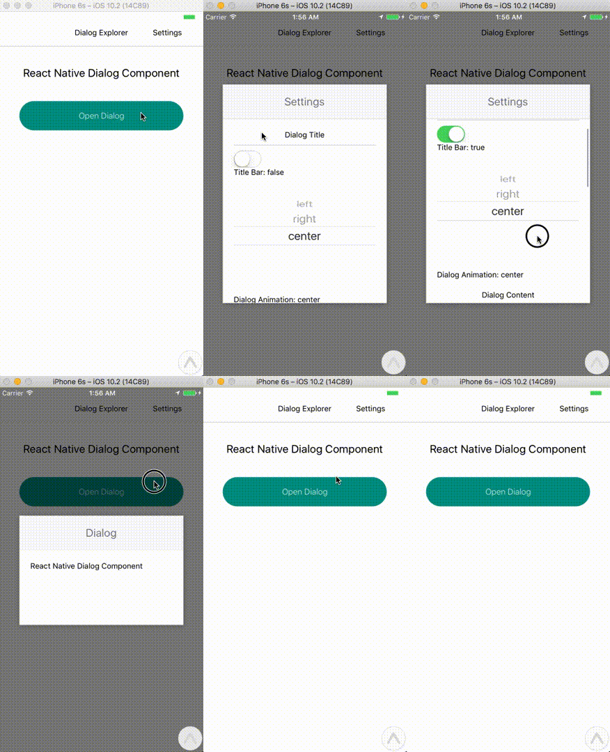
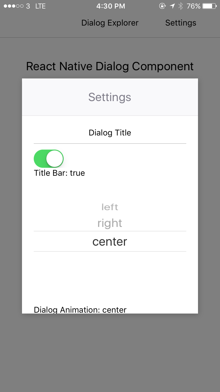
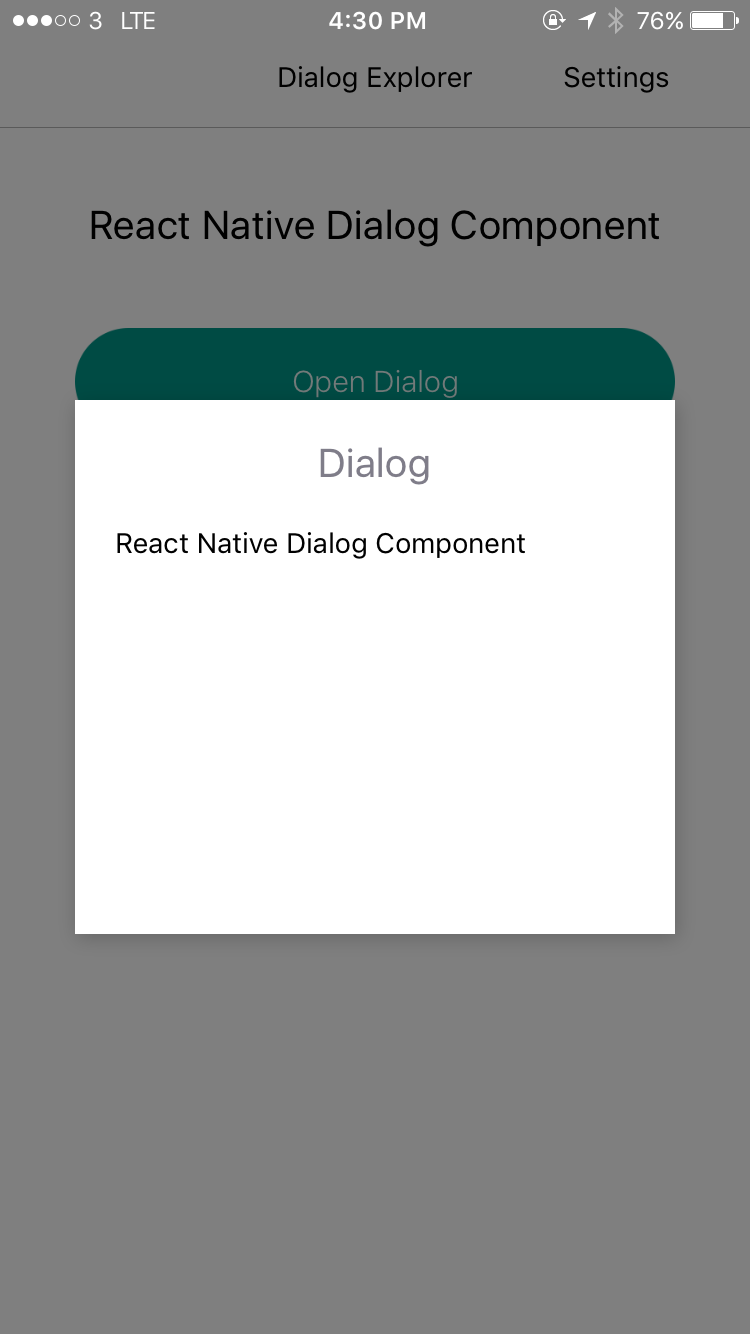
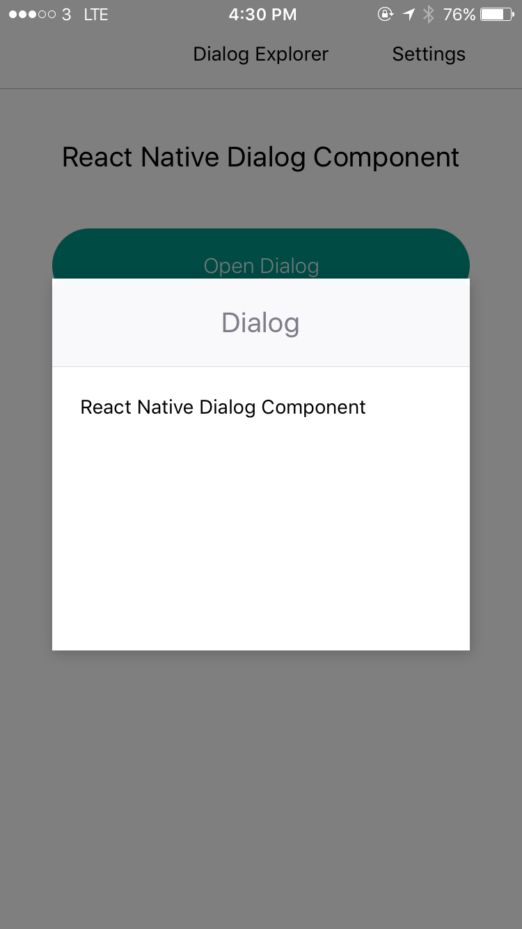
React Native Dialog Component for iOS & Android.
Pull request are welcomed. Please follow Airbnb JS Style Guide


npm install --save react-native-dialog-component
# OR
yarn add react-native-dialog-component
DialogManagerimport DialogManager, { ScaleAnimation, DialogContent } from 'react-native-dialog-component';
DialogManager.show({
  title: 'Dialog',
  titleAlign: 'center',
  animationDuration: 200,
  ScaleAnimation: new ScaleAnimation(),
  children: (
    <DialogContent>
      <View>
        <Text>
          React Native Dialog Component
        </Text>
      </View>
    </DialogContent>
  ),
}, () => {
  console.log('callback - show');
});
DialogManager.update({
  title: 'Dialog Updated',
  titleAlign: 'center',
  animationDuration: 200,
  ScaleAnimation: new ScaleAnimation(),
  children: (
    <DialogContent>
      <View>
        <Text>
          New Content
        </Text>
      </View>
    </DialogContent>
  ),
}, () => {
  console.log('callback - update dialog');
});
// dismiss dialog
DialogManager.dismiss(() => {
  console.log('callback - dismiss');
});
DialogManager.dismissAll(() => {
  console.log('callback - dismiss all');
});
DialogComponentimport { DialogComponent }from 'react-native-dialog-component';
<View style={styles.container}>
<Button
text="Show Dialog"
onPress={() => {
this.dialogComponent.show();
}}
/>
<DialogComponent
ref={(dialogComponent) => { this.dialogComponent = dialogComponent; }}
>
<View>
<Text>Hello</Text>
</View>
</DialogComponent>
</View>
import { DialogComponent, SlideAnimation } from 'react-native-dialog-component';

<View style={styles.container}>
  <Button
    text="Show Dialog"
    onPress={() => {
      this.dialogComponent.show();
    }}
  />
  <DialogComponent
    ref={(dialogComponent) => { this.dialogComponent = dialogComponent; }}
    dialogAnimation = { new SlideAnimation({ slideFrom: 'bottom' }) }
  >
    <View>
      <Text>Hello</Text>
    </View>
  </DialogComponent>
</View>
import { DialogComponent, DialogTitle } from 'react-native-dialog-component';

<View style={styles.container}>
  <Button
    text="Show Dialog"
    onPress={() => {
      this.dialogComponent.show();
    }}
  />
  <DialogComponent
    dialogTitle={<DialogTitle title="Dialog Title" />}
    ref={(dialogComponent) => { this.dialogComponent = dialogComponent; }}
  >
    <DialogContent>
      <View>
        <Text>Hello</Text>
      </View>
    </DialogContent>
  </DialogComponent>
</View>
| Prop | Type | Default | Note |
|---|---|---|---|
dialogTitle | React Element | You can pass a DialogTitle component or pass a View for customizing titlebar | |
width | Number | Your device width | The Width of Dialog, you can use fixed width or use percentage |
height | Number | 300 | The Width of Dialog, you can use fixed height or use percentage |
dialogAnimation | FadeAnimation | animation for dialog | |
dialogStyle | Object or Number | ||
animationDuration | Number | 200 | |
overlayPointerEvents | String | Available option: auto, none | |
overlayBackgroundColor | String | #000 | |
overlayOpacity | Number | 0.5 | |
dismissOnTouchOutside | Bool | true | When touch overlay will close dialog, but if haveOverlay is false then the dismissOnTouchOutside won't work |
dismissOnHardwareBackPress | Bool | true | Only for Android |
haveOverlay | Bool | true | If false won't show overlay when dialog show |
show | Bool | false | |
onShown | Function | You can pass onShown function as a aallback function, will call the function while dialog shown | |
onDismissed | Function | You can pass onDismissed function as a callback function, will call the function while dialog dismissed | |
actions | Array | Array of DialogButton component for example: [<DialogButton text="DISMISS", align="center" onPress={this.dismissDialog}/>] |
| Prop | Type | Default | Note |
|---|---|---|---|
contentStyle | Dialog's content container |
| Prop | Type | Default | Note |
|---|---|---|---|
title | String | ||
titleStyle | Object or Number | ||
titleTextStyle | Object or Number | ||
titleAlign | String | center | |
haveTitleBar | Bool | true |
| Prop | Type | Default | Note |
|---|---|---|---|
text | String | ||
align | String | center | The position of the button. Available option: left, center, right |
onPress | Function | ||
buttonStyle | Object or Number | ||
textStyle | Object or Number | ||
textContainerStyle | Object or Number | ||
disabled | Boolean | false | |
activeOpacity | Number |
| Param | Type | Default | Note |
|---|---|---|---|
toValue | Number | 0 | |
animationDuration | Number | 150 |
| Param | Type | Default | Note |
|---|---|---|---|
toValue | Number | 0 |
| Param | Type | Default | Note |
|---|---|---|---|
toValue | Number | 0 | |
slideFrom | String | bottom | Available option: top, bottom, left, right |
FAQs
React Native Dialog Component for IOS & Android.
The npm package react-native-dialog-component receives a total of 47 weekly downloads. As such, react-native-dialog-component popularity was classified as not popular.
We found that react-native-dialog-component demonstrated a not healthy version release cadence and project activity because the last version was released a year ago. It has 1 open source maintainer collaborating on the project.
Did you know?

Socket for GitHub automatically highlights issues in each pull request and monitors the health of all your open source dependencies. Discover the contents of your packages and block harmful activity before you install or update your dependencies.

Security News
Deno 2.4 brings back bundling, improves dependency updates and telemetry, and makes the runtime more practical for real-world JavaScript projects.

Security News
CVEForecast.org uses machine learning to project a record-breaking surge in vulnerability disclosures in 2025.

Security News
Browserslist-rs now uses static data to reduce binary size by over 1MB, improving memory use and performance for Rust-based frontend tools.