
Product
Introducing GitHub Actions Scanning Support
Detect malware, unsafe data flows, and license issues in GitHub Actions with Socket’s new workflow scanning support.
By Rakesh Chatrath, Greg Tystahl - Oct 23, 2025
react-native-dropdown-with-search-and-checkbox
Advanced tools
A React Native dropdown with search and checkbox functionality
A customizable React Native dropdown component featuring search functionality and checkbox selection (single & multiple). Ideal for creating dynamic, user-friendly dropdowns in your mobile applications.
Install the package using npm:
npm install react-native-dropdown-with-search-and-checkbox
Additionally, make sure to install the required dependencies:
npm install react-native-elements react-native-vector-icons
For React Native versions below 0.60, link react-native-vector-icons manually:
npx react-native link react-native-vector-icons
To use the dropdown in your React Native app, follow the example below:
import React, { useState } from 'react';
import { View, Text } from 'react-native';
import { DropdownSearch } from 'react-native-dropdown-with-search-and-checkbox';

const App = () => {
  const [selectedItems, setSelectedItems] = useState([]);

  const data = [
    { label: 'Apple', value: 'apple' },
    { label: 'Banana', value: 'banana' },
    { label: 'Mango', value: 'mango' },
  ];

  return (
    <View style={{ flex: 1, justifyContent: 'center' }}>
      <Text>Select Fruits</Text>
      <DropdownSearch
        label="Fruits"
        data={data}
        placeholder="Select fruits"
        multiSelect={true}
        showCheckbox="multiple"
        showFilter={true}
        onSelect={(items) => setSelectedItems(items)}
      />
    </View>
  );
};

export default App;
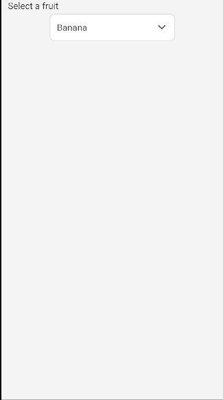
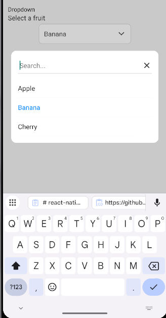
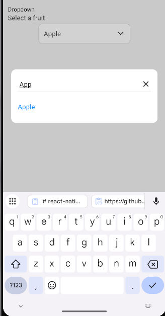
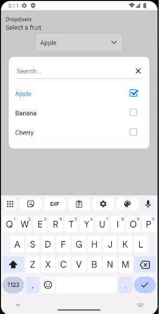
Example 1 Search with Single Select :
| Prop | Type | Default | Description |
|---|---|---|---|
data | array | [] | List of items to display in the dropdown |
onSelect | func | required | Callback function to handle selected items |
label | string | '' | Label displayed above the dropdown |
placeholder | string | 'Select...' | Placeholder text displayed when no selection is made |
labelKey | string | 'label' | The key name to access the label in each data item |
valueKey | string | 'value' | The key name to access the value in each data item |
multiSelect | bool | false | Enables or disables multiple selection |
showCheckbox | string | null | Set to 'multiple' to display checkboxes for multiple selection |
showFilter | bool | false | Shows the filter icon and search input |
saveButtonText | string | 'Save' | Text for the Save button when multiple items are selected |
placeholderStyle | object | {} | Custom styling for the placeholder text |
downArrowStyle | object | {} | Custom styling for the dropdown arrow icon |
filterIconStyle | object | {} | Custom styling for the filter icon |
searchInputStyle | object | {} | Custom styling for the search input |
dropdownButtonStyle | object | {} | Custom styling for the dropdown button |
checkboxStyle | object | {} | Custom styling for the checkbox |
checkboxColor | string | '#007bff' | Color for the checkbox |
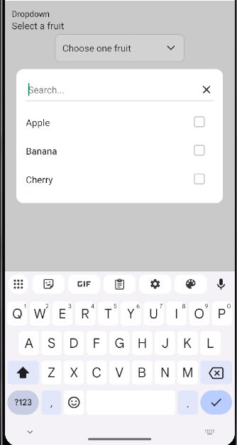
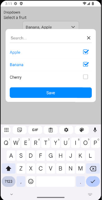
Example 2 Search with Multiple Select :
import React, { useState } from 'react';
import { View, Text } from 'react-native';
import { DropdownSearch } from 'react-native-dropdown-with-search-and-checkbox';

const MultiSelectExample = () => {
  const [selectedItems, setSelectedItems] = useState([]);

  const data = [
    { label: 'Apple', value: 'apple' },
    { label: 'Banana', value: 'banana' },
    { label: 'Mango', value: 'mango' },
  ];

  return (
    <View style={{ flex: 1, justifyContent: 'center' }}>
      <Text>Multi-select Fruits</Text>
      <DropdownSearch
        label="Fruits"
        data={data}
        placeholder="Select fruits"
        multiSelect={true}
        showCheckbox="multiple"
        onSelect={(items) => setSelectedItems(items)}
      />
      <Text>Selected: {selectedItems.map(item => item.label).join(', ')}</Text>
    </View>
  );
};

export default MultiSelectExample;
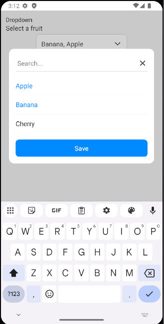
Example 3 Search with Multi Select :
MIT
Bhumit Dara
FAQs
A React Native dropdown with search and checkbox functionality
We found that react-native-dropdown-with-search-and-checkbox demonstrated a healthy version release cadence and project activity because the last version was released less than a year ago. It has 1 open source maintainer collaborating on the project.
Did you know?

Socket for GitHub automatically highlights issues in each pull request and monitors the health of all your open source dependencies. Discover the contents of your packages and block harmful activity before you install or update your dependencies.
Product
Detect malware, unsafe data flows, and license issues in GitHub Actions with Socket’s new workflow scanning support.

Product
Add real-time Socket webhook events to your workflows to automatically receive pull request scan results and security alerts in real time.

Research
The Socket Threat Research Team uncovered malicious NuGet packages typosquatting the popular Nethereum project to steal wallet keys.