react-native-dynamic-picker
I am sorry that my English is not very good.But I will try.
The README.md may be out of date in npmjs.com.
Please view README.md in github.
点击可查看简体中文版
Introduction
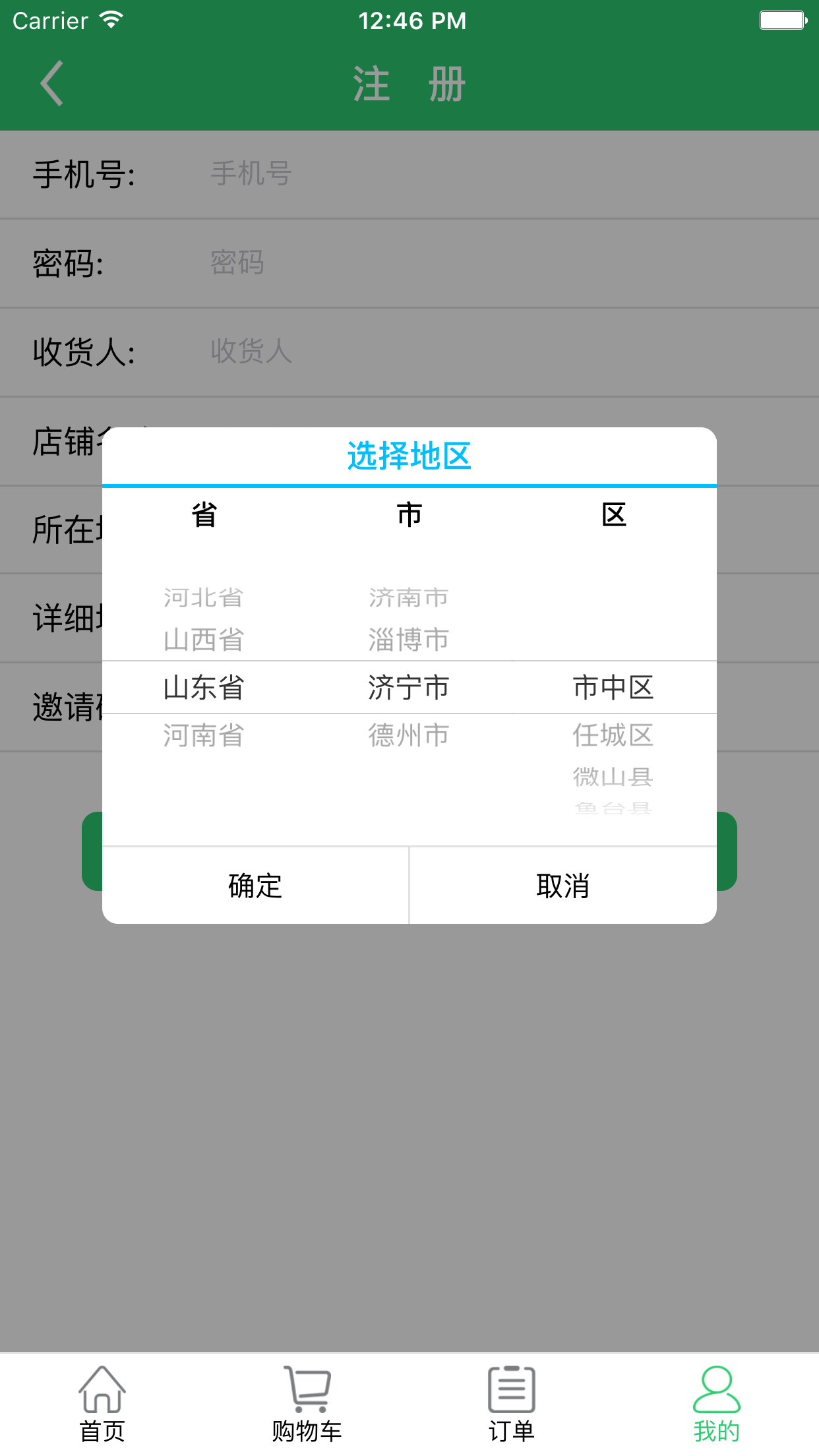
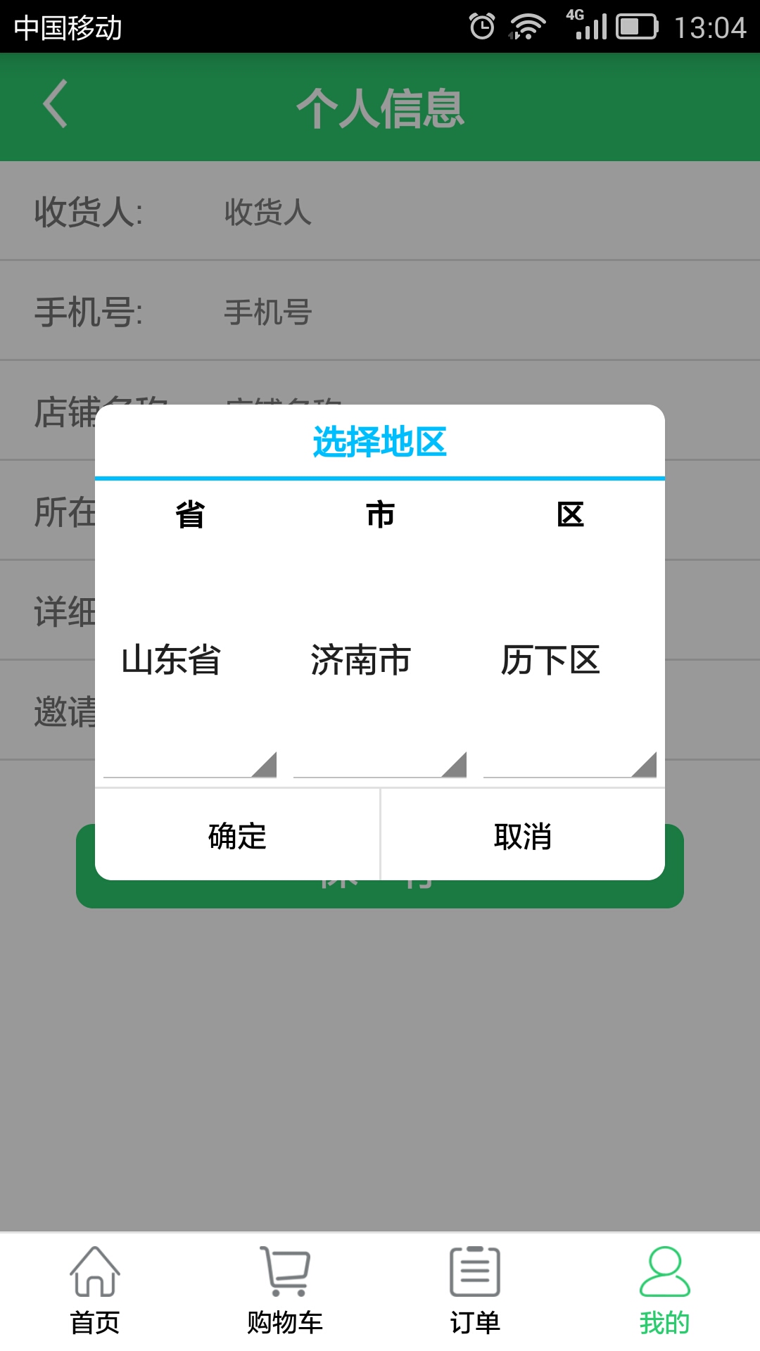
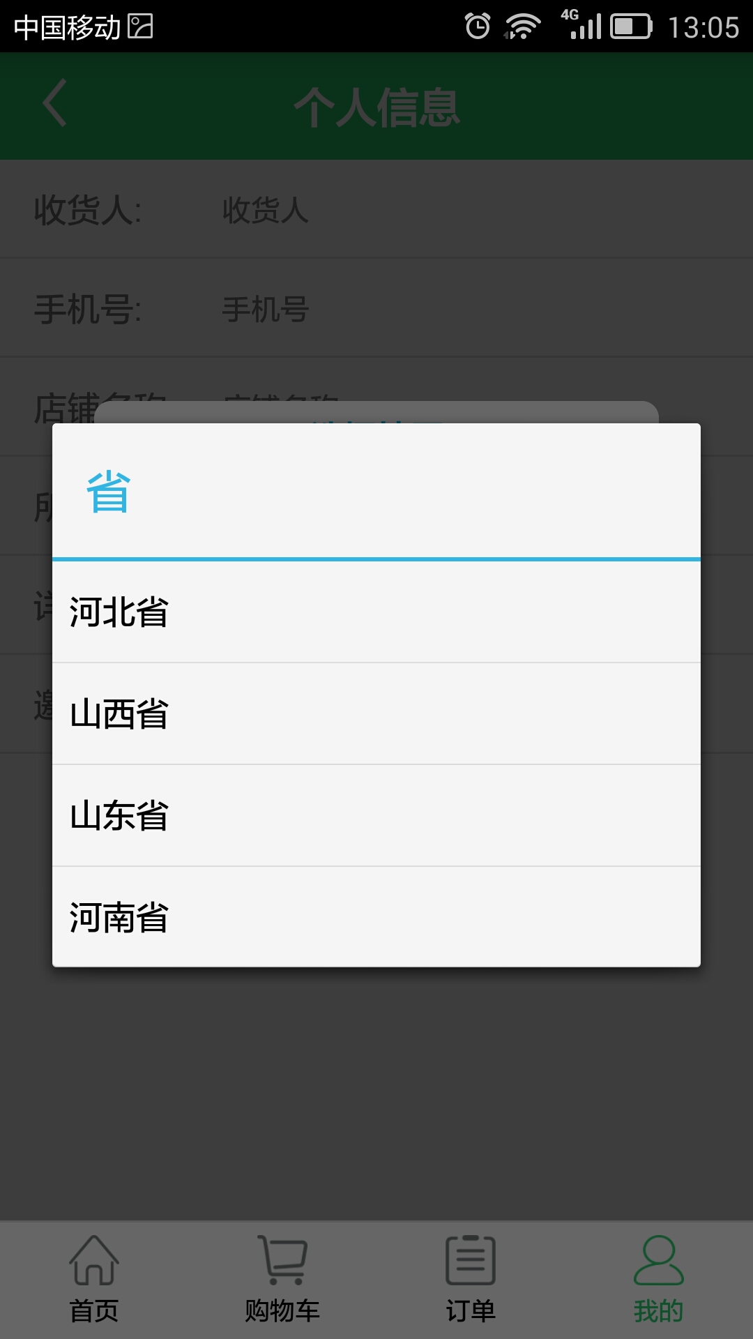
Based on Picker of react-native.Support multi-level linkage,like Province-City-District.
The package includes DateTimePicker Component,the Component Extended from react-native-dynamic-picker,it can be used to pick “year-month-day-hour-minute-second”.
note:the Picker represents react-native-dynamic-picker in the following,unless otherwise stated.
IOS Demo Screenshot: click to view
Android Demo Screenshot: click to view click to view
Install
lastest version: 1.0.6
npm install --save react-native-dynamic-picker
Example
import * as React from 'react';
import { StyleSheet, View } from 'react-native';
import { Picker, DateTimePicker } from 'react-native-dynamic-picker';

export default class Example extends React.Component {
	componentDidMount(){
		this.refs['Picker'].showPicker(true);
		this.refs['DynamicPicker'].showPicker(true);
		this.refs['DateTimePicker'].showPicker(true);
	}
    render() {
        return (
            <View style={styles.container}>
                <Picker ref='Picker' data={this.props.list} title='Picker' branchTitles={['Options']} />
                <Picker ref='DynamicPicker' isDynamic={true}  data={this.props.areaList} title='Pick Area' branchTitles={['Country', 'City', 'District']} />
                <DateTimePicker ref='DateTimePicker' title='Pick Date' type={DateTimePicker.type.date} />
            </View >
        )
    }
}

const styles = StyleSheet.create({
    container: {
        flex: 1,
        flexDirection: 'column'
    }
	})
Show And Hide
this.refs['Picker'].showPicker(true);
this.refs['Picker'].showPicker(false);
data Description:
when isDynamic is true
data is a "item List"(like [item,item,item...]) ,the List‘lable will display on first column of Picker ,

the data structure of item :
    {
        value: string, //value
        lable: string,  //display text
        children: item[]  //children item
        mustGetNewChildrenEveryTime: boolean //Whether to update children every time when you set "getChildrenFuns" (see Picker Parameters).defaultValue is false
	}

data example:
[
	{
		value:'100',
		lable:'China',
		children:[
					{
						value:'110',
						lable:'Beijing',
						children:[
									{
										value:'111',
										lable:'Chaoyang',
										children:undefined
									},
									{
										value:'112',
										lable:'Haidian',
										children:undefined
									}
								]
					},
					 {
						value:'120',
						lable:'Shanghai',
						children:...
					}
				]
	},
	{
		value: '200',
		lable: 'USA',
		children: ...
  	},
	...
]
when isDynamic is false
data is a Two-dimensional array (like [[item,item...],[item,item...],[item,item...],...]),
one column bind one [item,item...]

the data structure of item:
			 {
                    value: string, //value
                    lable: string,  //display text
			}

data example:
		[
			[
			     {
				 	value:'00',
					lable:'00 hour'
				 },
				 {
				 	value:'01',
					lable:'01 hour'
				 },
				 {
				 	value:'02',
					lable:'02 hour'
				 },
				 ...
			],
			[
			     {
				 	value:'00',
					lable:'00 minute'
				 },
				 {
				 	value:'01',
					lable:'01 minute'
				 },
				 {
				 	value:'02',
					lable:'02 minute'
				 },
				 ...
			]
		]
how to use DateTimePicker
The package includes 'DateTimePicker' Component,the Component Extended from 'react-native-dynamic-picker'.
It can be used to pick “year-month-day-hour-minute-second”.
Set the 'type' to change the mode of DateTimePicker.

type can set from one of 'DateTimePicker.type'

DateTimePicker.type=
 {
    datetime,
    date,
    year_month,
    month_day_time,
    month_day,
    day_time,
    time
}
Picker Parameters
note: only data is Required.
| isDynamic | is dynamic | boolean | default:false.The advice is always explicit set isDynamic. |
| data | data | [item,item,...] or [[item,item...],[item,item...],...] | The structure of the data depends on isDynamic.Please see Example |
| title | title | string | |
| titleStyle | style of the title | TextStyle | |
| branchTitles | every column's title | string List | like ['Country', 'City', 'District'] |
| branchTitleStyle | style of branchTitles | TextStyle List or TextStyle | Incoming List to control every branchTitle,or incoming one TextStyle to control all branchTitles |
| branchPickersStyles | style of react-native's Picker | ViewStyle List or ViewStyle | Incoming List to control every react-native's Picker,or incoming one ViewStyle to control all react-native's Pickers.See details from react-native document |
| branchPickersItemStyles(only IOS) | style of react-native's 'Picker.Item' | TextStyle List or TextStyle | only IOS |
| topInfoStyle | style of top prompt | TextStyle | |
| topInfoCreateFun | a function to create top prompt | function | when selected item has changed,the function will be called. The function can get a parameter, selectItems,it's the all of selected items now.The function must return a string like:Now Date:2011-1-1. |
| buttonStyle | style of bottom's button | TextStyle | |
| okButtonText | text of okButton | string | default:'确定' |
| cancelButtonText | text of cancelButton | string | default:'取消' |
| okCallBack | okCallBack | function | tow Parameters: selectValues and selectItems |
| cancelCallBack | cancelCallBack | function | tow Parameters: selectValues and selectItems |
| colunmMax | max colunm of one row | number | default:3 Max react-native's Picker of one row |
| defaultSelectValues | defaultSelectValues | string List | Set selected values when Picker init |
| defaultValueButtonShow | show 'DefaultValue' button | boolean | if you set the getDefaultSelectValuesFun,when you tap 'DefaultValue' button,there will call getDefaultSelectValuesFun and the selected items will change to the return values,else,the selected items will change to defaultSelectValues |
| defaultValueButtonText | text of 'DefaultValue' button | string | default:'默认值' |
| getDefaultSelectValuesFun | callback function of DefaultValue button | function | the getDefaultSelectValuesFun must return a Values List |
| pressMaskLayerToHide | press MaskLayer to hide Picker | boolean | default:false |
| getChildrenFuns | a function List to dynamic get children | function List | This is a function List ,like [fun,fun,fun...].When a selected item has changed,there will call one of the getChildrenFuns to get children.One column bind one of the getChildrenFuns.Every function will get two parameters,selectItems and columnIndex.And all of them must return a item List.when the 'item.mustGetNewChildrenEveryTime' is true,there will always call getChildrenFun every times.When the 'item.mustGetNewChildrenEveryTime' is false,there will call getChildrenFun only when 'item.children' is undefined or null |
DateTimePicker Parameters
support all Picker Parameters
note:no DateTimePicker Parameters is Required
| type | type of mode | DateTimePicker.type | DateTimePicker.type : { datetime, date, year_month, month_day_time, month_day, day_time, time} |
| minYear | min year | number | |
| maxYear | max year | number | |
| showNowDay | show 'NowDay' button | boolean | |
| showSecond | show second | boolean | |
| unitTexts | unit list(like['year', 'month', 'day', 'hour', 'minute', 'second'] ) | string List | default:['年', '月', '日', '时', '分', '秒'] |
| showWeek | show “week” | boolean | |
| weekTextType | type of week'text | DateTimePicker.weekTextType | DateTimePicker.weekTextType:{ en, en_simple, cn_zhou, cn_xingQi } |
Last
The first release of open source components, many deficiencies, I will step up to improve.
Do a lot of their own little things, have long wanted to think they can also share some things for everyone. But the work has been very busy, the quality of open source components to control and documentation (especially the English documentation, think of the headache) maintenance is indeed a very troublesome thing, so dragged on. Recently I finally made up my mind, can no longer own behind closed doors, and to start for our open source community building blocks, so this typecript written before I react-native components released. When I developed the first "react-native" project, I encountered the problem of "provincial-municipal-district" three-level linkage. I did not have a suitable component in the community for a day. So I decided to code myself out. I think it's okay to use them, I released some improvements. I hope you like it.
Please give me a message,if you have any question or find any bug.
The last of the final:Enjoy It


