react-native-gradient-icon
React native gradient icon provides icon having gradient fill, which can be either linear or radial, it also supports single color.
Install
Npm
npm i --save react-native-gradient-icon
Yarn
yarn add react-native-gradient-icon
Don't forget to install dependencies
Npm
npm i --save @react-native-masked-view/masked-view react-native-svg react-native-vector-icons
Yarn
yarn add @react-native-masked-view/masked-view react-native-svg react-native-vector-icons
Import
import { Icon } from 'react-native-gradient-icon';
Usage
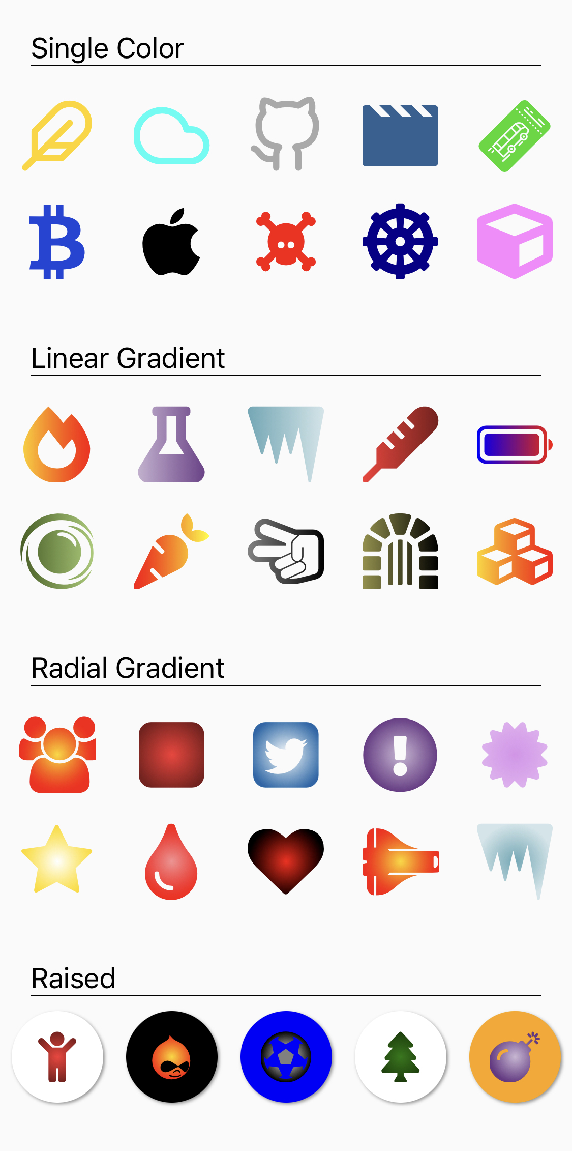
Single Color
import { Icon } from 'react-native-gradient-icon';
    <Icon
        size={50}
        color="black"
        name="github" type="antdesgin" />
Linear Gradient
import { Icon } from 'react-native-gradient-icon';
    <Icon
        size={50}
        colors={[
            {color:"gold",offset:"0",opacity:"1"},
            {color:"red",offset:"1",opacity:"1"},
        ]}
        name="font-awesome-5" type="fire-alt" />
Radial Gradient
import { Icon } from 'react-native-gradient-icon';
    <Icon
        size={50}
        mode='radial'
        colors={[
            {color:"red",offset:"0",opacity:"1"},
            {color:"black",offset:"1",opacity:"1"},
        ]}
        name='font-awesome' type='heart' />
Raised
import { Icon } from 'react-native-gradient-icon';
    <Icon
        raised
        color="#1c7801"
        name="tree" type="font-awesome-5" />
Icon types
- antdesign
- entypo
- evilicon
- feather
- font-awesome
- font-awesome-5
- fontisto
- foundation
- ionicon
- material
- material-community
- octicon
- zocial
- simple-line-icon
Browse all icons here .
Props
| style | style | yes | none | For styling. |
| mode | linear | radial | yes | linear | mode of gradient default linear. |
| type | string | no | feather | type of icon. |
| name | string | no | feather | name of icon. |
| size | number | yes | 24 | size of icon. |
| color | string | yes | none | single color of icon. |
| colors | array of
{
color:string,
offset:string,
opacity:string
} | yes | [
{
color:"gold",
offset:"0",
opacity:"1"
},
{
color:"red",
offset:"1",
opacity:"1"
}
] | array of gradient of color for linear or radial gradient both,
color is the color of respective gradient, takes all color strings,
offset defines the the offset of of corresponding color it ranges between 0 to 1,
opacity is the opacity of corresponding color, it ranges between 0 to 1. |
| start | object {x:number, y:number} | yes | {x:0,y:0} | works only in 'linear' mode, it is starting position of gradient. |
| end | object {x:number, y:number} | yes | {x:1,y:0} | works only in 'linear' mode, it is end position of gradient. |
| innerRing | object {x:number, y:number} | yes | {x:size/2,y: size/2} | works only in 'radial' mode, it is position of inner ring. |
| outterRing | object {x:number, y:number} | yes | {x:size/2, y:size/2} | works only in 'radial' mode, it is position of outer ring. |
| raised | boolean | yes | false | for applying raised effect. |
| raisedColor | string | yes | white | background color of raised effect, works only when raised is true. |
MIT Licensed


